Chapter 3 Descriptive statistics
3.2 Introduction
Any time that you get a new data set to look at, one of the first tasks that you have to do is find ways of summarising the data in a compact, easily understood fashion. This is what descriptive statistics (as opposed to inferential statistics) is all about. In fact, to many people the term “statistics” is synonymous with descriptive statistics. It is this topic that we’ll consider in this chapter, but before going into any details, let’s take a moment to get a sense of why we need descriptive statistics. To do this, let’s load the aflsmall.Rdata file, and use the who() function in the lsr package to see what variables are stored in the file:
load( "./data/aflsmall.Rdata" )
library(lsr)
who()
## -- Name -- -- Class -- -- Size --
## afl.finalists factor 400
## afl.margins numeric 176
## any.sales.this.month logical 12
## berkeley data.frame 39 x 3
## berkeley.small data.frame 46 x 2
## coef numeric 2
## Dan list 4
## days.per.month numeric 12
## expt data.frame 9 x 4
## february.sales numeric 1
## formula1 formula
## formula2 formula
## formula3 formula
## formula4 formula
## greeting character 1
## is.the.Party.correct logical 1
## months character 12
## my.formula formula
## projecthome character 1
## revenue numeric 1
## royalty numeric 1
## sales numeric 1
## sales.by.month numeric 12
## simpson matrix 6 x 5
## stock.levels character 12
## xlu numeric 1There are two variables here, afl.finalists and afl.margins. We’ll focus a bit on these two variables in this chapter, so I’d better tell you what they are. Unlike most of data sets in this book, these are actually real data, relating to the Australian Football League (AFL)57 The afl.margins variable contains the winning margin (number of points) for all 176 home and away games played during the 2010 season. The afl.finalists variable contains the names of all 400 teams that played in all 200 finals matches played during the period 1987 to 2010. Let’s have a look at the afl.margins variable:
print(afl.margins)## [1] 56 31 56 8 32 14 36 56 19 1 3 104 43 44 72 9 28
## [18] 25 27 55 20 16 16 7 23 40 48 64 22 55 95 15 49 52
## [35] 50 10 65 12 39 36 3 26 23 20 43 108 53 38 4 8 3
## [52] 13 66 67 50 61 36 38 29 9 81 3 26 12 36 37 70 1
## [69] 35 12 50 35 9 54 47 8 47 2 29 61 38 41 23 24 1
## [86] 9 11 10 29 47 71 38 49 65 18 0 16 9 19 36 60 24
## [103] 25 44 55 3 57 83 84 35 4 35 26 22 2 14 19 30 19
## [120] 68 11 75 48 32 36 39 50 11 0 63 82 26 3 82 73 19
## [137] 33 48 8 10 53 20 71 75 76 54 44 5 22 94 29 8 98
## [154] 9 89 1 101 7 21 52 42 21 116 3 44 29 27 16 6 44
## [171] 3 28 38 29 10 10This output doesn’t make it easy to get a sense of what the data are actually saying. Just “looking at the data” isn’t a terribly effective way of understanding data. In order to get some idea about what’s going on, we need to calculate some descriptive statistics (this chapter) and draw some nice pictures (Chapter 3.9. Since the descriptive statistics are the easier of the two topics, I’ll start with those, but nevertheless I’ll show you a histogram of the afl.margins data, since it should help you get a sense of what the data we’re trying to describe actually look like. But for what it’s worth, this histogram – which is shown in Figure 3.1 – was generated using the hist() function. We’ll talk a lot more about how to draw histograms in Section 3.9.2. For now, it’s enough to look at the histogram and note that it provides a fairly interpretable representation of the afl.margins data.
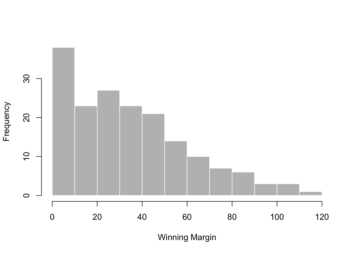
Figure 3.1: A histogram of the AFL 2010 winning margin data (the afl.margins variable). As you might expect, the larger the margin the less frequently you tend to see it.
3.3 Measures of central tendency
Drawing pictures of the data, as I did in Figure 3.1 is an excellent way to convey the “gist” of what the data is trying to tell you, it’s often extremely useful to try to condense the data into a few simple “summary” statistics. In most situations, the first thing that you’ll want to calculate is a measure of central tendency. That is, you’d like to know something about the “average” or “middle” of your data lies. The two most commonly used measures are the mean, median and mode; occasionally people will also report a trimmed mean. I’ll explain each of these in turn, and then discuss when each of them is useful.
3.3.1 The mean
The mean of a set of observations is just a normal, old-fashioned average: add all of the values up, and then divide by the total number of values. The first five AFL margins were 56, 31, 56, 8 and 32, so the mean of these observations is just: \[ \frac{56 + 31 + 56 + 8 + 32}{5} = \frac{183}{5} = 36.60 \] Of course, this definition of the mean isn’t news to anyone: averages (i.e., means) are used so often in everyday life that this is pretty familiar stuff. However, since the concept of a mean is something that everyone already understands, I’ll use this as an excuse to start introducing some of the mathematical notation that statisticians use to describe this calculation, and talk about how the calculations would be done in R.
The first piece of notation to introduce is \(N\), which we’ll use to refer to the number of observations that we’re averaging (in this case \(N = 5\)). Next, we need to attach a label to the observations themselves. It’s traditional to use \(X\) for this, and to use subscripts to indicate which observation we’re actually talking about. That is, we’ll use \(X_1\) to refer to the first observation, \(X_2\) to refer to the second observation, and so on, all the way up to \(X_N\) for the last one. Or, to say the same thing in a slightly more abstract way, we use \(X_i\) to refer to the \(i\)-th observation. Just to make sure we’re clear on the notation, the following table lists the 5 observations in the afl.margins variable, along with the mathematical symbol used to refer to it, and the actual value that the observation corresponds to:
| the observation | its symbol | the observed value |
|---|---|---|
| winning margin, game 1 | \(X_1\) | 56 points |
| winning margin, game 2 | \(X_2\) | 31 points |
| winning margin, game 3 | \(X_3\) | 56 points |
| winning margin, game 4 | \(X_4\) | 8 points |
| winning margin, game 5 | \(X_5\) | 32 points |
Okay, now let’s try to write a formula for the mean. By tradition, we use \(\bar{X}\) as the notation for the mean. So the calculation for the mean could be expressed using the following formula: \[ \bar{X} = \frac{X_1 + X_2 + ... + X_{N-1} + X_N}{N} \] This formula is entirely correct, but it’s terribly long, so we make use of the summation symbol \(\scriptstyle\sum\) to shorten it.58 If I want to add up the first five observations, I could write out the sum the long way, \(X_1 + X_2 + X_3 + X_4 +X_5\) or I could use the summation symbol to shorten it to this: \[ \sum_{i=1}^5 X_i \] Taken literally, this could be read as “the sum, taken over all \(i\) values from 1 to 5, of the value \(X_i\).” But basically, what it means is “add up the first five observations.” In any case, we can use this notation to write out the formula for the mean, which looks like this: \[ \bar{X} = \frac{1}{N} \sum_{i=1}^N X_i \]
In all honesty, I can’t imagine that all this mathematical notation helps clarify the concept of the mean at all. In fact, it’s really just a fancy way of writing out the same thing I said in words: add all the values up, and then divide by the total number of items. However, that’s not really the reason I went into all that detail. My goal was to try to make sure that everyone reading this book is clear on the notation that we’ll be using throughout the book: \(\bar{X}\) for the mean, \(\scriptstyle\sum\) for the idea of summation, \(X_i\) for the \(i\)th observation, and \(N\) for the total number of observations. We’re going to be re-using these symbols a fair bit, so it’s important that you understand them well enough to be able to “read” the equations, and to be able to see that it’s just saying “add up lots of things and then divide by another thing.”
3.3.2 Calculating the mean in R
Okay that’s the maths, how do we get the magic computing box to do the work for us? If you really wanted to, you could do this calculation directly in R. For the first 5 AFL scores, do this just by typing it in as if R were a calculator…
(56 + 31 + 56 + 8 + 32) / 5## [1] 36.6… in which case R outputs the answer 36.6, just as if it were a calculator. However, that’s not the only way to do the calculations, and when the number of observations starts to become large, it’s easily the most tedious. Besides, in almost every real world scenario, you’ve already got the actual numbers stored in a variable of some kind, just like we have with the afl.margins variable. Under those circumstances, what you want is a function that will just add up all the values stored in a numeric vector. That’s what the sum() function does. If we want to add up all 176 winning margins in the data set, we can do so using the following command:59
sum( afl.margins )## [1] 6213If we only want the sum of the first five observations, then we can use square brackets to pull out only the first five elements of the vector. So the command would now be:
sum( afl.margins[1:5] )## [1] 183To calculate the mean, we now tell R to divide the output of this summation by five, so the command that we need to type now becomes the following:
sum( afl.margins[1:5] ) / 5## [1] 36.6Although it’s pretty easy to calculate the mean using the sum() function, we can do it in an even easier way, since R also provides us with the mean() function. To calculate the mean for all 176 games, we would use the following command:
mean( x = afl.margins )## [1] 35.30114However, since x is the first argument to the function, I could have omitted the argument name. In any case, just to show you that there’s nothing funny going on, here’s what we would do to calculate the mean for the first five observations:
mean( afl.margins[1:5] )## [1] 36.6As you can see, this gives exactly the same answers as the previous calculations.
3.3.3 The median
The second measure of central tendency that people use a lot is the median, and it’s even easier to describe than the mean. The median of a set of observations is just the middle value. As before let’s imagine we were interested only in the first 5 AFL winning margins: 56, 31, 56, 8 and 32. To figure out the median, we sort these numbers into ascending order:
\[
8, 31, \mathbf{32}, 56, 56
\]
From inspection, it’s obvious that the median value of these 5 observations is 32, since that’s the middle one in the sorted list (I’ve put it in bold to make it even more obvious). Easy stuff. But what should we do if we were interested in the first 6 games rather than the first 5? Since the sixth game in the season had a winning margin of 14 points, our sorted list is now
\[
8, 14, \mathbf{31}, \mathbf{32}, 56, 56
\]
and there are two middle numbers, 31 and 32. The median is defined as the average of those two numbers, which is of course 31.5. As before, it’s very tedious to do this by hand when you’ve got lots of numbers. To illustrate this, here’s what happens when you use R to sort all 176 winning margins. First, I’ll use the sort() function (discussed in Chapter ??) to display the winning margins in increasing numerical order:
sort( x = afl.margins )## [1] 0 0 1 1 1 1 2 2 3 3 3 3 3 3 3 3 4
## [18] 4 5 6 7 7 8 8 8 8 8 9 9 9 9 9 9 10
## [35] 10 10 10 10 11 11 11 12 12 12 13 14 14 15 16 16 16
## [52] 16 18 19 19 19 19 19 20 20 20 21 21 22 22 22 23 23
## [69] 23 24 24 25 25 26 26 26 26 27 27 28 28 29 29 29 29
## [86] 29 29 30 31 32 32 33 35 35 35 35 36 36 36 36 36 36
## [103] 37 38 38 38 38 38 39 39 40 41 42 43 43 44 44 44 44
## [120] 44 47 47 47 48 48 48 49 49 50 50 50 50 52 52 53 53
## [137] 54 54 55 55 55 56 56 56 57 60 61 61 63 64 65 65 66
## [154] 67 68 70 71 71 72 73 75 75 76 81 82 82 83 84 89 94
## [171] 95 98 101 104 108 116The middle values are 30 and 31, so the median winning margin for 2010 was 30.5 points. In real life, of course, no-one actually calculates the median by sorting the data and then looking for the middle value. In real life, we use the median command:
median( x = afl.margins )## [1] 30.5which outputs the median value of 30.5.
3.3.4 Mean or median? What’s the difference?
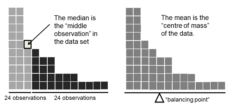
Figure 3.2: An illustration of the difference between how the mean and the median should be interpreted. The mean is basically the “centre of gravity” of the data set: if you imagine that the histogram of the data is a solid object, then the point on which you could balance it (as if on a see-saw) is the mean. In contrast, the median is the middle observation. Half of the observations are smaller, and half of the observations are larger.
Knowing how to calculate means and medians is only a part of the story. You also need to understand what each one is saying about the data, and what that implies for when you should use each one. This is illustrated in Figure 3.2 the mean is kind of like the “centre of gravity” of the data set, whereas the median is the “middle value” in the data. What this implies, as far as which one you should use, depends a little on what type of data you’ve got and what you’re trying to achieve. As a rough guide:
- If your data are nominal scale, you probably shouldn’t be using either the mean or the median. Both the mean and the median rely on the idea that the numbers assigned to values are meaningful. If the numbering scheme is arbitrary, then it’s probably best to use the mode (Section 3.3.7) instead.
- If your data are ordinal scale, you’re more likely to want to use the median than the mean. The median only makes use of the order information in your data (i.e., which numbers are bigger), but doesn’t depend on the precise numbers involved. That’s exactly the situation that applies when your data are ordinal scale. The mean, on the other hand, makes use of the precise numeric values assigned to the observations, so it’s not really appropriate for ordinal data.
- For interval and ratio scale data, either one is generally acceptable. Which one you pick depends a bit on what you’re trying to achieve. The mean has the advantage that it uses all the information in the data (which is useful when you don’t have a lot of data), but it’s very sensitive to extreme values, as we’ll see in Section 3.3.6.
Let’s expand on that last part a little. One consequence is that there’s systematic differences between the mean and the median when the histogram is asymmetric (skewed; see Section 3.5). This is illustrated in Figure 3.2 notice that the median (right hand side) is located closer to the “body” of the histogram, whereas the mean (left hand side) gets dragged towards the “tail” (where the extreme values are). To give a concrete example, suppose Bob (income $50,000), Kate (income $60,000) and Jane (income $65,000) are sitting at a table: the average income at the table is $58,333 and the median income is $60,000. Then Bill sits down with them (income $100,000,000). The average income has now jumped to $25,043,750 but the median rises only to $62,500. If you’re interested in looking at the overall income at the table, the mean might be the right answer; but if you’re interested in what counts as a typical income at the table, the median would be a better choice here.
3.3.5 A real life example
To try to get a sense of why you need to pay attention to the differences between the mean and the median, let’s consider a real life example. Since I tend to mock journalists for their poor scientific and statistical knowledge, I should give credit where credit is due. This is from an excellent article on the ABC news website60 24 September, 2010:
Senior Commonwealth Bank executives have travelled the world in the past couple of weeks with a presentation showing how Australian house prices, and the key price to income ratios, compare favourably with similar countries. “Housing affordability has actually been going sideways for the last five to six years,” said Craig James, the chief economist of the bank’s trading arm, CommSec.
This probably comes as a huge surprise to anyone with a mortgage, or who wants a mortgage, or pays rent, or isn’t completely oblivious to what’s been going on in the Australian housing market over the last several years. Back to the article:
CBA has waged its war against what it believes are housing doomsayers with graphs, numbers and international comparisons. In its presentation, the bank rejects arguments that Australia’s housing is relatively expensive compared to incomes. It says Australia’s house price to household income ratio of 5.6 in the major cities, and 4.3 nationwide, is comparable to many other developed nations. It says San Francisco and New York have ratios of 7, Auckland’s is 6.7, and Vancouver comes in at 9.3.
More excellent news! Except, the article goes on to make the observation that…
Many analysts say that has led the bank to use misleading figures and comparisons. If you go to page four of CBA’s presentation and read the source information at the bottom of the graph and table, you would notice there is an additional source on the international comparison – Demographia. However, if the Commonwealth Bank had also used Demographia’s analysis of Australia’s house price to income ratio, it would have come up with a figure closer to 9 rather than 5.6 or 4.3
That’s, um, a rather serious discrepancy. One group of people say 9, another says 4-5. Should we just split the difference, and say the truth lies somewhere in between? Absolutely not: this is a situation where there is a right answer and a wrong answer. Demographia are correct, and the Commonwealth Bank is incorrect. As the article points out
[An] obvious problem with the Commonwealth Bank’s domestic price to income figures is they compare average incomes with median house prices (unlike the Demographia figures that compare median incomes to median prices). The median is the mid-point, effectively cutting out the highs and lows, and that means the average is generally higher when it comes to incomes and asset prices, because it includes the earnings of Australia’s wealthiest people. To put it another way: the Commonwealth Bank’s figures count Ralph Norris’ multi-million dollar pay packet on the income side, but not his (no doubt) very expensive house in the property price figures, thus understating the house price to income ratio for middle-income Australians.
Couldn’t have put it better myself. The way that Demographia calculated the ratio is the right thing to do. The way that the Bank did it is incorrect. As for why an extremely quantitatively sophisticated organisation such as a major bank made such an elementary mistake, well… I can’t say for sure, since I have no special insight into their thinking, but the article itself does happen to mention the following facts, which may or may not be relevant:
[As] Australia’s largest home lender, the Commonwealth Bank has one of the biggest vested interests in house prices rising. It effectively owns a massive swathe of Australian housing as security for its home loans as well as many small business loans.
My, my.
3.3.6 Trimmed mean
One of the fundamental rules of applied statistics is that the data are messy. Real life is never simple, and so the data sets that you obtain are never as straightforward as the statistical theory says.61 This can have awkward consequences. To illustrate, consider this rather strange looking data set: \[ -100,2,3,4,5,6,7,8,9,10 \] If you were to observe this in a real life data set, you’d probably suspect that something funny was going on with the \(-100\) value. It’s probably an outlier, a value that doesn’t really belong with the others. You might consider removing it from the data set entirely, and in this particular case I’d probably agree with that course of action. In real life, however, you don’t always get such cut-and-dried examples. For instance, you might get this instead: \[ -15,2,3,4,5,6,7,8,9,12 \] The \(-15\) looks a bit suspicious, but not anywhere near as much as that \(-100\) did. In this case, it’s a little trickier. It might be a legitimate observation, it might not.
When faced with a situation where some of the most extreme-valued observations might not be quite trustworthy, the mean is not necessarily a good measure of central tendency. It is highly sensitive to one or two extreme values, and is thus not considered to be a robust measure. One remedy that we’ve seen is to use the median. A more general solution is to use a “trimmed mean.” To calculate a trimmed mean, what you do is “discard” the most extreme examples on both ends (i.e., the largest and the smallest), and then take the mean of everything else. The goal is to preserve the best characteristics of the mean and the median: just like a median, you aren’t highly influenced by extreme outliers, but like the mean, you “use” more than one of the observations. Generally, we describe a trimmed mean in terms of the percentage of observation on either side that are discarded. So, for instance, a 10% trimmed mean discards the largest 10% of the observations and the smallest 10% of the observations, and then takes the mean of the remaining 80% of the observations. Not surprisingly, the 0% trimmed mean is just the regular mean, and the 50% trimmed mean is the median. In that sense, trimmed means provide a whole family of central tendency measures that span the range from the mean to the median.
For our toy example above, we have 10 observations, and so a 10% trimmed mean is calculated by ignoring the largest value (i.e., 12) and the smallest value (i.e., -15) and taking the mean of the remaining values. First, let’s enter the data
dataset <- c( -15,2,3,4,5,6,7,8,9,12 )Next, let’s calculate means and medians:
mean( x = dataset )## [1] 4.1median( x = dataset )## [1] 5.5That’s a fairly substantial difference, but I’m tempted to think that the mean is being influenced a bit too much by the extreme values at either end of the data set, especially the \(-15\) one. So let’s just try trimming the mean a bit. If I take a 10% trimmed mean, we’ll drop the extreme values on either side, and take the mean of the rest:
mean( x = dataset, trim = .1)## [1] 5.5which in this case gives exactly the same answer as the median. Note that, to get a 10% trimmed mean you write trim = .1, not trim = 10. In any case, let’s finish up by calculating the 5% trimmed mean for the afl.margins data,
mean( x = afl.margins, trim = .05) ## [1] 33.753.3.7 Mode
The mode of a sample is very simple: it is the value that occurs most frequently. To illustrate the mode using the AFL data, let’s examine a different aspect to the data set. Who has played in the most finals? The afl.finalists variable is a factor that contains the name of every team that played in any AFL final from 1987-2010, so let’s have a look at it. To do this we will use the head() command. head() is useful when you’re working with a data.frame with a lot of rows since you can use it to tell you how many rows to return. There have been a lot of finals in this period so printing afl.finalists using print(afl.finalists) will just fill us the screen. The command below tells R we just want the first 25 rows of the data.frame.
head(afl.finalists, 25)## [1] Hawthorn Melbourne Carlton Melbourne Hawthorn
## [6] Carlton Melbourne Carlton Hawthorn Melbourne
## [11] Melbourne Hawthorn Melbourne Essendon Hawthorn
## [16] Geelong Geelong Hawthorn Collingwood Melbourne
## [21] Collingwood West Coast Collingwood Essendon Collingwood
## 17 Levels: Adelaide Brisbane Carlton Collingwood Essendon ... Western BulldogsThere are actually 400 entries (aren’t you glad we didn’t print them all?). We could read through all 400, and count the number of occasions on which each team name appears in our list of finalists, thereby producing a frequency table. However, that would be mindless and boring: exactly the sort of task that computers are great at. So let’s use the table() function (discussed in more detail in Section ??) to do this task for us:
table( afl.finalists )## afl.finalists
## Adelaide Brisbane Carlton Collingwood
## 26 25 26 28
## Essendon Fitzroy Fremantle Geelong
## 32 0 6 39
## Hawthorn Melbourne North Melbourne Port Adelaide
## 27 28 28 17
## Richmond St Kilda Sydney West Coast
## 6 24 26 38
## Western Bulldogs
## 24Now that we have our frequency table, we can just look at it and see that, over the 24 years for which we have data, Geelong has played in more finals than any other team. Thus, the mode of the finalists data is "Geelong". The core packages in R don’t have a function for calculating the mode62. However, I’ve included a function in the lsr package that does this. The function is called modeOf(), and here’s how you use it:
modeOf( x = afl.finalists )## [1] "Geelong"There’s also a function called maxFreq() that tells you what the modal frequency is. If we apply this function to our finalists data, we obtain the following:
maxFreq( x = afl.finalists )## [1] 39Taken together, we observe that Geelong (39 finals) played in more finals than any other team during the 1987-2010 period.
One last point to make with respect to the mode. While it’s generally true that the mode is most often calculated when you have nominal scale data (because means and medians are useless for those sorts of variables), there are some situations in which you really do want to know the mode of an ordinal, interval or ratio scale variable. For instance, let’s go back to thinking about our afl.margins variable. This variable is clearly ratio scale (if it’s not clear to you, it may help to re-read Section ??), and so in most situations the mean or the median is the measure of central tendency that you want. But consider this scenario… a friend of yours is offering a bet. They pick a football game at random, and (without knowing who is playing) you have to guess the exact margin. If you guess correctly, you win $50. If you don’t, you lose $1. There are no consolation prizes for “almost” getting the right answer. You have to guess exactly the right margin63 For this bet, the mean and the median are completely useless to you. It is the mode that you should bet on. So, we calculate this modal value
modeOf( x = afl.margins )## [1] 3maxFreq( x = afl.margins )## [1] 8So the 2010 data suggest you should bet on a 3 point margin, and since this was observed in 8 of the 176 game (4.5% of games) the odds are firmly in your favour.
3.4 Measures of variability
The statistics that we’ve discussed so far all relate to central tendency. That is, they all talk about which values are “in the middle” or “popular” in the data. However, central tendency is not the only type of summary statistic that we want to calculate. The second thing that we really want is a measure of the variability of the data. That is, how “spread out” are the data? How “far” away from the mean or median do the observed values tend to be? For now, let’s assume that the data are interval or ratio scale, so we’ll continue to use the afl.margins data. We’ll use this data to discuss several different measures of spread, each with different strengths and weaknesses.
3.4.1 Range
The range of a variable is very simple: it’s the biggest value minus the smallest value. For the AFL winning margins data, the maximum value is 116, and the minimum value is 0. We can calculate these values in R using the max() and min() functions:
max( afl.margins )## [1] 116min( afl.margins )## [1] 0where I’ve omitted the output because it’s not interesting. The other possibility is to use the range() function; which outputs both the minimum value and the maximum value in a vector, like this:
range( afl.margins )## [1] 0 116Although the range is the simplest way to quantify the notion of “variability,” it’s one of the worst. Recall from our discussion of the mean that we want our summary measure to be robust. If the data set has one or two extremely bad values in it, we’d like our statistics not to be unduly influenced by these cases. If we look once again at our toy example of a data set containing very extreme outliers… \[ -100,2,3,4,5,6,7,8,9,10 \] … it is clear that the range is not robust, since this has a range of 110, but if the outlier were removed we would have a range of only 8.
3.4.2 Interquartile range
The interquartile range (IQR) is like the range, but instead of calculating the difference between the biggest and smallest value, it calculates the difference between the 25th quantile and the 75th quantile. Probably you already know what a quantile is (they’re more commonly called percentiles), but if not: the 10th percentile of a data set is the smallest number \(x\) such that 10% of the data is less than \(x\). In fact, we’ve already come across the idea: the median of a data set is its 50th quantile / percentile! R actually provides you with a way of calculating quantiles, using the (surprise, surprise) quantile() function. Let’s use it to calculate the median AFL winning margin:
quantile( x = afl.margins, probs = .5)## 50%
## 30.5And not surprisingly, this agrees with the answer that we saw earlier with the median() function. Now, we can actually input lots of quantiles at once, by specifying a vector for the probs argument. So lets do that, and get the 25th and 75th percentile:
quantile( x = afl.margins, probs = c(.25,.75) )## 25% 75%
## 12.75 50.50And, by noting that \(50.5 - 12.75 = 37.75\), we can see that the interquartile range for the 2010 AFL winning margins data is 37.75. Of course, that seems like too much work to do all that typing, so R has a built in function called IQR() that we can use:
IQR( x = afl.margins )## [1] 37.75While it’s obvious how to interpret the range, it’s a little less obvious how to interpret the IQR. The simplest way to think about it is like this: the interquartile range is the range spanned by the “middle half” of the data. That is, one quarter of the data falls below the 25th percentile, one quarter of the data is above the 75th percentile, leaving the “middle half” of the data lying in between the two. And the IQR is the range covered by that middle half.
3.4.3 Mean absolute deviation
The two measures we’ve looked at so far, the range and the interquartile range, both rely on the idea that we can measure the spread of the data by looking at the quantiles of the data. However, this isn’t the only way to think about the problem. A different approach is to select a meaningful reference point (usually the mean or the median) and then report the “typical” deviations from that reference point. What do we mean by “typical” deviation? Usually, the mean or median value of these deviations! In practice, this leads to two different measures, the “mean absolute deviation (from the mean)” and the “median absolute deviation (from the median).” From what I’ve read, the measure based on the median seems to be used in statistics, and does seem to be the better of the two, but to be honest I don’t think I’ve seen it used much in psychology. The measure based on the mean does occasionally show up in psychology though. In this section I’ll talk about the first one, and I’ll come back to talk about the second one later.
Since the previous paragraph might sound a little abstract, let’s go through the mean absolute deviation from the mean a little more slowly. One useful thing about this measure is that the name actually tells you exactly how to calculate it. Let’s think about our AFL winning margins data, and once again we’ll start by pretending that there’s only 5 games in total, with winning margins of 56, 31, 56, 8 and 32. Since our calculations rely on an examination of the deviation from some reference point (in this case the mean), the first thing we need to calculate is the mean, \(\bar{X}\). For these five observations, our mean is \(\bar{X} = 36.6\). The next step is to convert each of our observations \(X_i\) into a deviation score. We do this by calculating the difference between the observation \(X_i\) and the mean \(\bar{X}\). That is, the deviation score is defined to be \(X_i - \bar{X}\). For the first observation in our sample, this is equal to \(56 - 36.6 = 19.4\). Okay, that’s simple enough. The next step in the process is to convert these deviations to absolute deviations. As we discussed earlier when talking about the abs() function in R (Section 2.7), we do this by converting any negative values to positive ones. Mathematically, we would denote the absolute value of \(-3\) as \(|-3|\), and so we say that \(|-3| = 3\). We use the absolute value function here because we don’t really care whether the value is higher than the mean or lower than the mean, we’re just interested in how close it is to the mean. To help make this process as obvious as possible, the table below shows these calculations for all five observations:
| the observation | its symbol | the observed value |
|---|---|---|
| winning margin, game 1 | \(X_1\) | 56 points |
| winning margin, game 2 | \(X_2\) | 31 points |
| winning margin, game 3 | \(X_3\) | 56 points |
| winning margin, game 4 | \(X_4\) | 8 points |
| winning margin, game 5 | \(X_5\) | 32 points |
Now that we have calculated the absolute deviation score for every observation in the data set, all that we have to do to calculate the mean of these scores. Let’s do that: \[ \frac{19.4 + 5.6 + 19.4 + 28.6 + 4.6}{5} = 15.52 \] And we’re done. The mean absolute deviation for these five scores is 15.52.
However, while our calculations for this little example are at an end, we do have a couple of things left to talk about. Firstly, we should really try to write down a proper mathematical formula. But in order do to this I need some mathematical notation to refer to the mean absolute deviation. Irritatingly, “mean absolute deviation” and “median absolute deviation” have the same acronym (MAD), which leads to a certain amount of ambiguity, and since R tends to use MAD to refer to the median absolute deviation, I’d better come up with something different for the mean absolute deviation. Sigh. What I’ll do is use AAD instead, short for average absolute deviation. Now that we have some unambiguous notation, here’s the formula that describes what we just calculated: \[ \mbox{}(X) = \frac{1}{N} \sum_{i = 1}^N |X_i - \bar{X}| \]
The last thing we need to talk about is how to calculate AAD in R. One possibility would be to do everything using low level commands, laboriously following the same steps that I used when describing the calculations above. However, that’s pretty tedious. You’d end up with a series of commands that might look like this:
X <- c(56, 31,56,8,32)   # enter the data
X.bar <- mean( X )       # step 1. the mean of the data
AD <- abs( X - X.bar )   # step 2. the absolute deviations from the mean
AAD <- mean( AD )        # step 3. the mean absolute deviations
print( AAD )             # print the results
## [1] 15.52Each of those commands is pretty simple, but there’s just too many of them. And because I find that to be too much typing, the lsr package has a very simple function called aad() that does the calculations for you. If we apply the aad() function to our data, we get this:
library(lsr)
aad( X )
## [1] 15.52No suprises there.
3.4.4 Variance
Although the mean absolute deviation measure has its uses, it’s not the best measure of variability to use. From a purely mathematical perspective, there are some solid reasons to prefer squared deviations rather than absolute deviations. If we do that, we obtain a measure is called the variance, which has a lot of really nice statistical properties that I’m going to ignore,64(X)$ and \(\mbox{Var}(Y)\) respectively. Now imagine I want to define a new variable \(Z\) that is the sum of the two, \(Z = X+Y\). As it turns out, the variance of \(Z\) is equal to \(\mbox{Var}(X) + \mbox{Var}(Y)\). This is a very useful property, but it’s not true of the other measures that I talk about in this section.] and one massive psychological flaw that I’m going to make a big deal out of in a moment. The variance of a data set \(X\) is sometimes written as \(\mbox{Var}(X)\), but it’s more commonly denoted \(s^2\) (the reason for this will become clearer shortly). The formula that we use to calculate the variance of a set of observations is as follows: \[ \mbox{Var}(X) = \frac{1}{N} \sum_{i=1}^N \left( X_i - \bar{X} \right)^2 \] \[\mbox{Var}(X) = \frac{\sum_{i=1}^N \left( X_i - \bar{X} \right)^2}{N}\] As you can see, it’s basically the same formula that we used to calculate the mean absolute deviation, except that instead of using “absolute deviations” we use “squared deviations.” It is for this reason that the variance is sometimes referred to as the “mean square deviation.”
Now that we’ve got the basic idea, let’s have a look at a concrete example. Once again, let’s use the first five AFL games as our data. If we follow the same approach that we took last time, we end up with the following table:
| Notation [English] | \(i\) [which game] | \(X_i\) [value] | \(X_i - \bar{X}\) [deviation from mean] | \((X_i - \bar{X})^2\) [absolute deviation] |
|---|---|---|---|---|
| 1 | 56 | 19.4 | 376.36 | |
| 2 | 31 | -5.6 | 31.36 | |
| 3 | 56 | 19.4 | 376.36 | |
| 4 | 8 | -28.6 | 817.96 | |
| 5 | 32 | -4.6 | 21.16 |
That last column contains all of our squared deviations, so all we have to do is average them. If we do that by typing all the numbers into R by hand…
( 376.36 + 31.36 + 376.36 + 817.96 + 21.16 ) / 5## [1] 324.64… we end up with a variance of 324.64. Exciting, isn’t it? For the moment, let’s ignore the burning question that you’re all probably thinking (i.e., what the heck does a variance of 324.64 actually mean?) and instead talk a bit more about how to do the calculations in R, because this will reveal something very weird.
As always, we want to avoid having to type in a whole lot of numbers ourselves. And as it happens, we have the vector X lying around, which we created in the previous section. With this in mind, we can calculate the variance of X by using the following command,
mean( (X - mean(X) )^2)## [1] 324.64and as usual we get the same answer as the one that we got when we did everything by hand. However, I still think that this is too much typing. Fortunately, R has a built in function called var() which does calculate variances. So we could also do this…
var(X)## [1] 405.8and you get the same… no, wait… you get a completely different answer. That’s just weird. Is R broken? Is this a typo? Is Dan an idiot?
As it happens, the answer is no.65 It’s not a typo, and R is not making a mistake. To get a feel for what’s happening, let’s stop using the tiny data set containing only 5 data points, and switch to the full set of 176 games that we’ve got stored in our afl.margins vector. First, let’s calculate the variance by using the formula that I described above:
mean( (afl.margins - mean(afl.margins) )^2)## [1] 675.9718Now let’s use the var() function:
var( afl.margins )## [1] 679.8345Hm. These two numbers are very similar this time. That seems like too much of a coincidence to be a mistake. And of course it isn’t a mistake. In fact, it’s very simple to explain what R is doing here, but slightly trickier to explain why R is doing it. So let’s start with the “what.” What R is doing is evaluating a slightly different formula to the one I showed you above. Instead of averaging the squared deviations, which requires you to divide by the number of data points \(N\), R has chosen to divide by \(N-1\). In other words, the formula that R is using is this one
\[
\frac{1}{N-1} \sum_{i=1}^N \left( X_i - \bar{X} \right)^2
\]
It’s easy enough to verify that this is what’s happening, as the following command illustrates:
sum( (X-mean(X))^2 ) / 4## [1] 405.8This is the same answer that R gave us originally when we calculated var(X) originally. So that’s the what. The real question is why R is dividing by \(N-1\) and not by \(N\). After all, the variance is supposed to be the mean squared deviation, right? So shouldn’t we be dividing by \(N\), the actual number of observations in the sample? Well, yes, we should. However, as we’ll discuss in Chapter 4.2, there’s a subtle distinction between “describing a sample” and “making guesses about the population from which the sample came.” Up to this point, it’s been a distinction without a difference. Regardless of whether you’re describing a sample or drawing inferences about the population, the mean is calculated exactly the same way. Not so for the variance, or the standard deviation, or for many other measures besides. What I outlined to you initially (i.e., take the actual average, and thus divide by \(N\)) assumes that you literally intend to calculate the variance of the sample. Most of the time, however, you’re not terribly interested in the sample in and of itself. Rather, the sample exists to tell you something about the world. If so, you’re actually starting to move away from calculating a “sample statistic,” and towards the idea of estimating a “population parameter.” However, I’m getting ahead of myself. For now, let’s just take it on faith that R knows what it’s doing, and we’ll revisit the question later on when we talk about estimation in Chapter 4.2.
Okay, one last thing. This section so far has read a bit like a mystery novel. I’ve shown you how to calculate the variance, described the weird “\(N-1\)” thing that R does and hinted at the reason why it’s there, but I haven’t mentioned the single most important thing… how do you interpret the variance? Descriptive statistics are supposed to describe things, after all, and right now the variance is really just a gibberish number. Unfortunately, the reason why I haven’t given you the human-friendly interpretation of the variance is that there really isn’t one. This is the most serious problem with the variance. Although it has some elegant mathematical properties that suggest that it really is a fundamental quantity for expressing variation, it’s completely useless if you want to communicate with an actual human… variances are completely uninterpretable in terms of the original variable! All the numbers have been squared, and they don’t mean anything anymore. This is a huge issue. For instance, according to the table I presented earlier, the margin in game 1 was “376.36 points-squared higher than the average margin.” This is exactly as stupid as it sounds; and so when we calculate a variance of 324.64, we’re in the same situation. I’ve watched a lot of footy games, and never has anyone referred to “points squared.” It’s not a real unit of measurement, and since the variance is expressed in terms of this gibberish unit, it is totally meaningless to a human.
3.4.5 Standard deviation
Okay, suppose that you like the idea of using the variance because of those nice mathematical properties that I haven’t talked about, but – since you’re a human and not a robot – you’d like to have a measure that is expressed in the same units as the data itself (i.e., points, not points-squared). What should you do? The solution to the problem is obvious: take the square root of the variance, known as the standard deviation, also called the “root mean squared deviation,” or RMSD. This solves out problem fairly neatly: while nobody has a clue what “a variance of 324.68 points-squared” really means, it’s much easier to understand “a standard deviation of 18.01 points,” since it’s expressed in the original units. It is traditional to refer to the standard deviation of a sample of data as \(s\), though “sd” and “std dev.” are also used at times. Because the standard deviation is equal to the square root of the variance, you probably won’t be surprised to see that the formula is:
\[
s = \sqrt{ \frac{1}{N} \sum_{i=1}^N \left( X_i - \bar{X} \right)^2 }
\]
and the R function that we use to calculate it is sd(). However, as you might have guessed from our discussion of the variance, what R actually calculates is slightly different to the formula given above. Just like the we saw with the variance, what R calculates is a version that divides by \(N-1\) rather than \(N\). For reasons that will make sense when we return to this topic in Chapter@refch:estimation I’ll refer to this new quantity as \(\hat\sigma\) (read as: “sigma hat”), and the formula for this is
\[
\hat\sigma = \sqrt{ \frac{1}{N-1} \sum_{i=1}^N \left( X_i - \bar{X} \right)^2 }
\]
With that in mind, calculating standard deviations in R is simple:
sd( afl.margins ) ## [1] 26.07364Interpreting standard deviations is slightly more complex. Because the standard deviation is derived from the variance, and the variance is a quantity that has little to no meaning that makes sense to us humans, the standard deviation doesn’t have a simple interpretation. As a consequence, most of us just rely on a simple rule of thumb: in general, you should expect 68% of the data to fall within 1 standard deviation of the mean, 95% of the data to fall within 2 standard deviation of the mean, and 99.7% of the data to fall within 3 standard deviations of the mean. This rule tends to work pretty well most of the time, but it’s not exact: it’s actually calculated based on an assumption that the histogram is symmetric and “bell shaped.”66 As you can tell from looking at the AFL winning margins histogram in Figure 3.1, this isn’t exactly true of our data! Even so, the rule is approximately correct. As it turns out, 65.3% of the AFL margins data fall within one standard deviation of the mean. This is shown visually in Figure 3.3.
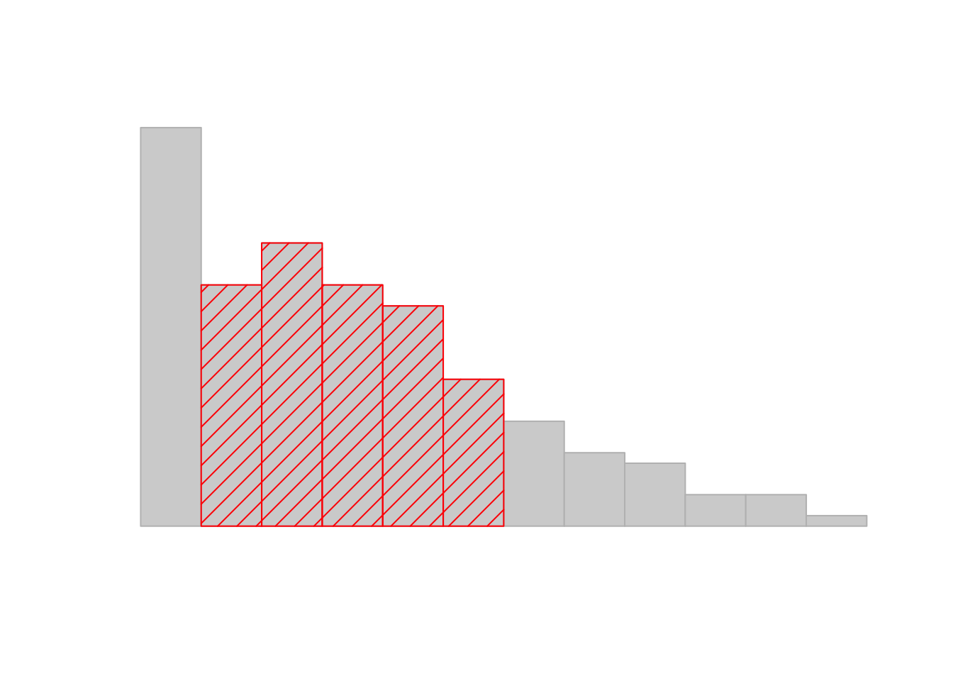
Figure 3.3: An illustration of the standard deviation, applied to the AFL winning margins data. The shaded bars in the histogram show how much of the data fall within one standard deviation of the mean. In this case, 65.3% of the data set lies within this range, which is pretty consistent with the “approximately 68% rule” discussed in the main text.
3.4.6 Median absolute deviation
The last measure of variability that I want to talk about is the median absolute deviation (MAD). The basic idea behind MAD is very simple, and is pretty much identical to the idea behind the mean absolute deviation (Section 3.4.3). The difference is that you use the median everywhere. If we were to frame this idea as a pair of R commands, they would look like this:
# mean absolute deviation from the mean:
mean( abs(afl.margins - mean(afl.margins)) )
## [1] 21.10124# *median* absolute deviation from the *median*:
median( abs(afl.margins - median(afl.margins)) )## [1] 19.5This has a straightforward interpretation: every observation in the data set lies some distance away from the typical value (the median). So the MAD is an attempt to describe a typical deviation from a typical value in the data set. It wouldn’t be unreasonable to interpret the MAD value of 19.5 for our AFL data by saying something like this:
The median winning margin in 2010 was 30.5, indicating that a typical game involved a winning margin of about 30 points. However, there was a fair amount of variation from game to game: the MAD value was 19.5, indicating that a typical winning margin would differ from this median value by about 19-20 points.
As you’d expect, R has a built in function for calculating MAD, and you will be shocked no doubt to hear that it’s called mad(). However, it’s a little bit more complicated than the functions that we’ve been using previously. If you want to use it to calculate MAD in the exact same way that I have described it above, the command that you need to use specifies two arguments: the data set itself x, and a constant that I’ll explain in a moment. For our purposes, the constant is 1, so our command becomes
mad( x = afl.margins, constant = 1 )## [1] 19.5Apart from the weirdness of having to type that constant = 1 part, this is pretty straightforward.
Okay, so what exactly is this constant = 1 argument? I won’t go into all the details here, but here’s the gist. Although the “raw” MAD value that I’ve described above is completely interpretable on its own terms, that’s not actually how it’s used in a lot of real world contexts. Instead, what happens a lot is that the researcher actually wants to calculate the standard deviation. However, in the same way that the mean is very sensitive to extreme values, the standard deviation is vulnerable to the exact same issue. So, in much the same way that people sometimes use the median as a “robust” way of calculating “something that is like the mean,” it’s not uncommon to use MAD as a method for calculating “something that is like the standard deviation.” Unfortunately, the raw MAD value doesn’t do this. Our raw MAD value is 19.5, and our standard deviation was 26.07. However, what some clever person has shown is that, under certain assumptions67, you can multiply the raw MAD value by 1.4826 and obtain a number that is directly comparable to the standard deviation. As a consequence, the default value of constant is 1.4826, and so when you use the mad() command without manually setting a value, here’s what you get:
mad( afl.margins )## [1] 28.9107I should point out, though, that if you want to use this “corrected” MAD value as a robust version of the standard deviation, you really are relying on the assumption that the data are (or at least, are “supposed to be” in some sense) symmetric and basically shaped like a bell curve. That’s really not true for our afl.margins data, so in this case I wouldn’t try to use the MAD value this way.
3.4.7 Which measure to use?
We’ve discussed quite a few measures of spread (range, IQR, MAD, variance and standard deviation), and hinted at their strengths and weaknesses. Here’s a quick summary:
- Range. Gives you the full spread of the data. It’s very vulnerable to outliers, and as a consequence it isn’t often used unless you have good reasons to care about the extremes in the data.
- Interquartile range. Tells you where the “middle half” of the data sits. It’s pretty robust, and complements the median nicely. This is used a lot.
- Mean absolute deviation. Tells you how far “on average” the observations are from the mean. It’s very interpretable, but has a few minor issues (not discussed here) that make it less attractive to statisticians than the standard deviation. Used sometimes, but not often.
- Variance. Tells you the average squared deviation from the mean. It’s mathematically elegant, and is probably the “right” way to describe variation around the mean, but it’s completely uninterpretable because it doesn’t use the same units as the data. Almost never used except as a mathematical tool; but it’s buried “under the hood” of a very large number of statistical tools.
- Standard deviation. This is the square root of the variance. It’s fairly elegant mathematically, and it’s expressed in the same units as the data so it can be interpreted pretty well. In situations where the mean is the measure of central tendency, this is the default. This is by far the most popular measure of variation.
- Median absolute deviation. The typical (i.e., median) deviation from the median value. In the raw form it’s simple and interpretable; in the corrected form it’s a robust way to estimate the standard deviation, for some kinds of data sets. Not used very often, but it does get reported sometimes.
In short, the IQR and the standard deviation are easily the two most common measures used to report the variability of the data; but there are situations in which the others are used. I’ve described all of them in this book because there’s a fair chance you’ll run into most of these somewhere.
3.5 Skew and kurtosis
Text by David Schuster
There are two more descriptive statistics that you will sometimes see reported in the psychological literature, known as skew and kurtosis. These two measures are useful to diagnose normality (although kurtosis is less useful, in practice). If we find evidence of skewness or kurtosis, we may suspect that our distribution is not normal. Later in this course, we will see that it is generally not a problem for us if one of our sample distributions are non-normal. Regardless, skewness and kurtosis can tell us about the shape of our data.
## [1] -0.9226281## [1] 0.00571054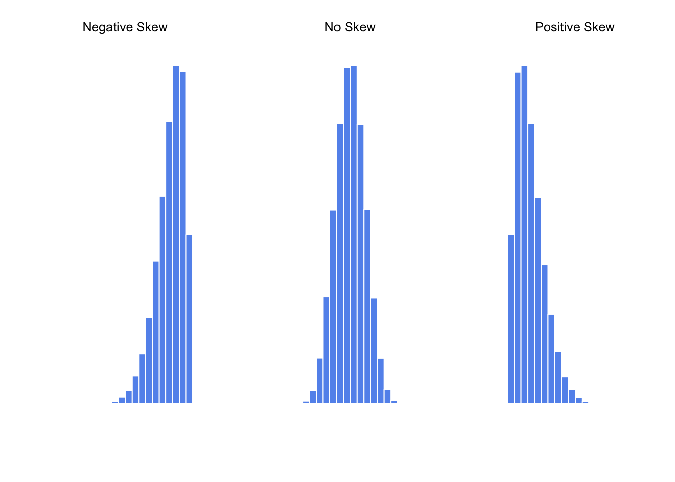
Figure 3.4: An illustration of skewness. On the left we have a negatively skewed data set (skewness \(= -.93\)), in the middle we have a data set with no skew (technically, skewness \(= -.006\)), and on the right we have a positively skewed data set (skewness \(= .93\)).
## [1] 0.9069393Since it’s the more interesting of the two, let’s start by talking about the skewness. Skewness is basically a measure of asymmetry, and the easiest way to explain it is by drawing some pictures. As Figure 3.4 illustrates, if the data tend to have a lot of extreme small values (i.e., the lower tail is “longer” than the upper tail) and not so many extremely large values (left panel), then we say that the data are negatively skewed. On the other hand, if there are more extremely large values than extremely small ones (right panel) we say that the data are positively skewed. That’s the qualitative idea behind skewness. The actual formula for the skewness of a data set is as follows
\[
\mbox{skewness}(X) = \frac{1}{N \hat{\sigma}^3} \sum_{i=1}^N (X_i - \bar{X})^3
\]
where \(N\) is the number of observations, \(\bar{X}\) is the sample mean, and \(\hat{\sigma}\) is the standard deviation (the “divide by \(N-1\)” version, that is). Perhaps more helpfully, it might be useful to point out that the psych package contains a skew() function that you can use to calculate skewness. So if we wanted to use this function to calculate the skewness of the afl.margins data, we’d first need to load the package
library( psych )which now makes it possible to use the following command:
skew( x = afl.margins )## [1] 0.7671555Not surprisingly, it turns out that the AFL winning margins data is fairly skewed.
3.5.1 More detail on skewness measures
Text by David Schuster
Unfortunately, this characterization of skewness is a bit of a simplification. R’s psych package does have a skewness statistic, but it does not match the formula Navarro provided in this section. I spent an afternoon disentangling all the available skewness statistics. Rather than get too detailed with this (if you want that detail, look for Doane & Seward’s 2011 article on measuring skewness), allow me to summarize:
First, my overall recommendation would be to visually examine a Q-Q plot and histogram, then run a Shapiro-Wilks test, understanding that none of these methods are perfect.
Skewness is defined mathematically as the third moment. Moments are statistical parameters. The first moment is mean, the second moment is variance, the third moment is skewness, and the fourth moment is kurtosis
The mathematical definition is of limited use to the researcher, because it does not account for sample size or variation in samples (sampling error)
Statisticians have come up with several more useful measures of skewness. Their performance differences are not very important in practice, and they tend to give the same result when you have large samples.
It matters less which skewness value you report. It is more important that you are clear about which statistic you used. Frustratingly, stats packages and Excel implement a single method but do not make it clear which method they use. This leads to people saying, “I measured skewness using SPSS,” which the SPSS people probably really like.
For future reference more than use right now, I researched which measures are used in which packages.
3.5.1.1 Use statistics to describe skew
x <- afl.margins # use the same example
n <- length(x) # sample size
sum_cubed <- sum((x - mean(x))^3) # sum of cubed deviations from the mean
pop_sd <- sqrt(var(x) * (n-1)/n) # population sd
sample_sd <- sd(x)
pop_sd_cubed <- pop_sd^3 # population sd cubed

gamma_1 <- sum_cubed / pop_sd_cubed  # Pearson’s moment coefficient of skewness
g_1 <- sum_cubed / (pop_sd_cubed * n) # Fisher-Pearson coefficient of skewness (Type = 1, Excel skew.p, Cohen (2013), skewness())
G_1 <- (n / ((n-1)*(n-2))) * sum(((x - mean(x)) / sample_sd)^3)  # adjusted Fisher–Pearson standardized moment coefficient (Type = 2, Excel skew, SPSS skew)
b_1 <- g_1 * ((n-1)/n)^(3/2) # (Type = 3, MINITAB, stat.desc, skew(), psych package)
SE_skew_SPSS = sqrt(6*n*(n-1) / ((n-2)*(n+1)*(n+3))) # SPSS skewness SE per https://www.ibm.com/support/pages/standard-errors-skewness-and-kurtosis-are-all-same-set-variables

gamma_1
## [1] 136.1783g_1## [1] 0.7737405G_1## [1] 0.7804075b_1## [1] 0.7671555The point of all of this is to be aware that when you use the psych package and skew() or stat.desc commands, you are reporting \(\beta_{1}\). SPSS reports \(G_{1}\) as the skewness statistic as well as a standard error statisti. You can replicate this, if you want:
Find \(G_{1}\) using
skew(x, type = 2)Find \({SE_{skew}}\) using the R formula:
sqrt(6*n*(n-1) / ((n-2)*(n+1)*(n+3)))Divide: \(G_{1}/{SE_{skew}}\).
If the result is between -2 and 2, you can infer a lack of skewness. Values -2 indicate a concerning amount of negative skew; values above 2 indicate a concerning amount of positive skew.
3.5.1.2 Examine the histogram
hist(x)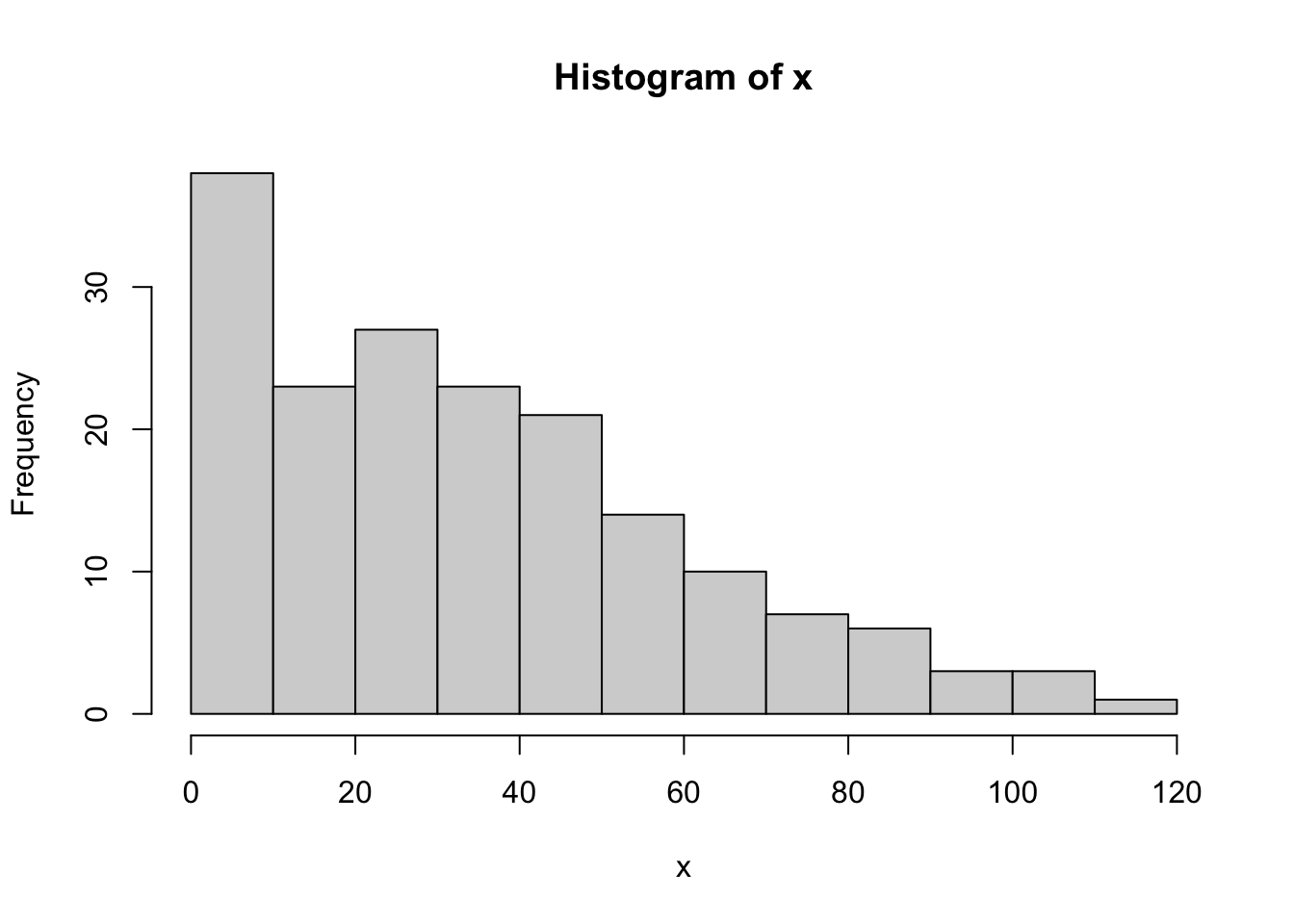
3.5.1.3 Look for normality visually in a Q-Q plot (quantile-quantile plot)
library("ggplot2")##
## Attaching package: 'ggplot2'## The following objects are masked from 'package:psych':
##
## %+%, alphaqplot(sample = x) # qplot Q-Q plots
In a normal distribution, the dots of the plot will form a near-straight line.
Remember that quantiles divide a continuous probability distribution into intervals with equal probabilities.
A Q-Q plot is based on quantiles of data versus theoretical normal distribution.
In contrast a P-P plot (not shown here) is based on the cumulative density function (probability) of data versus a theoretical normal distribution.
Q-Q is better at detecting differences near the middle of the distribution than a P-P plot.
3.5.1.4 The Shapiro-Wilk test tests the null hypothsis that data are from a normal distribution
If p < .05, reject the null and conclude the data are not normal. If p > .05, retain the null and officially make no inference about the distribution. Also, beware that not all deviations from normality may be detected, and, in large samples, the test may be too sensitive. Report as W(df) = #, p = #.
shapiro.test(x) ##
## Shapiro-Wilk normality test
##
## data: x
## W = 0.9398, p-value = 9.481e-07The final measure that is sometimes referred to, though very rarely in practice, is the kurtosis of a data set. Put simply, kurtosis is a measure of the “pointiness” of a data set, as illustrated in Figure 3.5.
## [1] -0.9695987## [1] -0.01439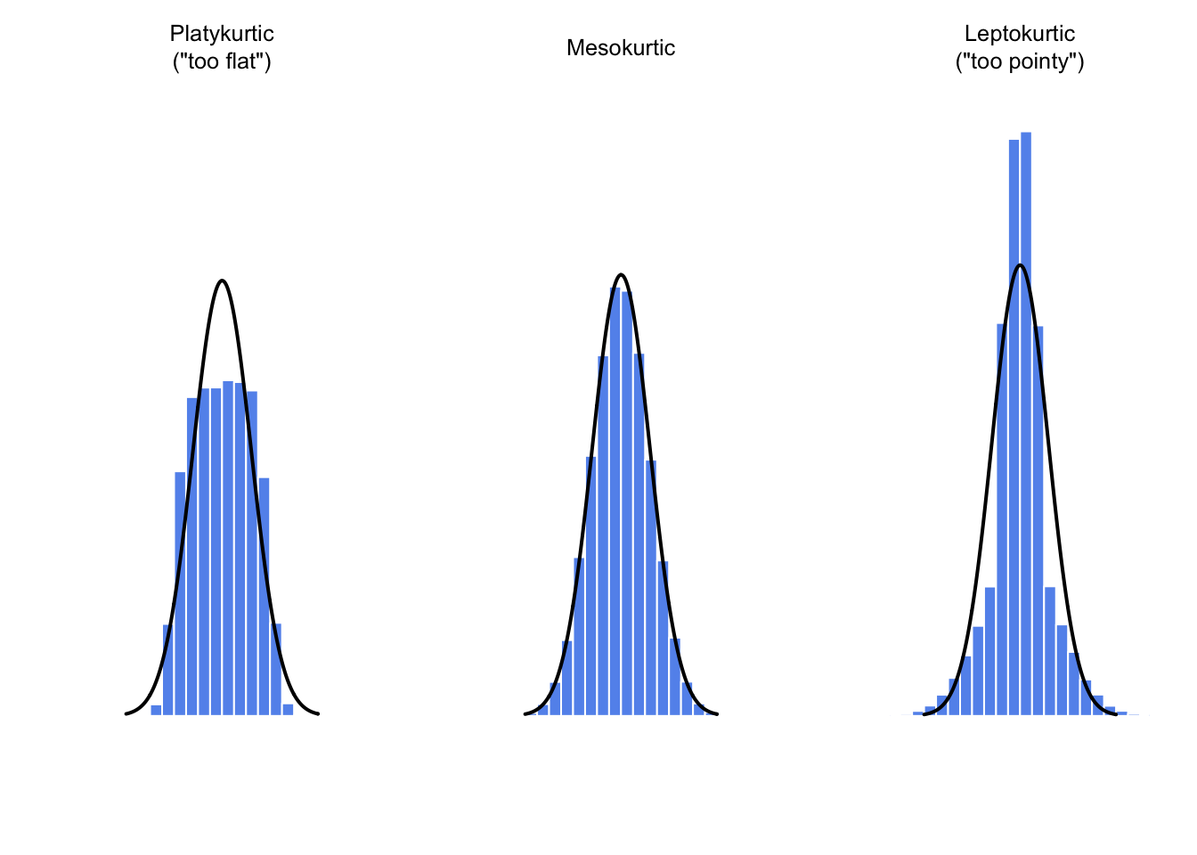
Figure 3.5: An illustration of kurtosis. On the left, we have a “platykurtic” data set (kurtosis = \(-.95\)), meaning that the data set is “too flat.” In the middle we have a “mesokurtic” data set (kurtosis is almost exactly 0), which means that the pointiness of the data is just about right. Finally, on the right, we have a “leptokurtic” data set (kurtosis \(= 2.12\)) indicating that the data set is “too pointy.” Note that kurtosis is measured with respect to a normal curve (black line)
## [1] 2.121044By convention, we say that the “normal curve” (black lines) has zero kurtosis, so the pointiness of a data set is assessed relative to this curve. In this Figure, the data on the left are not pointy enough, so the kurtosis is negative and we call the data platykurtic. The data on the right are too pointy, so the kurtosis is positive and we say that the data is leptokurtic. But the data in the middle are just pointy enough, so we say that it is mesokurtic and has kurtosis zero. This is summarised in the table below:
| informal term | technical name | kurtosis value |
|---|---|---|
| too flat | platykurtic | negative |
| just pointy enough | mesokurtic | zero |
| too pointy | leptokurtic | positive |
The equation for kurtosis is pretty similar in spirit to the formulas we’ve seen already for the variance and the skewness; except that where the variance involved squared deviations and the skewness involved cubed deviations, the kurtosis involves raising the deviations to the fourth power:68
\[
\mbox{kurtosis}(X) = \frac{1}{N \hat\sigma^4} \sum_{i=1}^N \left( X_i - \bar{X} \right)^4 - 3
\]
I know, it’s not terribly interesting to me either. More to the point, the psych package has a function called kurtosi() that you can use to calculate the kurtosis of your data. For instance, if we were to do this for the AFL margins,
kurtosi( x = afl.margins )## [1] 0.02962633we discover that the AFL winning margins data are just pointy enough.
3.6 Getting an overall summary of a variable
Up to this point in the chapter I’ve explained several different summary statistics that are commonly used when analysing data, along with specific functions that you can use in R to calculate each one. However, it’s kind of annoying to have to separately calculate means, medians, standard deviations, skews etc. Wouldn’t it be nice if R had some helpful functions that would do all these tedious calculations at once? Something like summary() or describe(), perhaps? Why yes, yes it would. So much so that both of these functions exist. The summary() function is in the base package, so it comes with every installation of R. The describe() function is part of the psych package, which we loaded earlier in the chapter.
3.6.1 “Summarising” a variable
The summary() function is an easy thing to use, but a tricky thing to understand in full, since it’s a generic function (see Section 2.26. The basic idea behind the summary() function is that it prints out some useful information about whatever object (i.e., variable, as far as we’re concerned) you specify as the object argument. As a consequence, the behaviour of the summary() function differs quite dramatically depending on the class of the object that you give it. Let’s start by giving it a numeric object:
summary( object = afl.margins ) ## Min. 1st Qu. Median Mean 3rd Qu. Max.
## 0.00 12.75 30.50 35.30 50.50 116.00For numeric variables, we get a whole bunch of useful descriptive statistics. It gives us the minimum and maximum values (i.e., the range), the first and third quartiles (25th and 75th percentiles; i.e., the IQR), the mean and the median. In other words, it gives us a pretty good collection of descriptive statistics related to the central tendency and the spread of the data.
Okay, what about if we feed it a logical vector instead? Let’s say I want to know something about how many “blowouts” there were in the 2010 AFL season. I operationalise the concept of a blowout (see Chapter 1.6) as a game in which the winning margin exceeds 50 points. Let’s create a logical variable blowouts in which the \(i\)-th element is TRUE if that game was a blowout according to my definition,
blowouts <-  afl.margins > 50
blowouts
## [1] TRUE FALSE TRUE FALSE FALSE FALSE FALSE TRUE FALSE FALSE FALSE
## [12] TRUE FALSE FALSE TRUE FALSE FALSE FALSE FALSE TRUE FALSE FALSE
## [23] FALSE FALSE FALSE FALSE FALSE TRUE FALSE TRUE TRUE FALSE FALSE
## [34] TRUE FALSE FALSE TRUE FALSE FALSE FALSE FALSE FALSE FALSE FALSE
## [45] FALSE TRUE TRUE FALSE FALSE FALSE FALSE FALSE TRUE TRUE FALSE
## [56] TRUE FALSE FALSE FALSE FALSE TRUE FALSE FALSE FALSE FALSE FALSE
## [67] TRUE FALSE FALSE FALSE FALSE FALSE FALSE TRUE FALSE FALSE FALSE
## [78] FALSE FALSE TRUE FALSE FALSE FALSE FALSE FALSE FALSE FALSE FALSE
## [89] FALSE FALSE TRUE FALSE FALSE TRUE FALSE FALSE FALSE FALSE FALSE
## [100] FALSE TRUE FALSE FALSE FALSE TRUE FALSE TRUE TRUE TRUE FALSE
## [111] FALSE FALSE FALSE FALSE FALSE FALSE FALSE FALSE FALSE TRUE FALSE
## [122] TRUE FALSE FALSE FALSE FALSE FALSE FALSE FALSE TRUE TRUE FALSE
## [133] FALSE TRUE TRUE FALSE FALSE FALSE FALSE FALSE TRUE FALSE TRUE
## [144] TRUE TRUE TRUE FALSE FALSE FALSE TRUE FALSE FALSE TRUE FALSE
## [155] TRUE FALSE TRUE FALSE FALSE TRUE FALSE FALSE TRUE FALSE FALSE
## [166] FALSE FALSE FALSE FALSE FALSE FALSE FALSE FALSE FALSE FALSE FALSESo that’s what the blowouts variable looks like. Now let’s ask R for a summary()
summary( object = blowouts )## Mode FALSE TRUE
## logical 132 44In this context, the summary() function gives us a count of the number of TRUE values, the number of FALSE values, and the number of missing values (i.e., the NAs). Pretty reasonable behaviour.
Next, let’s try to give it a factor. If you recall, I’ve defined the afl.finalists vector as a factor, so let’s use that:
summary( object = afl.finalists )## Adelaide Brisbane Carlton Collingwood
## 26 25 26 28
## Essendon Fitzroy Fremantle Geelong
## 32 0 6 39
## Hawthorn Melbourne North Melbourne Port Adelaide
## 27 28 28 17
## Richmond St Kilda Sydney West Coast
## 6 24 26 38
## Western Bulldogs
## 24For factors, we get a frequency table, just like we got when we used the table() function. Interestingly, however, if we convert this to a character vector using the as.character() function (see Section ??, we don’t get the same results:
f2 <- as.character( afl.finalists )
summary( object = f2 )
## Length Class Mode
## 400 character characterThis is one of those situations I was referring to in Section 2.22, in which it is helpful to declare your nominal scale variable as a factor rather than a character vector. Because I’ve defined afl.finalists as a factor, R knows that it should treat it as a nominal scale variable, and so it gives you a much more detailed (and helpful) summary than it would have if I’d left it as a character vector.
3.6.2 “Summarising” a data frame
Okay what about data frames? When you pass a data frame to the summary() function, it produces a slightly condensed summary of each variable inside the data frame. To give you a sense of how this can be useful, let’s try this for a new data set, one that you’ve never seen before. The data is stored in the clinicaltrial.Rdata file, and we’ll use it a lot in Chapter 10 (you can find a complete description of the data at the start of that chapter). Let’s load it, and see what we’ve got:
load( "./data/clinicaltrial.Rdata" )
who(TRUE)
## -- Name -- -- Class -- -- Size --
## clin.trial data.frame 18 x 3
## $drug factor 18
## $therapy factor 18
## $mood.gain numeric 18There’s a single data frame called clin.trial which contains three variables, drug, therapy and mood.gain. Presumably then, this data is from a clinical trial of some kind, in which people were administered different drugs; and the researchers looked to see what the drugs did to their mood. Let’s see if the summary() function sheds a little more light on this situation:
summary( clin.trial )## drug therapy mood.gain
## placebo :6 no.therapy:9 Min. :0.1000
## anxifree:6 CBT :9 1st Qu.:0.4250
## joyzepam:6 Median :0.8500
## Mean :0.8833
## 3rd Qu.:1.3000
## Max. :1.8000Evidently there were three drugs: a placebo, something called “anxifree” and something called “joyzepam”; and there were 6 people administered each drug. There were 9 people treated using cognitive behavioural therapy (CBT) and 9 people who received no psychological treatment. And we can see from looking at the summary of the mood.gain variable that most people did show a mood gain (mean \(=.88\)), though without knowing what the scale is here it’s hard to say much more than that. Still, that’s not too bad. Overall, I feel that I learned something from that.
3.6.3 “Describing” a data frame
The describe() function (in the psych package) is a little different, and it’s really only intended to be useful when your data are interval or ratio scale. Unlike the summary() function, it calculates the same descriptive statistics for any type of variable you give it. By default, these are:
var. This is just an index: 1 for the first variable, 2 for the second variable, and so on.n. This is the sample size: more precisely, it’s the number of non-missing values.mean. This is the sample mean (Section 3.3.1).sd. This is the (bias corrected) standard deviation (Section 3.4.5).median. The median (Section 3.3.3).trimmed. This is trimmed mean. By default it’s the 10% trimmed mean (Section 3.3.6).mad. The median absolute deviation (Section 3.4.6).min. The minimum value.max. The maximum value.range. The range spanned by the data (Section 3.4.1).skew. The skewness (Section 3.5).kurtosis. The kurtosis (Section 3.5).se. The standard error of the mean (Chapter 4.2).
Notice that these descriptive statistics generally only make sense for data that are interval or ratio scale (usually encoded as numeric vectors). For nominal or ordinal variables (usually encoded as factors), most of these descriptive statistics are not all that useful. What the describe() function does is convert factors and logical variables to numeric vectors in order to do the calculations. These variables are marked with * and most of the time, the descriptive statistics for those variables won’t make much sense. If you try to feed it a data frame that includes a character vector as a variable, it produces an error.
With those caveats in mind, let’s use the describe() function to have a look at the clin.trial data frame. Here’s what we get:
describe( x = clin.trial )## vars n mean sd median trimmed mad min max range skew
## drug* 1 18 2.00 0.84 2.00 2.00 1.48 1.0 3.0 2.0 0.00
## therapy* 2 18 1.50 0.51 1.50 1.50 0.74 1.0 2.0 1.0 0.00
## mood.gain 3 18 0.88 0.53 0.85 0.88 0.67 0.1 1.8 1.7 0.13
## kurtosis se
## drug* -1.66 0.20
## therapy* -2.11 0.12
## mood.gain -1.44 0.13As you can see, the output for the asterisked variables is pretty meaningless, and should be ignored. However, for the mood.gain variable, there’s a lot of useful information.
3.7 Descriptive statistics separately for each group
It is very commonly the case that you find yourself needing to look at descriptive statistics, broken down by some grouping variable. This is pretty easy to do in R, and there are three functions in particular that are worth knowing about: by(), describeBy() and aggregate(). Let’s start with the describeBy() function, which is part of the psych package. The describeBy() function is very similar to the describe() function, except that it has an additional argument called group which specifies a grouping variable. For instance, let’s say, I want to look at the descriptive statistics for the clin.trial data, broken down separately by therapy type. The command I would use here is:
describeBy( x=clin.trial, group=clin.trial$therapy )##
## Descriptive statistics by group
## group: no.therapy
## vars n mean sd median trimmed mad min max range skew kurtosis
## drug* 1 9 2.00 0.87 2.0 2.00 1.48 1.0 3.0 2.0 0.00 -1.81
## therapy* 2 9 1.00 0.00 1.0 1.00 0.00 1.0 1.0 0.0 NaN NaN
## mood.gain 3 9 0.72 0.59 0.5 0.72 0.44 0.1 1.7 1.6 0.51 -1.59
## se
## drug* 0.29
## therapy* 0.00
## mood.gain 0.20
## --------------------------------------------------------
## group: CBT
## vars n mean sd median trimmed mad min max range skew
## drug* 1 9 2.00 0.87 2.0 2.00 1.48 1.0 3.0 2.0 0.00
## therapy* 2 9 2.00 0.00 2.0 2.00 0.00 2.0 2.0 0.0 NaN
## mood.gain 3 9 1.04 0.45 1.1 1.04 0.44 0.3 1.8 1.5 -0.03
## kurtosis se
## drug* -1.81 0.29
## therapy* NaN 0.00
## mood.gain -1.12 0.15As you can see, the output is essentially identical to the output that the describe() function produce, except that the output now gives you means, standard deviations etc separately for the CBT group and the no.therapy group. Notice that, as before, the output displays asterisks for factor variables, in order to draw your attention to the fact that the descriptive statistics that it has calculated won’t be very meaningful for those variables. Nevertheless, this command has given us some really useful descriptive statistics mood.gain variable, broken down as a function of therapy.
A somewhat more general solution is offered by the by() function. There are three arguments that you need to specify when using this function: the data argument specifies the data set, the INDICES argument specifies the grouping variable, and the FUN argument specifies the name of a function that you want to apply separately to each group. To give a sense of how powerful this is, you can reproduce the describeBy() function by using a command like this:
by( data=clin.trial, INDICES=clin.trial$therapy, FUN=describe )## clin.trial$therapy: no.therapy
## vars n mean sd median trimmed mad min max range skew kurtosis
## drug* 1 9 2.00 0.87 2.0 2.00 1.48 1.0 3.0 2.0 0.00 -1.81
## therapy* 2 9 1.00 0.00 1.0 1.00 0.00 1.0 1.0 0.0 NaN NaN
## mood.gain 3 9 0.72 0.59 0.5 0.72 0.44 0.1 1.7 1.6 0.51 -1.59
## se
## drug* 0.29
## therapy* 0.00
## mood.gain 0.20
## --------------------------------------------------------
## clin.trial$therapy: CBT
## vars n mean sd median trimmed mad min max range skew
## drug* 1 9 2.00 0.87 2.0 2.00 1.48 1.0 3.0 2.0 0.00
## therapy* 2 9 2.00 0.00 2.0 2.00 0.00 2.0 2.0 0.0 NaN
## mood.gain 3 9 1.04 0.45 1.1 1.04 0.44 0.3 1.8 1.5 -0.03
## kurtosis se
## drug* -1.81 0.29
## therapy* NaN 0.00
## mood.gain -1.12 0.15This will produce the exact same output as the command shown earlier. However, there’s nothing special about the describe() function. You could just as easily use the by() function in conjunction with the summary() function. For example:
by( data=clin.trial, INDICES=clin.trial$therapy, FUN=summary )## clin.trial$therapy: no.therapy
## drug therapy mood.gain
## placebo :3 no.therapy:9 Min. :0.1000
## anxifree:3 CBT :0 1st Qu.:0.3000
## joyzepam:3 Median :0.5000
## Mean :0.7222
## 3rd Qu.:1.3000
## Max. :1.7000
## --------------------------------------------------------
## clin.trial$therapy: CBT
## drug therapy mood.gain
## placebo :3 no.therapy:0 Min. :0.300
## anxifree:3 CBT :9 1st Qu.:0.800
## joyzepam:3 Median :1.100
## Mean :1.044
## 3rd Qu.:1.300
## Max. :1.800Again, this output is pretty easy to interpret. It’s the output of the summary() function, applied separately to CBT group and the no.therapy group. For the two factors (drug and therapy) it prints out a frequency table, whereas for the numeric variable (mood.gain) it prints out the range, interquartile range, mean and median.
What if you have multiple grouping variables? Suppose, for example, you would like to look at the average mood gain separately for all possible combinations of drug and therapy. It is actually possible to do this using the by() and describeBy() functions, but I usually find it more convenient to use the aggregate() function in this situation. There are again three arguments that you need to specify. The formula argument is used to indicate which variable you want to analyse, and which variables are used to specify the groups. For instance, if you want to look at mood.gain separately for each possible combination of drug and therapy, the formula you want is mood.gain ~ drug + therapy. The data argument is used to specify the data frame containing all the data, and the FUN argument is used to indicate what function you want to calculate for each group (e.g., the mean). So, to obtain group means, use this command:
 aggregate( formula = mood.gain ~ drug + therapy,  # mood.gain by drug/therapy combination
            data = clin.trial,                     # data is in the clin.trial data frame
            FUN = mean                             # print out group means
 )
## drug therapy mood.gain
## 1 placebo no.therapy 0.300000
## 2 anxifree no.therapy 0.400000
## 3 joyzepam no.therapy 1.466667
## 4 placebo CBT 0.600000
## 5 anxifree CBT 1.033333
## 6 joyzepam CBT 1.500000or, alternatively, if you want to calculate the standard deviations for each group, you would use the following command (argument names omitted this time):
aggregate( mood.gain ~ drug + therapy, clin.trial, sd )## drug therapy mood.gain
## 1 placebo no.therapy 0.2000000
## 2 anxifree no.therapy 0.2000000
## 3 joyzepam no.therapy 0.2081666
## 4 placebo CBT 0.3000000
## 5 anxifree CBT 0.2081666
## 6 joyzepam CBT 0.26457513.8 Good descriptive statistics are descriptive!
The death of one man is a tragedy. The death of millions is a statistic.
– Josef Stalin, Potsdam 1945
950,000 – 1,200,000
– Estimate of Soviet repression deaths, 1937-1938 (Ellman 2002)
Stalin’s infamous quote about the statistical character death of millions is worth giving some thought. The clear intent of his statement is that the death of an individual touches us personally and its force cannot be denied, but that the deaths of a multitude are incomprehensible, and as a consequence mere statistics, more easily ignored. I’d argue that Stalin was half right. A statistic is an abstraction, a description of events beyond our personal experience, and so hard to visualise. Few if any of us can imagine what the deaths of millions is “really” like, but we can imagine one death, and this gives the lone death its feeling of immediate tragedy, a feeling that is missing from Ellman’s cold statistical description.
Yet it is not so simple: without numbers, without counts, without a description of what happened, we have no chance of understanding what really happened, no opportunity event to try to summon the missing feeling. And in truth, as I write this, sitting in comfort on a Saturday morning, half a world and a whole lifetime away from the Gulags, when I put the Ellman estimate next to the Stalin quote a dull dread settles in my stomach and a chill settles over me. The Stalinist repression is something truly beyond my experience, but with a combination of statistical data and those recorded personal histories that have come down to us, it is not entirely beyond my comprehension. Because what Ellman’s numbers tell us is this: over a two year period, Stalinist repression wiped out the equivalent of every man, woman and child currently alive in the city where I live. Each one of those deaths had it’s own story, was it’s own tragedy, and only some of those are known to us now. Even so, with a few carefully chosen statistics, the scale of the atrocity starts to come into focus.
Thus it is no small thing to say that the first task of the statistician and the scientist is to summarise the data, to find some collection of numbers that can convey to an audience a sense of what has happened. This is the job of descriptive statistics, but it’s not a job that can be told solely using the numbers. You are a data analyst, not a statistical software package. Part of your job is to take these statistics and turn them into a description. When you analyse data, it is not sufficient to list off a collection of numbers. Always remember that what you’re really trying to do is communicate with a human audience. The numbers are important, but they need to be put together into a meaningful story that your audience can interpret. That means you need to think about framing. You need to think about context. And you need to think about the individual events that your statistics are summarising.
3.9 Drawing graphs
Above all else show the data.
–Edward Tufte69
Visualising data is one of the most important tasks facing the data analyst. It’s important for two distinct but closely related reasons. Firstly, there’s the matter of drawing “presentation graphics”: displaying your data in a clean, visually appealing fashion makes it easier for your reader to understand what you’re trying to tell them. Equally important, perhaps even more important, is the fact that drawing graphs helps you to understand the data. To that end, it’s important to draw “exploratory graphics” that help you learn about the data as you go about analysing it. These points might seem pretty obvious, but I cannot count the number of times I’ve seen people forget them.
Figure 3.6: A stylised redrawing of John Snow’s original cholera map. Each small dot represents the location of a cholera case, and each large circle shows the location of a well. As the plot makes clear, the cholera outbreak is centred very closely on the Broad St pump. This image uses the data from the HistData package, and was drawn using minor alterations to the commands provided in the help files. Note that Snow’s original hand drawn map used different symbols and labels, but you get the idea.
To give a sense of the importance of this chapter, I want to start with a classic illustration of just how powerful a good graph can be. To that end, Figure 3.6 shows a redrawing of one of the most famous data visualisations of all time: John Snow’s 1854 map of cholera deaths. The map is elegant in its simplicity. In the background we have a street map, which helps orient the viewer. Over the top, we see a large number of small dots, each one representing the location of a cholera case. The larger symbols show the location of water pumps, labelled by name. Even the most casual inspection of the graph makes it very clear that the source of the outbreak is almost certainly the Broad Street pump. Upon viewing this graph, Dr Snow arranged to have the handle removed from the pump, ending the outbreak that had killed over 500 people. Such is the power of a good data visualisation.
The goals in this chapter are twofold: firstly, to discuss several fairly standard graphs that we use a lot when analysing and presenting data, and secondly, to show you how to create these graphs in R. The graphs themselves tend to be pretty straightforward, so in that respect this chapter is pretty simple. Where people usually struggle is learning how to produce graphs, and especially, learning how to produce good graphs.70 Fortunately, learning how to draw graphs in R is reasonably simple, as long as you’re not too picky about what your graph looks like. What I mean when I say this is that R has a lot of very good graphing functions, and most of the time you can produce a clean, high-quality graphic without having to learn very much about the low-level details of how R handles graphics. Unfortunately, on those occasions when you do want to do something non-standard, or if you need to make highly specific changes to the figure, you actually do need to learn a fair bit about the these details; and those details are both complicated and boring. With that in mind, the structure of this chapter is as follows: I’ll start out by giving you a very quick overview of how graphics work in R. I’ll then discuss several different kinds of graph and how to draw them, as well as showing the basics of how to customise these plots.
Dave note: Navarro (2018) included a fair amount of under-the-hood detail about how graphs are drawn in R. We do not need that level of theory for now. Instead, I’m including just the least you need to quickly visualize your data.
3.9.1 An introduction to plotting
Before I discuss any specialised graphics, let’s start by drawing a few very simple graphs just to get a feel for what it’s like to draw pictures using R. To that end, let’s create a small vector Fibonacci that contains a few numbers we’d like R to draw for us. Then, we’ll ask R to plot() those numbers. The result is Figure 3.7.
Fibonacci <- c( 1,1,2,3,5,8,13 )
plot( Fibonacci )
Figure 3.7: Our first plot
As you can see, what R has done is plot the values stored in the Fibonacci variable on the vertical axis (y-axis) and the corresponding index on the horizontal axis (x-axis). In other words, since the 4th element of the vector has a value of 3, we get a dot plotted at the location (4,3). That’s pretty straightforward, and the image in Figure 3.7 is probably pretty close to what you would have had in mind when I suggested that we plot the Fibonacci data.
3.9.1.1 Customising the title and the axis labels
One of the first things that you’ll find yourself wanting to do when customising your plot is to label it better. You might want to specify more appropriate axis labels, add a title or add a subtitle. The arguments that you need to specify to make this happen are:
main. A character string containing the title.sub. A character string containing the subtitle.xlab. A character string containing the x-axis label.ylab. A character string containing the y-axis label.
These aren’t graphical parameters, they’re arguments to the high-level function. However, because the high-level functions all rely on the same low-level function to do the drawing71 the names of these arguments are identical for pretty much every high-level function I’ve come across. Let’s have a look at what happens when we make use of all these arguments. Here’s the command. The picture that this draws is shown in Figure 3.8.
plot( x = Fibonacci,
               main = "You specify title using the 'main' argument",
               sub = "The subtitle appears here! (Use the 'sub' argument for this)",
               xlab = "The x-axis label is 'xlab'",
                ylab = "The y-axis label is 'ylab'"
            )
Figure 3.8: How to add your own title, subtitle, x-axis label and y-axis label to the plot.
It’s more or less as you’d expect. The plot itself is identical to the one we drew in Figure 3.7, except for the fact that we’ve changed the axis labels, and added a title and a subtitle. Even so, there’s a couple of interesting features worth calling your attention to. Firstly, notice that the subtitle is drawn below the plot, which I personally find annoying; as a consequence I almost never use subtitles. You may have a different opinion, of course, but the important thing is that you remember where the subtitle actually goes. Secondly, notice that R has decided to use boldface text and a larger font size for the title. This is one of my most hated default settings in R graphics, since I feel that it draws too much attention to the title. Generally, while I do want my reader to look at the title, I find that the R defaults are a bit overpowering, so I often like to change the settings. To that end, there are a bunch of graphical parameters that you can use to customise the font style:
- Font styles:
font.main,font.sub,font.lab,font.axis. These four parameters control the font style used for the plot title (font.main), the subtitle (font.sub), the axis labels (font.lab: note that you can’t specify separate styles for the x-axis and y-axis without using low level commands), and the numbers next to the tick marks on the axis (font.axis). Somewhat irritatingly, these arguments are numbers instead of meaningful names: a value of 1 corresponds to plain text, 2 means boldface, 3 means italic and 4 means bold italic. - Font colours:
col.main,col.sub,col.lab,col.axis. These parameters do pretty much what the name says: each one specifies a colour in which to type each of the different bits of text. Conveniently, R has a very large number of named colours (typecolours()to see a list of over 650 colour names that R knows), so you can use the English language name of the colour to select it.72 Thus, the parameter value here string like"red","gray25"or"springgreen4"(yes, R really does recognise four different shades of “spring green”). - Font size:
cex.main,cex.sub,cex.lab,cex.axis. Font size is handled in a slightly curious way in R. The “cex” part here is short for “character expansion,” and it’s essentially a magnification value. By default, all of these are set to a value of 1, except for the font title:cex.mainhas a default magnification of 1.2, which is why the title font is 20% bigger than the others. - Font family:
family. This argument specifies a font family to use: the simplest way to use it is to set it to"sans","serif", or"mono", corresponding to a san serif font, a serif font, or a monospaced font. If you want to, you can give the name of a specific font, but keep in mind that different operating systems use different fonts, so it’s probably safest to keep it simple. Better yet, unless you have some deep objections to the R defaults, just ignore this parameter entirely. That’s what I usually do.
To give you a sense of how you can use these parameters to customise your titles, the following command can be used to draw Figure 3.9:
plot( x = Fibonacci,                           # the data to plot
          main = "The first 7 Fibonacci numbers",  # the title
          xlab = "Position in the sequence",       # x-axis label
          ylab = "The Fibonacci number",           # y-axis
          font.main = 1,
          cex.main = 1,
          font.axis = 2,
          col.lab = "gray50" )
Figure 3.9: How to customise the appearance of the titles and labels.
Although this command is quite long, it’s not complicated: all it does is override a bunch of the default parameter values. The only difficult aspect to this is that you have to remember what each of these parameters is called, and what all the different values are. And in practice I never remember: I have to look up the help documentation every time, or else look it up in this book.
3.9.2 Histograms
Now that we’ve tamed (or possibly fled from) the beast that is R graphical parameters, let’s talk more seriously about some real life graphics that you’ll want to draw. We begin with the humble histogram. Histograms are one of the simplest and most useful ways of visualising data. They make most sense when you have an interval or ratio scale (e.g., the afl.margins data from Chapter 3 and what you want to do is get an overall impression of the data. Most of you probably know how histograms work, since they’re so widely used, but for the sake of completeness I’ll describe them. All you do is divide up the possible values into bins, and then count the number of observations that fall within each bin. This count is referred to as the frequency of the bin, and is displayed as a bar: in the AFL winning margins data, there are 33 games in which the winning margin was less than 10 points, and it is this fact that is represented by the height of the leftmost bar in Figure 3.10. Drawing this histogram in R is pretty straightforward. The function you need to use is called hist(), and it has pretty reasonable default settings. In fact, Figure 3.10 is exactly what you get if you just type this:
hist( afl.margins )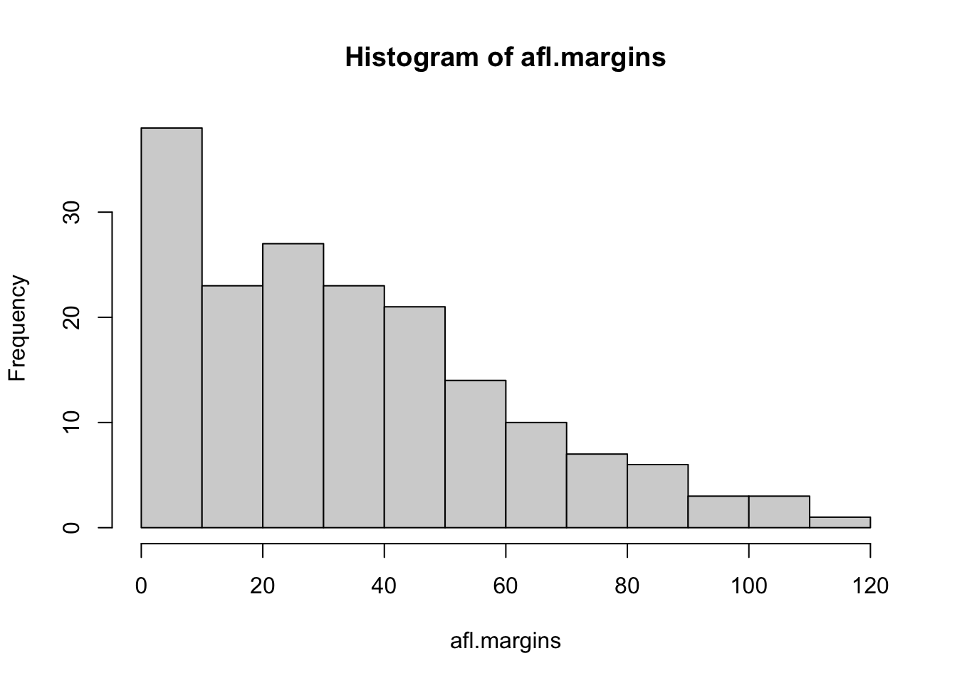
Figure 3.10: The default histogram that R produces
Although this image would need a lot of cleaning up in order to make a good presentation graphic (i.e., one you’d include in a report), it nevertheless does a pretty good job of describing the data. In fact, the big strength of a histogram is that (properly used) it does show the entire spread of the data, so you can get a pretty good sense about what it looks like. The downside to histograms is that they aren’t very compact: unlike some of the other plots I’ll talk about it’s hard to cram 20-30 histograms into a single image without overwhelming the viewer. And of course, if your data are nominal scale (e.g., the afl.finalists data) then histograms are useless.
The main subtlety that you need to be aware of when drawing histograms is determining where the breaks that separate bins should be located, and (relatedly) how many breaks there should be. In Figure 3.10, you can see that R has made pretty sensible choices all by itself: the breaks are located at 0, 10, 20, … 120, which is exactly what I would have done had I been forced to make a choice myself. On the other hand, consider the two histograms in Figure 3.11 and 3.12, which I produced using the following two commands:
hist( x = afl.margins, breaks = 3 )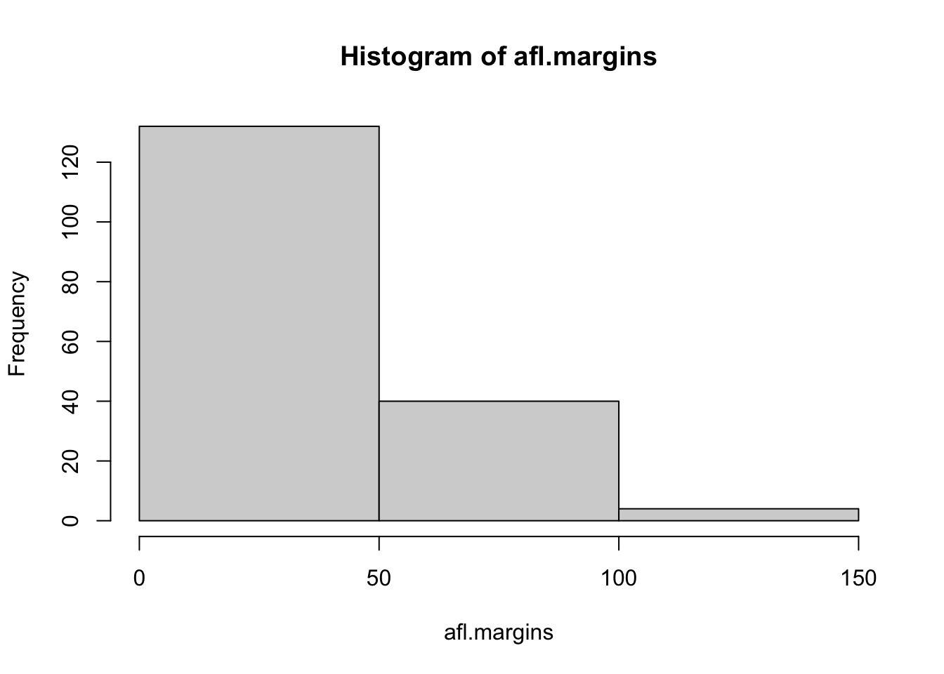
Figure 3.11: A histogram with too few bins
hist( x = afl.margins, breaks = 0:116 )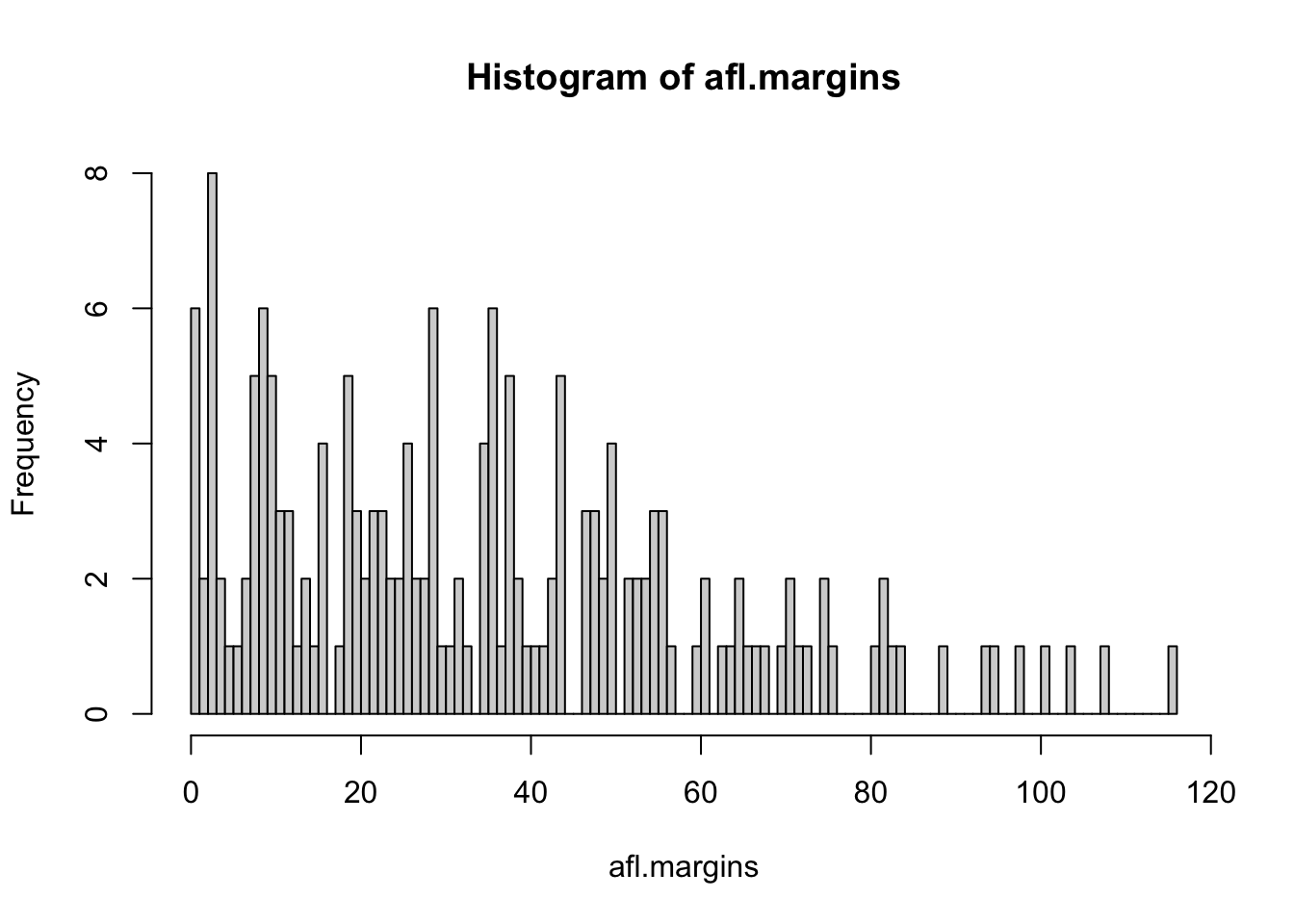
Figure 3.12: A histogram with too many bins
In Figure 3.12, the bins are only 1 point wide. As a result, although the plot is very informative (it displays the entire data set with no loss of information at all!) the plot is very hard to interpret, and feels quite cluttered. On the other hand, the plot in Figure 3.11 has a bin width of 50 points, and has the opposite problem: it’s very easy to “read” this plot, but it doesn’t convey a lot of information. One gets the sense that this histogram is hiding too much. In short, the way in which you specify the breaks has a big effect on what the histogram looks like, so it’s important to make sure you choose the breaks sensibly. In general R does a pretty good job of selecting the breaks on its own, since it makes use of some quite clever tricks that statisticians have devised for automatically selecting the right bins for a histogram, but nevertheless it’s usually a good idea to play around with the breaks a bit to see what happens.
There is one fairly important thing to add regarding how the breaks argument works. There are two different ways you can specify the breaks. You can either specify how many breaks you want (which is what I did for panel b when I typed breaks = 3) and let R figure out where they should go, or you can provide a vector that tells R exactly where the breaks should be placed (which is what I did for panel c when I typed breaks = 0:116). The behaviour of the hist() function is slightly different depending on which version you use. If all you do is tell it how many breaks you want, R treats it as a “suggestion” not as a demand. It assumes you want “approximately 3” breaks, but if it doesn’t think that this would look very pretty on screen, it picks a different (but similar) number. It does this for a sensible reason – it tries to make sure that the breaks are located at sensible values (like 10) rather than stupid ones (like 7.224414). And most of the time R is right: usually, when a human researcher says “give me 3 breaks,” he or she really does mean “give me approximately 3 breaks, and don’t put them in stupid places.” However, sometimes R is dead wrong. Sometimes you really do mean “exactly 3 breaks,” and you know precisely where you want them to go. So you need to invoke “real person privilege,” and order R to do what it’s bloody well told. In order to do that, you have to input the full vector that tells R exactly where you want the breaks. If you do that, R will go back to behaving like the nice little obedient calculator that it’s supposed to be.
3.9.2.1 Visual style of your histogram
Okay, so at this point we can draw a basic histogram, and we can alter the number and even the location of the breaks. However, the visual style of the histograms shown in Figures 3.10, 3.11, and 3.12 could stand to be improved. We can fix this by making use of some of the other arguments to the hist() function. Most of the things you might want to try doing have already been covered in Section 3.9.1, but there’s a few new things:
- Shading lines:
density,angle. You can add diagonal lines to shade the bars: thedensityvalue is a number indicating how many lines per inch R should draw (the default value ofNULLmeans no lines), and theangleis a number indicating how many degrees from horizontal the lines should be drawn at (default isangle = 45degrees). - Specifics regarding colours:
col,border. You can also change the colours: in this instance thecolparameter sets the colour of the shading (either the shading lines if there are any, or else the colour of the interior of the bars if there are not), and theborderargument sets the colour of the edges of the bars. - Labelling the bars:
labels. You can also attach labels to each of the bars using thelabelsargument. The simplest way to do this is to setlabels = TRUE, in which case R will add a number just above each bar, that number being the exact number of observations in the bin. Alternatively, you can choose the labels yourself, by inputting a vector of strings, e.g.,labels = c("label 1","label 2","etc")
Not surprisingly, this doesn’t exhaust the possibilities. If you type help("hist") or ?hist and have a look at the help documentation for histograms, you’ll see a few more options. A histogram that makes use of the histogram-specific customisations as well as several of the options we discussed in Section 3.9.1 is shown in Figure 3.13. The R command that I used to draw it is this:
hist( x = afl.margins,
      main = "2010 AFL margins", # title of the plot
      xlab = "Margin",           # set the x-axis label
      density = 10,              # draw shading lines: 10 per inch
      angle = 40,                # set the angle of the shading lines is 40 degrees
      border = "gray20",         # set the colour of the borders of the bars
      col = "gray80",            # set the colour of the shading lines
      labels = TRUE,             # add frequency labels to each bar
      ylim = c(0,40)             # change the scale of the y-axis
)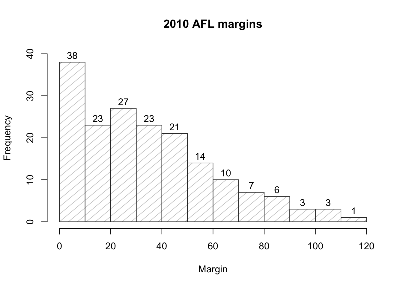
Figure 3.13: A histogram with histogram specific customisations
Overall, this is a much nicer histogram than the default ones.
3.9.3 Boxplots
Another alternative to histograms is a boxplot, sometimes called a “box and whiskers” plot. Like histograms, they’re most suited to interval or ratio scale data. The idea behind a boxplot is to provide a simple visual depiction of the median, the interquartile range, and the range of the data. And because they do so in a fairly compact way, boxplots have become a very popular statistical graphic, especially during the exploratory stage of data analysis when you’re trying to understand the data yourself. Let’s have a look at how they work, again using the afl.margins data as our example. Firstly, let’s actually calculate these numbers ourselves using the summary() function:73
summary( afl.margins )## Min. 1st Qu. Median Mean 3rd Qu. Max.
## 0.00 12.75 30.50 35.30 50.50 116.00So how does a boxplot capture these numbers? The easiest way to describe what a boxplot looks like is just to draw one. The function for doing this in R is (surprise, surprise) boxplot(). As always there’s a lot of optional arguments that you can specify if you want, but for the most part you can just let R choose the defaults for you. That said, I’m going to override one of the defaults to start with by specifying the range option, but for the most part you won’t want to do this (I’ll explain why in a minute). With that as preamble, let’s try the following command:
boxplot( x = afl.margins, range = 100 )
Figure 3.14: A basic boxplot
What R draws is shown in Figure 3.14, the most basic boxplot possible. When you look at this plot, this is how you should interpret it: the thick line in the middle of the box is the median; the box itself spans the range from the 25th percentile to the 75th percentile; and the “whiskers” cover the full range from the minimum value to the maximum value. This is summarised in the annotated plot in Figure 3.15.
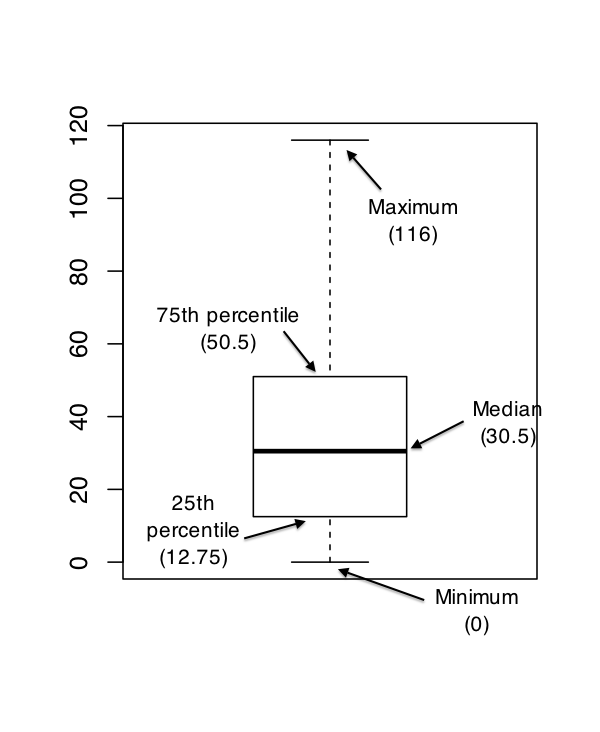
Figure 3.15: An annotated boxplot
In practice, this isn’t quite how boxplots usually work. In most applications, the “whiskers” don’t cover the full range from minimum to maximum. Instead, they actually go out to the most extreme data point that doesn’t exceed a certain bound. By default, this value is 1.5 times the interquartile range, corresponding to a range value of 1.5. Any observation whose value falls outside this range is plotted as a circle instead of being covered by the whiskers, and is commonly referred to as an outlier. For our AFL margins data, there is one observation (a game with a margin of 116 points) that falls outside this range. As a consequence, the upper whisker is pulled back to the next largest observation (a value of 108), and the observation at 116 is plotted as a circle. This is illustrated in Figure 3.16. Since the default value is range = 1.5 we can draw this plot using the simple command
boxplot( afl.margins )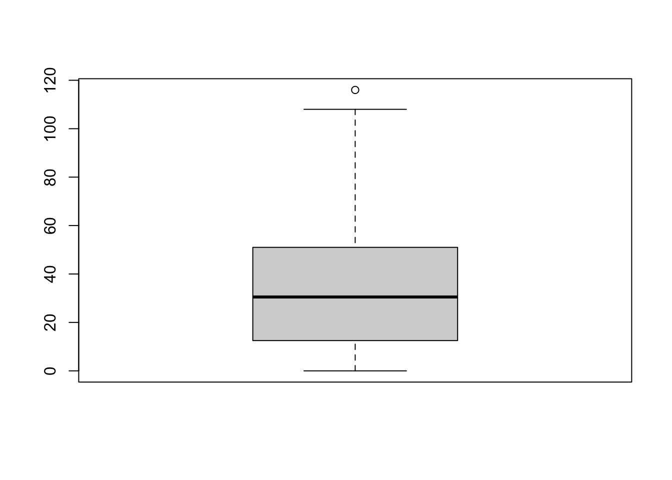
Figure 3.16: By default, R will only extent the whiskers a distance of 1.5 times the interquartile range, and will plot any points that fall outside that range separately
3.9.3.1 Visual style of your boxplot
I’ll talk a little more about the relationship between boxplots and outliers in the Section 3.9.3.2, but before I do let’s take the time to clean this figure up. Boxplots in R are extremely customisable. In addition to the usual range of graphical parameters that you can tweak to make the plot look nice, you can also exercise nearly complete control over every element to the plot. Consider the boxplot in Figure 3.17: in this version of the plot, not only have I added labels (xlab, ylab) and removed the stupid border (frame.plot), I’ve also dimmed all of the graphical elements of the boxplot except the central bar that plots the median (border) so as to draw more attention to the median rather than the rest of the boxplot.
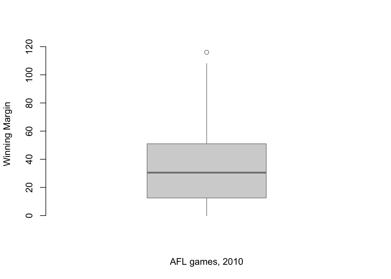
Figure 3.17: A boxplot with boxplot specific customisations
You’ve seen all these options in previous sections in this chapter, so hopefully those customisations won’t need any further explanation. However, I’ve done two new things as well: I’ve deleted the cross-bars at the top and bottom of the whiskers (known as the “staples” of the plot), and converted the whiskers themselves to solid lines. The arguments that I used to do this are called by the ridiculous names of staplewex and whisklty,74 and I’ll explain these in a moment.
But first, here’s the actual command I used to draw this figure:
boxplot( x = afl.margins,           # the data
          xlab = "AFL games, 2010",  # x-axis label
          ylab = "Winning Margin",   # y-axis label
          border = "grey50",         # dim the border of the box
          frame.plot = FALSE,        # don't draw a frame
          staplewex = 0,             # don't draw staples
          whisklty = 1               # solid line for whisker
 )
Overall, I think the resulting boxplot is a huge improvement in visual design over the default version. In my opinion at least, there’s a fairly minimalist aesthetic that governs good statistical graphics. Ideally, every visual element that you add to a plot should convey part of the message. If your plot includes things that don’t actually help the reader learn anything new, you should consider removing them. Personally, I can’t see the point of the cross-bars on a standard boxplot, so I’ve deleted them.
3.9.3.2 Using box plots to detect outliers
Because the boxplot automatically (unless you change the range argument) separates out those observations that lie within a certain range, people often use them as an informal method for detecting outliers: observations that are “suspiciously” distant from the rest of the data. Here’s an example. Suppose that I’d drawn the boxplot for the AFL margins data, and it came up looking like Figure 3.18.
Figure 3.18: A boxplot showing one very suspicious outlier! I’ve drawn this plot in a similar, minimalist style to the one in Figure 3.17, but I’ve used the horizontal argument to draw it sideways in order to save space.
It’s pretty clear that something funny is going on with one of the observations. Apparently, there was one game in which the margin was over 300 points! That doesn’t sound right to me. Now that I’ve become suspicious, it’s time to look a bit more closely at the data. One function that can be handy for this is the which() function; it takes as input a vector of logicals, and outputs the indices of the TRUE cases. This is particularly useful in the current context because it lets me do this:
suspicious.cases <- afl.margins > 300
which( suspicious.cases )
## [1] 137although in real life I probably wouldn’t bother creating the suspicious.cases variable: I’d just cut out the middle man and use a command like which( afl.margins > 300 ). In any case, what this has done is shown me that the outlier corresponds to game 137. Then, I find the recorded margin for that game:
afl.margins[137]## [1] 333Hm. That definitely doesn’t sound right. So then I go back to the original data source (the internet!) and I discover that the actual margin of that game was 33 points. Now it’s pretty clear what happened. Someone must have typed in the wrong number. Easily fixed, just by typing afl.margins[137] <- 33. While this might seem like a silly example, I should stress that this kind of thing actually happens a lot. Real world data sets are often riddled with stupid errors, especially when someone had to type something into a computer at some point. In fact, there’s actually a name for this phase of data analysis, since in practice it can waste a huge chunk of our time: data cleaning. It involves searching for typos, missing data and all sorts of other obnoxious errors in raw data files.75
What about the real data? Does the value of 116 constitute a funny observation not? Possibly. As it turns out the game in question was Fremantle v Hawthorn, and was played in round 21 (the second last home and away round of the season). Fremantle had already qualified for the final series and for them the outcome of the game was irrelevant; and the team decided to rest several of their star players. As a consequence, Fremantle went into the game severely underpowered. In contrast, Hawthorn had started the season very poorly but had ended on a massive winning streak, and for them a win could secure a place in the finals. With the game played on Hawthorn’s home turf76 and with so many unusual factors at play, it is perhaps no surprise that Hawthorn annihilated Fremantle by 116 points. Two weeks later, however, the two teams met again in an elimination final on Fremantle’s home ground, and Fremantle won comfortably by 30 points.77
So, should we exclude the game from subsequent analyses? If this were a psychology experiment rather than an AFL season, I’d be quite tempted to exclude it because there’s pretty strong evidence that Fremantle weren’t really trying very hard: and to the extent that my research question is based on an assumption that participants are genuinely trying to do the task. On the other hand, in a lot of studies we’re actually interested in seeing the full range of possible behaviour, and that includes situations where people decide not to try very hard: so excluding that observation would be a bad idea. In the context of the AFL data, a similar distinction applies. If I’d been trying to make tips about who would perform well in the finals, I would have (and in fact did) disregard the Round 21 massacre, because it’s way too misleading. On the other hand, if my interest is solely in the home and away season itself, I think it would be a shame to throw away information pertaining to one of the most distinctive (if boring) games of the year. In other words, the decision about whether to include outliers or exclude them depends heavily on why you think the data look they way they do, and what you want to use the data for. Statistical tools can provide an automatic method for suggesting candidates for deletion, but you really need to exercise good judgment here. As I’ve said before, R is a mindless automaton. It doesn’t watch the footy, so it lacks the broader context to make an informed decision. You are not a mindless automaton, so you should exercise judgment: if the outlier looks legitimate to you, then keep it. In any case, I’ll return to the topic again in Section 8.13, so let’s return to our discussion of how to draw boxplots.
3.9.3.3 Drawing multiple boxplots
One last thing. What if you want to draw multiple boxplots at once? Suppose, for instance, I wanted separate boxplots showing the AFL margins not just for 2010, but for every year between 1987 and 2010. To do that, the first thing we’ll have to do is find the data. These are stored in the aflsmall2.Rdata file. So let’s load it and take a quick peek at what’s inside:
load( "aflsmall2.Rdata" )
who( TRUE )
#   -- Name --   -- Class --   -- Size --
#   afl2         data.frame    4296 x 2
#    $margin     numeric       4296
#    $year       numeric       4296
Notice that afl2 data frame is pretty big. It contains 4296 games, which is far more than I want to see printed out on my computer screen. To that end, R provides you with a few useful functions to print out only a few of the row in the data frame. The first of these is head() which prints out the first 6 rows, of the data frame, like this:
head( afl2 )## margin year
## 1 33 1987
## 2 59 1987
## 3 45 1987
## 4 91 1987
## 5 39 1987
## 6 1 1987You can also use the tail() function to print out the last 6 rows. The car package also provides a handy little function called some() which prints out a random subset of the rows.
In any case, the important thing is that we have the afl2 data frame which contains the variables that we’re interested in. What we want to do is have R draw boxplots for the margin variable, plotted separately for each separate year. The way to do this using the boxplot() function is to input a formula rather than a variable as the input. In this case, the formula we want is margin ~ year. So our boxplot command now looks like this. The result is shown in Figure 3.19.78
boxplot( formula = margin ~ year,
         data = afl2
)
Figure 3.19: Boxplots showing the AFL winning margins for the 24 years from 1987 to 2010 inclusive. This is the default plot created by R, with no annotations added and no changes to the visual design. It’s pretty readable, though at a minimum you’d want to include some basic annotations labelling the axes. Compare and contrast with Figure 3.20
Even this, the default version of the plot, gives a sense of why it’s sometimes useful to choose boxplots instead of histograms. Even before taking the time to turn this basic output into something more readable, it’s possible to get a good sense of what the data look like from year to year without getting overwhelmed with too much detail. Now imagine what would have happened if I’d tried to cram 24 histograms into this space: no chance at all that the reader is going to learn anything useful.
That being said, the default boxplot leaves a great deal to be desired in terms of visual clarity. The outliers are too visually prominent, the dotted lines look messy, and the interesting content (i.e., the behaviour of the median and the interquartile range across years) gets a little obscured. Fortunately, this is easy to fix, since we’ve already covered a lot of tools you can use to customise your output. After playing around with several different versions of the plot, the one I settled on is shown in Figure 3.20. The command I used to produce it is long, but not complicated:
boxplot( formula =  margin ~ year,   # the formula
           data = afl2,                # the data set
           xlab = "AFL season",        # x axis label
           ylab = "Winning Margin",    # y axis label
           frame.plot = FALSE,         # don't draw a frame
           staplewex = 0,              # don't draw staples
           staplecol = "white",        # (fixes a tiny display issue)
           boxwex = .75,               # narrow the boxes slightly
           boxfill = "grey80",         # lightly shade the boxes
           whisklty = 1,               # solid line for whiskers
           whiskcol = "grey70",        # dim the whiskers
           boxcol = "grey70",          # dim the box borders
           outcol = "grey70",          # dim the outliers
           outpch = 20,                # outliers as solid dots
           outcex = .5,                # shrink the outliers
           medlty = "blank",           # no line for the medians
           medpch = 20,                # instead, draw solid dots
           medlwd = 1.5                # make them larger
 )
Figure 3.20: A cleaned up version of Figure 3.19. Notice that I’ve used a very minimalist design for the boxplots, so as to focus the eye on the medians. I’ve also converted the medians to solid dots, to convey a sense that year to year variation in the median should be thought of as a single coherent plot (similar to what we did when plotting the Fibonacci variable earlier). The size of outliers has been shrunk, because they aren’t actually very interesting. In contrast, I’ve added a fill colour to the boxes, to make it easier to look at the trend in the interquartile range across years.
Of course, given that the command is that long, you might have guessed that I didn’t spend ages typing all that rubbish in over and over again. Instead, I wrote a script, which I kept tweaking until it produced the figure that I wanted. We’ll talk about scripts later in Section ??, but given the length of the command I thought I’d remind you that there’s an easier way of trying out different commands than typing them all in over and over.
3.9.4 Bar graphs
Another form of graph that you often want to plot is the bar graph. The main function that you can use in R to draw them is the barplot() function.79 And to illustrate the use of the function, I’ll use the finalists variable that I introduced in Section 3.3.7. What I want to do is draw a bar graph that displays the number of finals that each team has played in over the time spanned by the afl data set. So, let’s start by creating a vector that contains this information. I’ll use the tabulate() function to do this (which will be discussed properly in Section ??, since it creates a simple numeric vector:
freq <- tabulate( afl.finalists )
print( freq )
## [1] 26 25 26 28 32 0 6 39 27 28 28 17 6 24 26 38 24This isn’t exactly the prettiest of frequency tables, of course. I’m only doing it this way so that you can see the barplot() function in it’s “purest” form: when the input is just an ordinary numeric vector. That being said, I’m obviously going to need the team names to create some labels, so let’s create a variable with those. I’ll do this using the levels() function, which outputs the names of all the levels of a factor (see Section 2.22:
teams <- levels( afl.finalists )
print( teams )
## [1] "Adelaide" "Brisbane" "Carlton"
## [4] "Collingwood" "Essendon" "Fitzroy"
## [7] "Fremantle" "Geelong" "Hawthorn"
## [10] "Melbourne" "North Melbourne" "Port Adelaide"
## [13] "Richmond" "St Kilda" "Sydney"
## [16] "West Coast" "Western Bulldogs"Okay, so now that we have the information we need, let’s draw our bar graph. The main argument that you need to specify for a bar graph is the height of the bars, which in our case correspond to the values stored in the freq variable:
barplot( height = freq )  # specifying the argument name
barplot( freq )           # the lazier version
Either of these two commands will produce the simple bar graph shown in Figure 3.21.
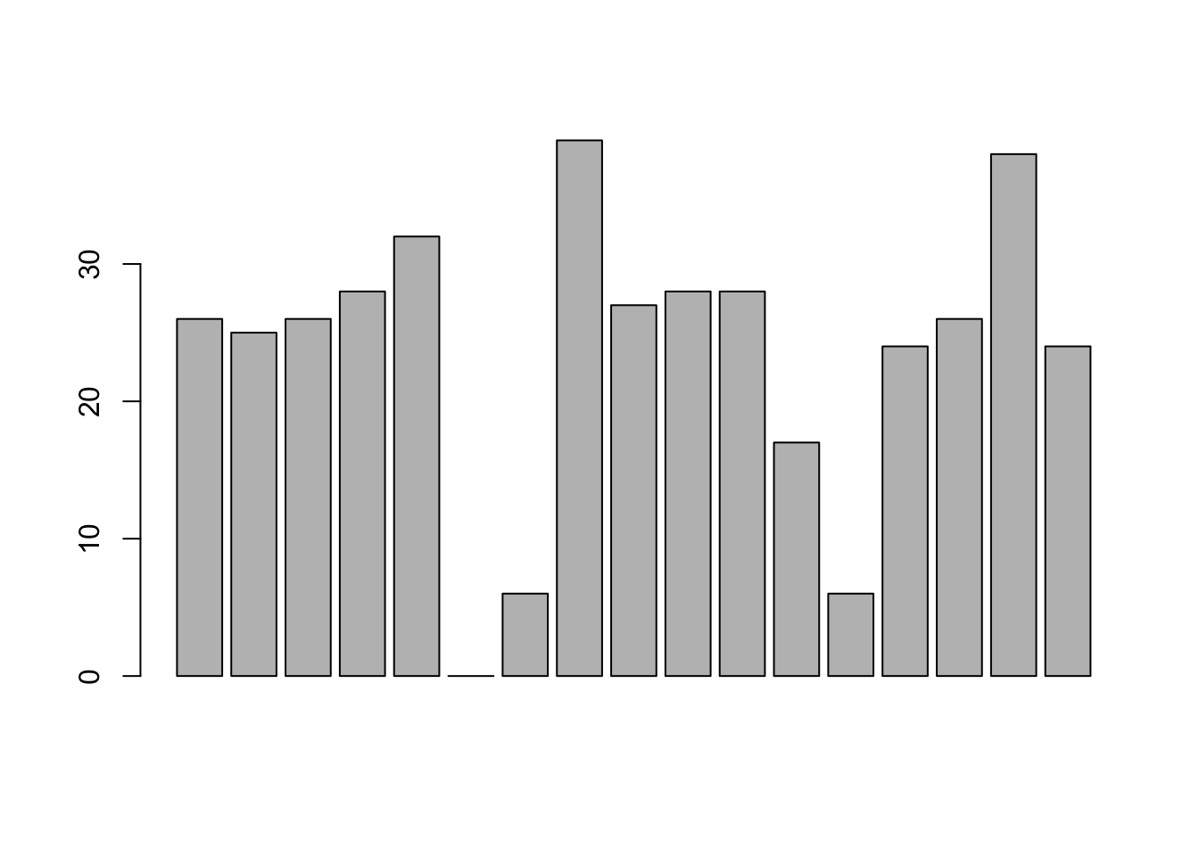
Figure 3.21: the simplest version of a bargraph, containing the data but no labels
As you can see, R has drawn a pretty minimal plot. It doesn’t have any labels, obviously, because we didn’t actually tell the barplot() function what the labels are! To do this, we need to specify the names.arg argument. The names.arg argument needs to be a vector of character strings containing the text that needs to be used as the label for each of the items. In this case, the teams vector is exactly what we need, so the command we’re looking for is:
barplot( height = freq, names.arg = teams ) 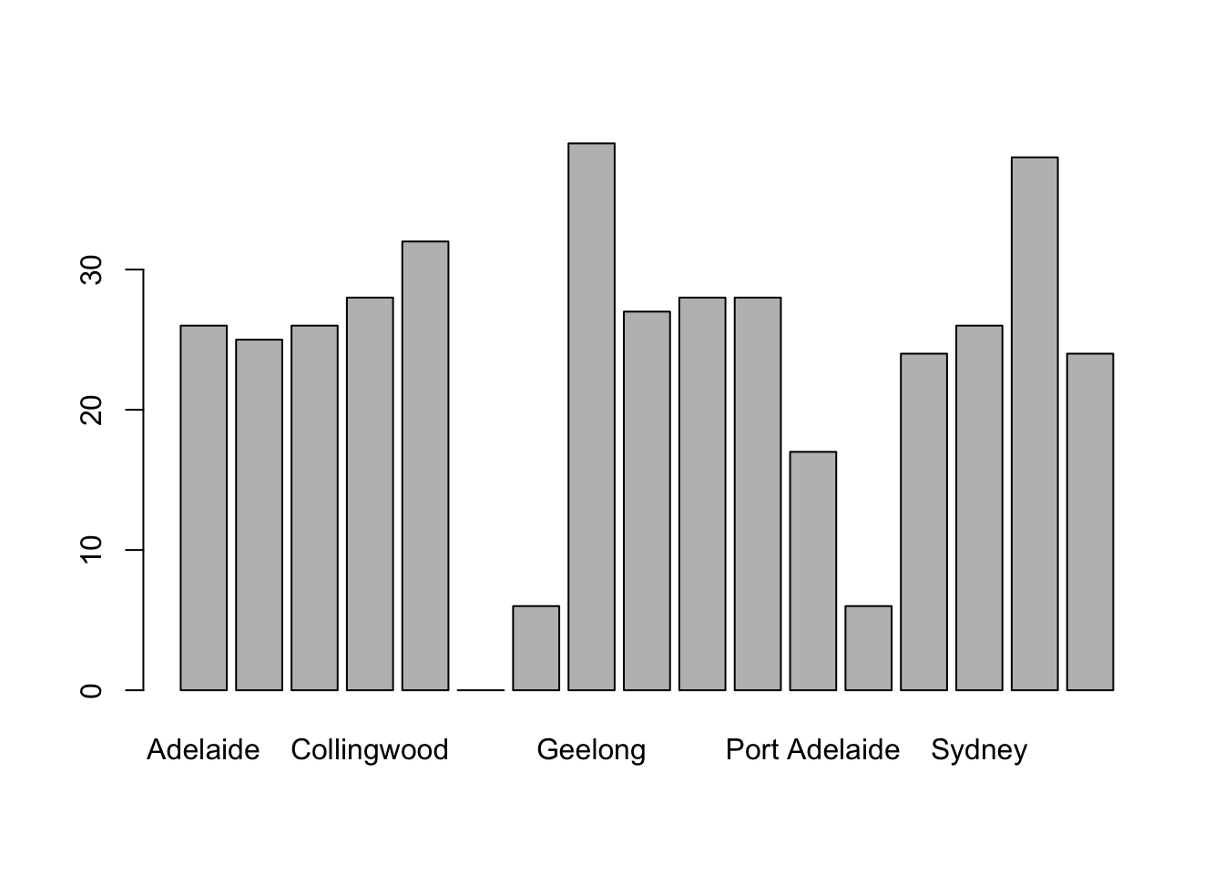
Figure 3.22: we’ve added the labels, but because the text runs horizontally R only includes a few of them
This is an improvement, but not much of an improvement. R has only included a few of the labels, because it can’t fit them in the plot. This is the same behaviour we saw earlier with the multiple-boxplot graph in Figure 3.19. However, in Figure 3.19 it wasn’t an issue: it’s pretty obvious from inspection that the two unlabelled plots in between 1987 and 1990 must correspond to the data from 1988 and 1989. However, the fact that barplot() has omitted the names of every team in between Adelaide and Fitzroy is a lot more problematic.
The simplest way to fix this is to rotate the labels, so that the text runs vertically not horizontally. To do this, we need to alter set the las parameter, which I discussed briefly in Section 3.9.1. What I’ll do is tell R to rotate the text so that it’s always perpendicular to the axes (i.e., I’ll set las = 2). When I do that, as per the following command…
    barplot(height = freq,  # the frequencies
            names.arg = teams,  # the label
            las = 2)            # rotate the labels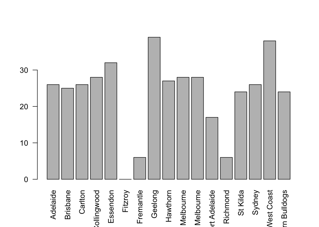
Figure 3.23: we’ve rotated the labels, but now the text is too long to fit
… the result is the bar graph shown in Figure 3.23. We’ve fixed the problem, but we’ve created a new one: the axis labels don’t quite fit anymore. To fix this, we have to be a bit cleverer again. A simple fix would be to use shorter names rather than the full name of all teams, and in many situations that’s probably the right thing to do. However, at other times you really do need to create a bit more space to add your labels, so I’ll show you how to do that.
3.9.5 Saving image files using R and Rstudio
Hold on, you might be thinking. What’s the good of being able to draw pretty pictures in R if I can’t save them and send them to friends to brag about how awesome my data is? How do I save the picture? This is another one of those situations where the easiest thing to do is to use the RStudio tools.
If you’re running R through Rstudio, then the easiest way to save your image is to click on the “Export” button in the Plot panel (i.e., the area in Rstudio where all the plots have been appearing). When you do that you’ll see a menu that contains the options “Save Plot as PDF” and “Save Plot as Image.” Either version works. Both will bring up dialog boxes that give you a few options that you can play with, but besides that it’s pretty simple.
This works pretty nicely for most situations. So, unless you’re filled with a burning desire to learn the low level details, feel free to skip the rest of this section.
3.9.6 Summary
Calculating some basic descriptive statistics is one of the very first things you do when analysing real data, and descriptive statistics are much simpler to understand than inferential statistics, so like every other statistics textbook I’ve started with descriptives. In this chapter, we talked about the following topics:
- Measures of central tendency. Broadly speaking, central tendency measures tell you where the data are. There’s three measures that are typically reported in the literature: the mean, median and mode. (Section 3.3)
- Measures of variability. In contrast, measures of variability tell you about how “spread out” the data are. The key measures are: range, standard deviation, interquartile reange (Section 3.4)
- Getting summaries of variables in R. Since this book focuses on doing data analysis in R, we spent a bit of time talking about how descriptive statistics are computed in R. (Section 2.14 and 3.7)
- Basic overview to R graphics. In Section ?? we talked about how graphics in R are organised, and then moved on to the basics of how they’re drawn in Section 3.9.1.
- Common plots. Much of the chapter was focused on standard graphs that statisticians like to produce: histograms (Section 3.9.2), boxplots (Section 3.9.3), and bar graphs (Section 3.9.4).
A traditional first course in statistics spends only a small proportion of the class on descriptive statistics, maybe one or two lectures at most. The vast majority of the lecturer’s time is spent on inferential statistics, because that’s where all the hard stuff is. That makes sense, but it hides the practical everyday importance of choosing good descriptives.
Dave note: With this chapter, I condensed two of Navarro (2018)’s chapters: descriptive stats and visualizations. For our course, the tools we need at this moment are the ones that help us describe single variables. We will introduce additional tools for summarizing and visualizing bivariate (two variable) data a bit later in the course, when we need them. And, if you do not feel comfortable with every customiziation option presented here, do not be concerned. For now, if you can generate histograms, bar charts, and the like, you have what you need. We will learn more about customizing these graphs for presentations later, as well.
References
Note for non-Australians: the AFL is an Australian rules football competition. You don’t need to know anything about Australian rules in order to follow this section.↩︎
The choice to use \(\Sigma\) to denote summation isn’t arbitrary: it’s the Greek upper case letter sigma, which is the analogue of the letter S in that alphabet. Similarly, there’s an equivalent symbol used to denote the multiplication of lots of numbers: because multiplications are also called “products,” we use the \(\Pi\) symbol for this; the Greek upper case pi, which is the analogue of the letter P.↩︎
Note that, just as we saw with the combine function
c()and the remove functionrm(), thesum()function has unnamed arguments. I’ll talk about unnamed arguments later in Section ??, but for now let’s just ignore this detail.↩︎www.abc.net.au/news/stories/2010/09/24/3021480.htm↩︎
Or at least, the basic statistical theory – these days there is a whole subfield of statistics called robust statistics that tries to grapple with the messiness of real data and develop theory that can cope with it.↩︎
As we saw earlier, it does have a function called
mode(), but it does something completely different.↩︎This is called a “0-1 loss function,” meaning that you either win (1) or you lose (0), with no middle ground.↩︎
Well, I will very briefly mention the one that I think is coolest, for a very particular definition of “cool,” that is. Variances are additive. Here’s what that means: suppose I have two variables \(X\) and \(Y\), whose variances are $↩︎
With the possible exception of the third question.↩︎
Strictly, the assumption is that the data are normally distributed, which is an important concept that we’ll discuss more in Chapter ??, and will turn up over and over again later in the book.↩︎
The assumption again being that the data are normally-distributed!↩︎
The “\(-3\)” part is something that statisticians tack on to ensure that the normal curve has kurtosis zero. It looks a bit stupid, just sticking a “-3” at the end of the formula, but there are good mathematical reasons for doing this.↩︎
The origin of this quote is Tufte’s lovely book The Visual Display of Quantitative Information.↩︎
I should add that this isn’t unique to R. Like everything in R there’s a pretty steep learning curve to learning how to draw graphs, and like always there’s a massive payoff at the end in terms of the quality of what you can produce. But to be honest, I’ve seen the same problems show up regardless of what system people use. I suspect that the hardest thing to do is to force yourself to take the time to think deeply about what your graphs are doing. I say that in full knowledge that only about half of my graphs turn out as well as they ought to. Understanding what makes a good graph is easy: actually designing a good graph is hard.↩︎
The low-level function that does this is called
title()in case you ever need to know, and you can type?titleto find out a bit more detail about what these arguments do.↩︎On the off chance that this isn’t enough freedom for you, you can select a colour directly as a “red, green, blue” specification using the
rgb()function, or as a “hue, saturation, value” specification using thehsv()function.↩︎R being what it is, it’s no great surprise that there’s also a
fivenum()function that does much the same thing.↩︎I realise there’s a kind of logic to the way R names are constructed, but they still sound dumb. When I typed this sentence, all I could think was that it sounded like the name of a kids movie if it had been written by Lewis Carroll: “The frabjous gambolles of Staplewex and Whisklty” or something along those lines.↩︎
Sometimes it’s convenient to have the boxplot automatically label the outliers for you. The original
boxplot()function doesn’t allow you to do this; however, theBoxplot()function in thecarpackage does. The design of theBoxplot()function is very similar toboxplot(). It just adds a few new arguments that allow you to tweak the labelling scheme. I’ll leave it to the reader to check this out.↩︎Sort of. The game was played in Launceston, which is a de facto home away from home for Hawthorn.↩︎
Contrast this situation with the next largest winning margin in the data set, which was Geelong’s 108 point demolition of Richmond in round 6 at their home ground, Kardinia Park. Geelong have been one of the most dominant teams over the last several years, a period during which they strung together an incredible 29-game winning streak at Kardinia Park. Richmond have been useless for several years. This is in no meaningful sense an outlier. Geelong have been winning by these margins (and Richmond losing by them) for quite some time. Frankly I’m surprised that the result wasn’t more lopsided: as happened to Melbourne in 2011 when Geelong won by a modest 186 points.↩︎
Actually, there’s other ways to do this. If the input argument
xis a list object (see Section 2.24, theboxplot()function will draw a separate boxplot for each variable in that list. Relatedly, since theplot()function – which we’ll discuss shortly – is a generic (see Section 2.26, you might not be surprised to learn that one of its special cases is a boxplot: specifically, if you useplot()where the first argumentxis a factor and the second argumentyis numeric, then the result will be a boxplot, showing the values iny, with a separate boxplot for each level. For instance, something likeplot(x = afl2\$year, y = afl2\$margin)would work. ↩︎Once again, it’s worth noting the link to the generic
plot()function. If thexargument toplot()is a factor (and noyargument is given), the result is a bar graph. So you could useplot( afl.finalists )and get the same output asbarplot( afl.finalists ).↩︎