Chapter 8 Regression
8.1 Videos
While I had intended on producing my own videos for this chapter, the existing videos I found were just too good.
Video: Correlation Does’t Equal Causation - 13 min Quick note about this video: This one and the one on regression are excellent. However, I was surprised to see Karl Pearson’s work on the heights of fathers and sons included without editorial comment. The reason why Pearson was studying this problem is worth discussing. Oddly, I found an excellent video describing this from another channel from the same organization. Pearson isn’t discussed specifically, but both Pearson and Galton were British mathematicians who developed many of techniques we are using today (see their Wikipedia pages for a list). Therefore, their legacy lives on in our work, and you’ll find connections between modern psychology and these two in this video: Video: Eugenics and Francis Galton - 13 min
Video: Regression - 13 min. This is an excellent introduction to GLM and regression. Worth watching more than once.
Because it’s longer and lower quality than the videos above, you don’t need to watch the following video. But I am including it here to provide as many resources as possible.
8.2 Introduction
The goal in this chapter is to introduce linear regression, the standard tool that statisticians rely on when analysing the relationship between interval scale predictors and interval scale outcomes. Stripped to its bare essentials, linear regression models are basically a slightly fancier version of the Pearson correlation (Section 8.4) though as we’ll see, regression models are much more powerful tools.
8.3 The General Linear Model (GLM)
Text by David Schuster
We have not even done \(t\)-tests in R yet and we are already doing multiple regression! This is intentional. One theme of this course is that statistical concepts that seem to be independent are sometimes mathematically related. Such is the case with regression. Regression is the mathematical basis of most of the inferential statistical procedures we use, including \(t\)-tests, \(F\)-tests (including all variations of analysis of variance, also called ANOVA), and, of course, correlation and multiple regression. Besides introducing linear regression, which is powerful and versatile, this chapter will introduce the mathematical concept that underlies all of these procedures, the general linear model (GLM). As an example of GLM, we will see that linear regression is perhaps the more powerful and versatile technique we will discuss in this class, because everything that follows can be implemented as a GLM model.
The key concept of the GLM is that it measures a linear relationship between one or more outcome variables (in our research they will usually be the dependent variable) and one or more predictor variables (usually independent variables). GLM models that have a single outcome variable are univariate statistics. GLM modeling with a single predictor is called simple regression. In this chapter, we will discover that we can add unlimited number of predictors in a linear model (although we will discover that there are situations where we can have too many variables), which is what defines multiple regression (it contains multiple independent variables). Our course will focus on univariate statistics. You should be aware, however, that a more complex version exists; we can combine multiple dependent variables on the left side of the equation. Including more than one outcome variable in a model is called multivariate statistics.
8.3.1 The Traditional approach: Two kinds of parametric statistical tests
Statistics teachers and textbook authors sometimes de-emphasize GLM in favor of presenting statistical tests as being one of two types:
Statistical tests that measure linear relationships (e.g., correlation)
Statistical tests that measure differences between groups (e.g., z-test)
This characterization can be useful, as researchers find themselves wanting to measure a linear relationship (i.e., Is there a correlation between A and B?) or measure differences between groups (i.e., Is there a difference between Condition A and Condition B?). Consequently, linear relationships are useful when researchers are doing observational research. You can measure two quantitative variables and see if they are related. Meanwhile, experimental researchers want to see if their discrete manipulation (participants are either in Condition A or Condition B; it is a discrete IV) causes a change in their dependent variable. This makes multiple regression more convenient for researchers because they have continuous variables. Meanwhile, experimental researchers often have a discrete IV, so software designed to run an ANOVA can make this analysis more convenient than adapting it to run as a multiple regression. It is important to note that this is merely convenience. Both procedures use GLM.
This distinction between linear relationships and group differences can be misleading when researchers think that these two techniques are separate. Any t-test or ANOVA could be run as a multiple regression. Or, worse, researchers may mix up the research design and the statistical analysis. Therefore, it is important to state:
Regression can be used with continuous or discrete predictor variables. There is a rule about this; discrete predictors in a regression must be dichotomous (only having two possible values). A yes/no question could be added to a regression model. A question asking participants their favorite color could not be added to a regression model without an additional step. Non-dichotomous, discrete predictors are added to regression models using a technique called dummy coding, which turns a categorical variable into a series of dichotomous variables (we will learn how to do this later on). Dummy coding would lead researchers to the same answer as running an ANOVA.
ANOVA is designed for discrete predictor variables (with as many categories or levels as you would like). ANOVA can be used with continuous predictor variables if we make them discrete, but that is rarely advisable. One way to do this is a median split (scores below the median are 0 and scores above the median are 1). If one participant scores just below the median and another very far below the median, they will both be scored the same. Therefore, this throws away variance and can reduce statistical power. For this reason, multiple regression is the more adaptable technique. That said, we will see that we use some ANOVA calculations on our regression models when we do null hypothesis significance testing (NHST).
All GLM procedures can be used with non-experimental, quasi-experimental, or experimental research designs. Whether inferences can be made about causality is affected by the research design, not the choice of statistical technique. Both regression and ANOVA can show us if two variables are related. Thus, which one is the right statistic depends on the type of measurement used in the study, not whether the study is an experiment, quasi-experiment, or non-experiment. If you have two continuous variables, you should use a correlation. If you have a discrete IV and a continuous DV, you could use either correlation or a t-test. You can use a correlation to analyze experiments, quasi-experiments, or non-experiments. You can use a t-test to analyze experiments, quasi-experiments, or non-experiments. A correlation analysis is not the same thing as a “correlational research design.” For this reason, “experiment, quasi-experiment, and non-experiment” are much clearer labels.
The same model and data tested as a regression or as an ANOVA will yield the same mean differences, effect size, and p-value. Regression and ANOVA, because they are both GLM, have the same statistical power.
All GLM procedures are parametric statistics, which means that they make assumptions about the population distributions from which we sample. In practice, this means that parametric statistics typically have more assumptions than their nonparametric alternatives. We need to learn which assumptions are important and how we can check our data to see if assumptions are met. It is an oversimplification to say that nonparametric stats have no assumptions; they just have fewer assumptions.
8.3.2 The GLM approach
\[ Y = BX + I + E \] With GLM, we are using the equation for a line to assess and describe the relationship between variables. You will see this equation several times in this chapter with different letters labeling each element. The elements are:
\(Y\), an outcome variable, which can also be called the regressand, response variable, predicted variable, or output variable
\(X\), a predictor variable, which can also be called the regressor, independent variable, treatment variable, or factor
\(B\), a model parameter, also called the weight, slope or the coefficient, which defines the relationship between \(X\) and \(Y\)
\(I\), the intercept, which gives the estimated value of Y when \(X = 0\). It is also the y-intercept of the regression line.
\(E\), error, also called the residual
The techniques in this chapter expand upon this approach of creating a model and using it to estimate an outcome variable. For example, each of these elements can actually be a list (a matrix) of observations. Further, we can expand this model such that \(XB\) is a combination of several predictor variables, not just one. Or, we could create an even simpler model with no predictors.
It might help to illustrate this with an example. In Kozma and Stones (1983) found that good health predicted happiness. Imagine that I wanted to predict your score on this measure right now. However, I know nothing about you. What could serve as my best guess of your happiness? I could use the population mean. That would result in a model \(Y = I + E\), where Y is your predicted happiness, predicted on the basis of the population mean (\(I = \mu)\) and nothing else. As there are no variables, there would be no \(XB\) term. I could probably do a bit better if I also knew your health score. This new model would be \(Y = XB + I + E\), where \(X\) is your health score, and \(B\) is a model parameter that explains how to adjust your predicted happiness score based on the health score (technically, it says to increase the predicted \(Y\) by \(B\) units for every 1 unit increase of \(X\)). We have just created a linear regression model, which is a use of the GLM. We have also shown how the addition of predictors (assuming they are good predictors that independently correlate with our outcome variable) can increase the predictive power of a model. This pattern could continue if we added an additional explanatory variable, leading to a multiple regression equation in the form \(Y = X_1B_1 + X_2B_2 + I +E\).
8.4 Correlations
Up to this point we have focused entirely on how to construct descriptive statistics for a single variable. What we haven’t done is talked about how to describe the relationships between variables in the data. To do that, we want to talk mostly about the correlation between variables. But first, we need some data.
8.4.1 The data
After spending so much time looking at the AFL data, I’m starting to get bored with sports. Instead, let’s turn to a topic close to every parent’s heart: sleep. The following data set is fictitious, but based on real events. Suppose I’m curious to find out how much my infant son’s sleeping habits affect my mood. Let’s say that I can rate my grumpiness very precisely, on a scale from 0 (not at all grumpy) to 100 (grumpy as a very, very grumpy old man). And, lets also assume that I’ve been measuring my grumpiness, my sleeping patterns and my son’s sleeping patterns for quite some time now. Let’s say, for 100 days. And, being a nerd, I’ve saved the data as a file called parenthood.Rdata. If we load the data…
load( "./data/parenthood.Rdata" )
who(TRUE)
## -- Name -- -- Class -- -- Size --
## parenthood data.frame 100 x 4
## $dan.sleep numeric 100
## $baby.sleep numeric 100
## $dan.grump numeric 100
## $day integer 100… we see that the file contains a single data frame called parenthood, which contains four variables dan.sleep, baby.sleep, dan.grump and day. If we peek at the data using head() out the data, here’s what we get:
head(parenthood,10)## dan.sleep baby.sleep dan.grump day
## 1 7.59 10.18 56 1
## 2 7.91 11.66 60 2
## 3 5.14 7.92 82 3
## 4 7.71 9.61 55 4
## 5 6.68 9.75 67 5
## 6 5.99 5.04 72 6
## 7 8.19 10.45 53 7
## 8 7.19 8.27 60 8
## 9 7.40 6.06 60 9
## 10 6.58 7.09 71 10Next, I’ll calculate some basic descriptive statistics:
describe( parenthood )## vars n mean sd median trimmed mad min max range
## dan.sleep 1 100 6.97 1.02 7.03 7.00 1.09 4.84 9.00 4.16
## baby.sleep 2 100 8.05 2.07 7.95 8.05 2.33 3.25 12.07 8.82
## dan.grump 3 100 63.71 10.05 62.00 63.16 9.64 41.00 91.00 50.00
## day 4 100 50.50 29.01 50.50 50.50 37.06 1.00 100.00 99.00
## skew kurtosis se
## dan.sleep -0.29 -0.72 0.10
## baby.sleep -0.02 -0.69 0.21
## dan.grump 0.43 -0.16 1.00
## day 0.00 -1.24 2.90Finally, to give a graphical depiction of what each of the three interesting variables looks like, Figure 8.1 plots histograms.
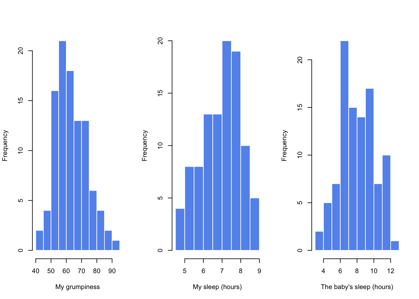
Figure 8.1: Histograms for the three interesting variables in the parenthood data set
One thing to note: just because R can calculate dozens of different statistics doesn’t mean you should report all of them. If I were writing this up for a report, I’d probably pick out those statistics that are of most interest to me (and to my readership), and then put them into a nice, simple table like the one in Table 8.1.111 Notice that when I put it into a table, I gave everything “human readable” names. This is always good practice. Notice also that I’m not getting enough sleep. This isn’t good practice, but other parents tell me that it’s standard practice.
| variable | min | max | mean | median | std. dev | IQR |
|---|---|---|---|---|---|---|
| Dan’s grumpiness | 41 | 91 | 63.71 | 62 | 10.05 | 14 |
| Dan’s hours slept | 4.84 | 9 | 6.97 | 7.03 | 1.02 | 1.45 |
| Dan’s son’s hours slept | 3.25 | 12.07 | 8.05 | 7.95 | 2.07 | 3.21 |
8.4.2 The strength and direction of a relationship
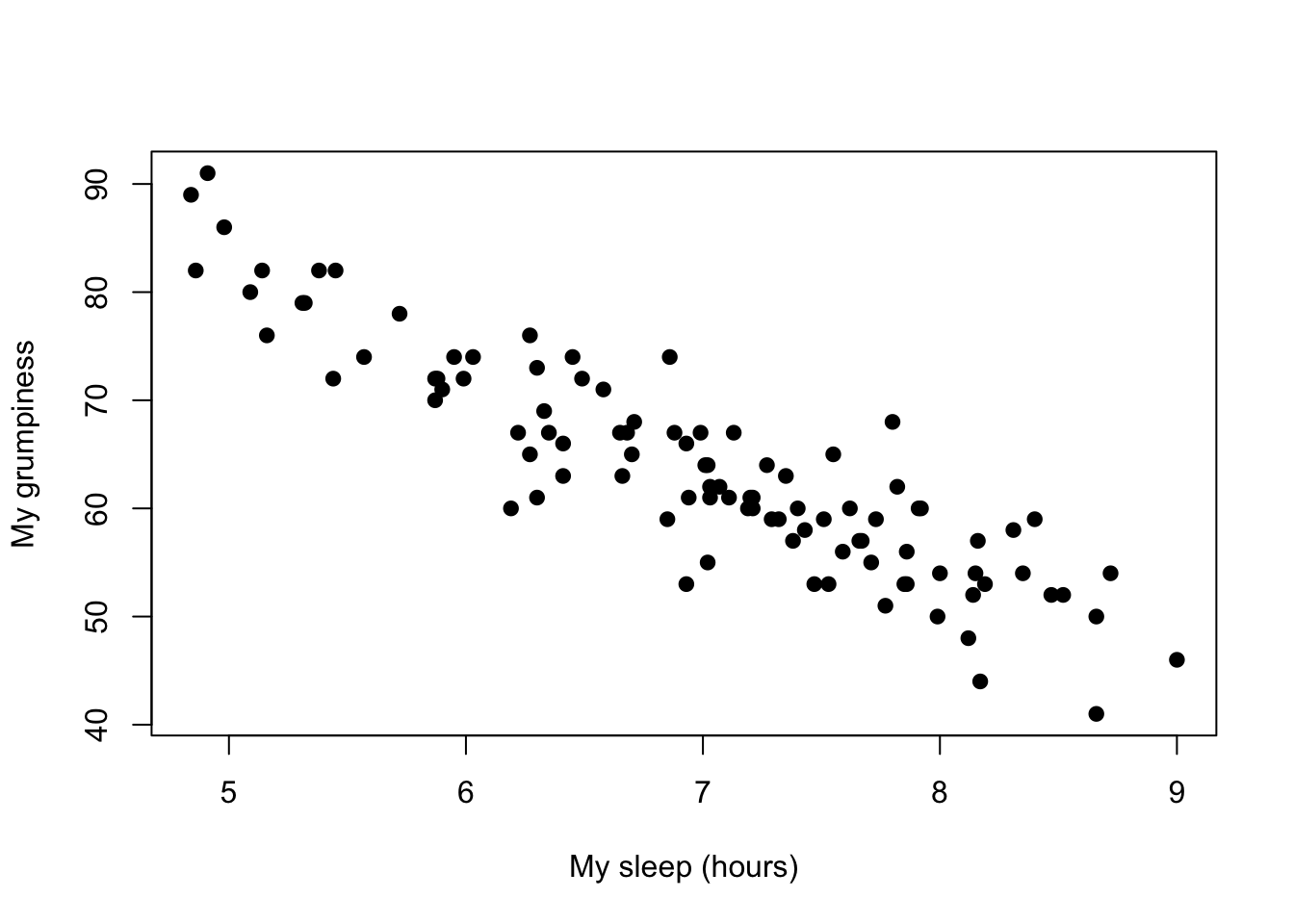
Figure 8.2: Scatterplot showing the relationship between dan.sleep and dan.grump
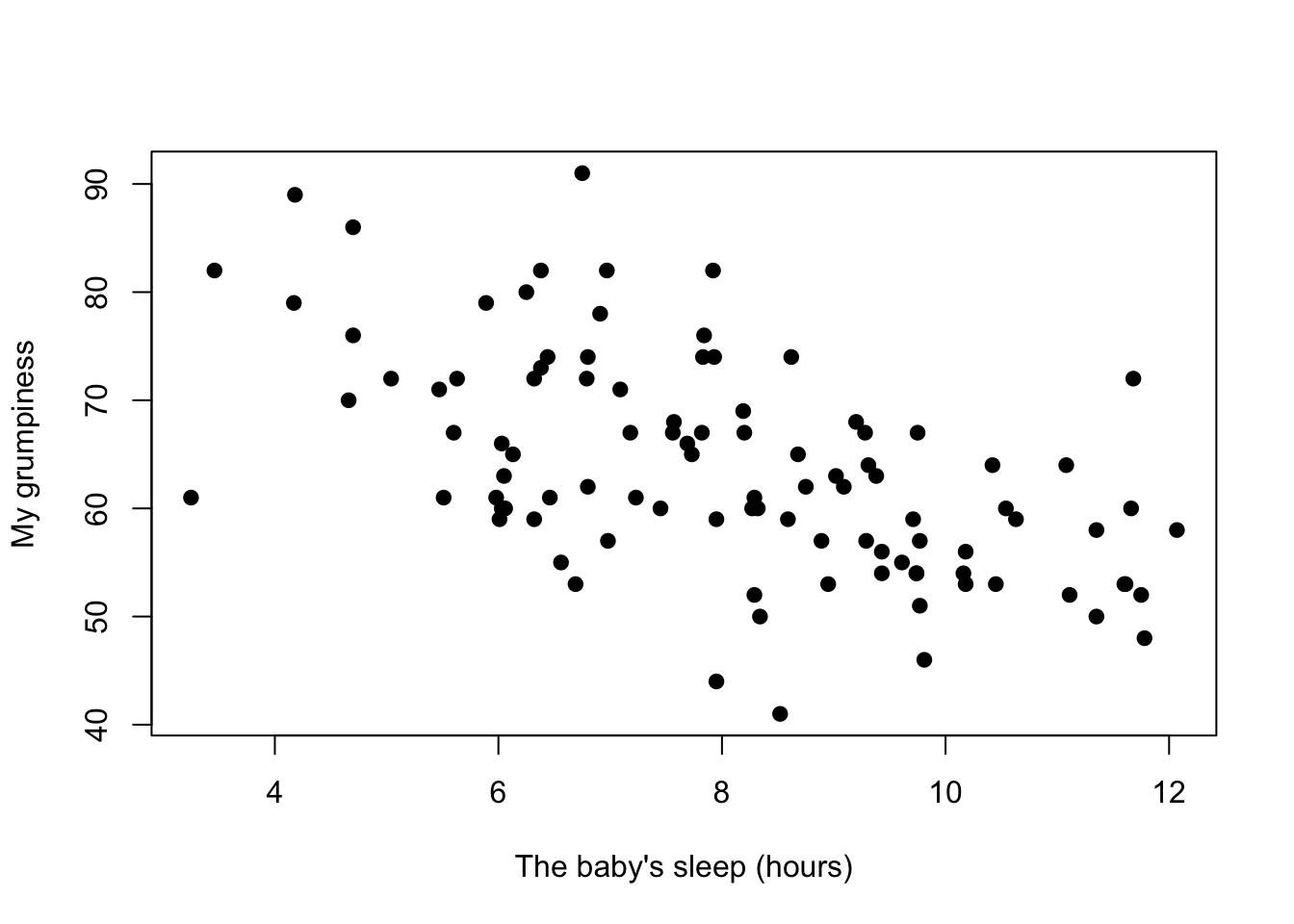
Figure 8.3: Scatterplot showing the relationship between baby.sleep and dan.grump
We can draw scatterplots to give us a general sense of how closely related two variables are. Ideally though, we might want to say a bit more about it than that. For instance, let’s compare the relationship between dan.sleep and dan.grump (Figure 8.2 with that between baby.sleep and dan.grump (Figure 8.3. When looking at these two plots side by side, it’s clear that the relationship is qualitatively the same in both cases: more sleep equals less grump! However, it’s also pretty obvious that the relationship between dan.sleep and dan.grump is stronger than the relationship between baby.sleep and dan.grump. The plot on the left is “neater” than the one on the right. What it feels like is that if you want to predict what my mood is, it’d help you a little bit to know how many hours my son slept, but it’d be more helpful to know how many hours I slept.
In contrast, let’s consider Figure 8.3 vs. Figure 8.4. If we compare the scatterplot of “baby.sleep v dan.grump” to the scatterplot of “`baby.sleep v dan.sleep,” the overall strength of the relationship is the same, but the direction is different. That is, if my son sleeps more, I get more sleep (positive relationship, but if he sleeps more then I get less grumpy (negative relationship).
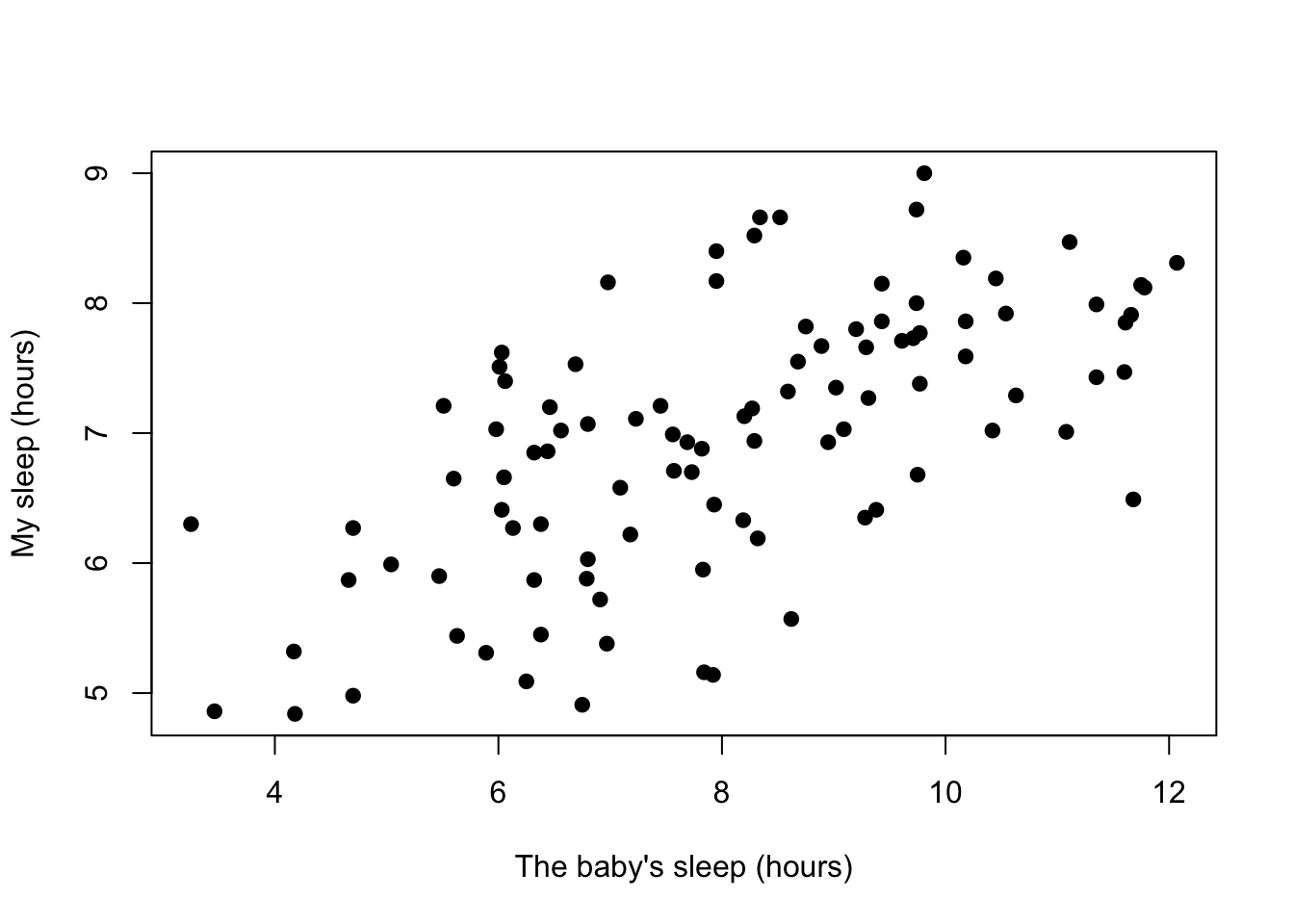
Figure 8.4: Scatterplot showing the relationship between baby.sleep and dan.sleep
8.4.3 The correlation coefficient
We can make these ideas a bit more explicit by introducing the idea of a correlation coefficient (or, more specifically, Pearson’s correlation coefficient), which is traditionally denoted by \(r\). The correlation coefficient between two variables \(X\) and \(Y\) (sometimes denoted \(r_{XY}\)), which we’ll define more precisely in the next section, is a measure that varies from \(-1\) to \(1\). When \(r = -1\) it means that we have a perfect negative relationship, and when \(r = 1\) it means we have a perfect positive relationship. When \(r = 0\), there’s no relationship at all. If you look at Figure 8.5, you can see several plots showing what different correlations look like.
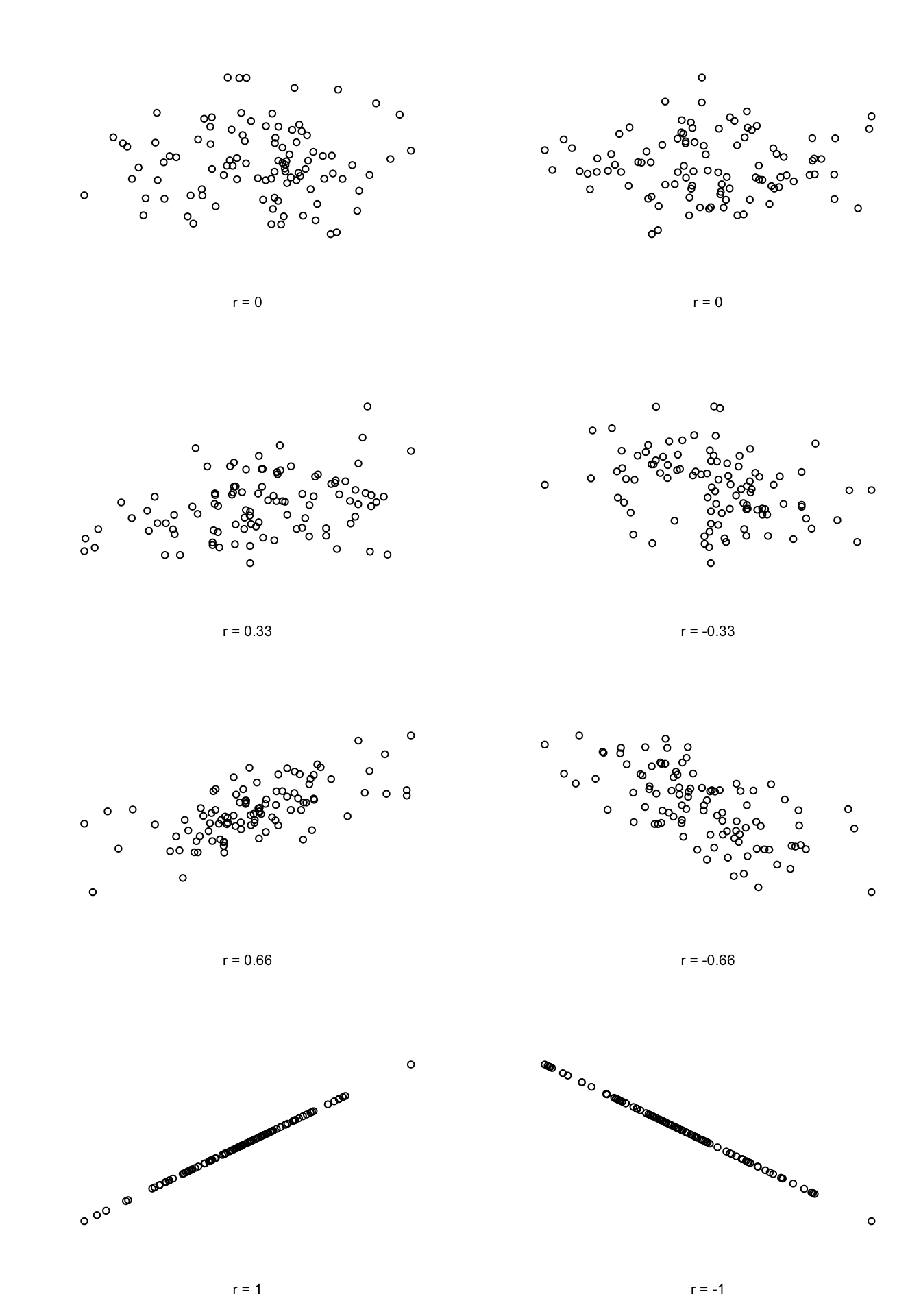
Figure 8.5: Illustration of the effect of varying the strength and direction of a correlation
The formula for the Pearson’s correlation coefficient can be written in several different ways. I think the simplest way to write down the formula is to break it into two steps. Firstly, let’s introduce the idea of a covariance. The covariance between two variables \(X\) and \(Y\) is a generalisation of the notion of the variance; it’s a mathematically simple way of describing the relationship between two variables that isn’t terribly informative to humans:
\[
\mbox{Cov}(X,Y) = \frac{1}{N-1} \sum_{i=1}^N \left( X_i - \bar{X} \right) \left( Y_i - \bar{Y} \right)
\]
Because we’re multiplying (i.e., taking the “product” of) a quantity that depends on \(X\) by a quantity that depends on \(Y\) and then averaging112, you can think of the formula for the covariance as an “average cross product” between \(X\) and \(Y\). The covariance has the nice property that, if \(X\) and \(Y\) are entirely unrelated, then the covariance is exactly zero. If the relationship between them is positive (in the sense shown in Figure@reffig:corr) then the covariance is also positive; and if the relationship is negative then the covariance is also negative. In other words, the covariance captures the basic qualitative idea of correlation. Unfortunately, the raw magnitude of the covariance isn’t easy to interpret: it depends on the units in which \(X\) and \(Y\) are expressed, and worse yet, the actual units that the covariance itself is expressed in are really weird. For instance, if \(X\) refers to the dan.sleep variable (units: hours) and \(Y\) refers to the dan.grump variable (units: grumps), then the units for their covariance are “hours \(\times\) grumps.” And I have no freaking idea what that would even mean.
The Pearson correlation coefficient \(r\) fixes this interpretation problem by standardising the covariance, in pretty much the exact same way that the \(z\)-score standardises a raw score: by dividing by the standard deviation. However, because we have two variables that contribute to the covariance, the standardisation only works if we divide by both standard deviations.113 In other words, the correlation between \(X\) and \(Y\) can be written as follows: \[ r_{XY} = \frac{\mbox{Cov}(X,Y)}{ \hat{\sigma}_X \ \hat{\sigma}_Y} \] By doing this standardisation, not only do we keep all of the nice properties of the covariance discussed earlier, but the actual values of \(r\) are on a meaningful scale: \(r= 1\) implies a perfect positive relationship, and \(r = -1\) implies a perfect negative relationship. I’ll expand a little more on this point later, in Section@refsec:interpretingcorrelations. But before I do, let’s look at how to calculate correlations in R.
8.4.4 Calculating correlations in R
Calculating correlations in R can be done using the cor() command. The simplest way to use the command is to specify two input arguments x and y, each one corresponding to one of the variables. The following extract illustrates the basic usage of the function:114
cor( x = parenthood$dan.sleep, y = parenthood$dan.grump )## [1] -0.903384However, the cor() function is a bit more powerful than this simple example suggests. For example, you can also calculate a complete “correlation matrix,” between all pairs of variables in the data frame:115
# correlate all pairs of variables in "parenthood":
cor( x = parenthood )
## dan.sleep baby.sleep dan.grump day
## dan.sleep 1.00000000 0.62794934 -0.90338404 -0.09840768
## baby.sleep 0.62794934 1.00000000 -0.56596373 -0.01043394
## dan.grump -0.90338404 -0.56596373 1.00000000 0.07647926
## day -0.09840768 -0.01043394 0.07647926 1.000000008.4.5 Interpreting a correlation
Naturally, in real life you don’t see many correlations of 1. So how should you interpret a correlation of, say \(r= .4\)? The honest answer is that it really depends on what you want to use the data for, and on how strong the correlations in your field tend to be. A friend of mine in engineering once argued that any correlation less than \(.95\) is completely useless (I think he was exaggerating, even for engineering). On the other hand there are real cases – even in psychology – where you should really expect correlations that strong. For instance, one of the benchmark data sets used to test theories of how people judge similarities is so clean that any theory that can’t achieve a correlation of at least \(.9\) really isn’t deemed to be successful. However, when looking for (say) elementary correlates of intelligence (e.g., inspection time, response time), if you get a correlation above \(.3\) you’re doing very very well. In short, the interpretation of a correlation depends a lot on the context. That said, the rough guide in Table 8.2 is pretty typical.
| Correlation | Strength | Direction |
|---|---|---|
| -1.0 to -0.9 | Very strong | Negative |
| -0.9 to -0.7 | Strong | Negative |
| -0.7 to -0.4 | Moderate | Negative |
| -0.4 to -0.2 | Weak | Negative |
| -0.2 to 0 | Negligible | Negative |
| 0 to 0.2 | Negligible | Positive |
| 0.2 to 0.4 | Weak | Positive |
| 0.4 to 0.7 | Moderate | Positive |
| 0.7 to 0.9 | Strong | Positive |
| 0.9 to 1.0 | Very strong | Positive |
However, something that can never be stressed enough is that you should always look at the scatterplot before attaching any interpretation to the data. A correlation might not mean what you think it means. The classic illustration of this is “Anscombe’s Quartet” (Anscombe 1973), which is a collection of four data sets. Each data set has two variables, an \(X\) and a \(Y\). For all four data sets the mean value for \(X\) is 9 and the mean for \(Y\) is 7.5. The, standard deviations for all \(X\) variables are almost identical, as are those for the the \(Y\) variables. And in each case the correlation between \(X\) and \(Y\) is \(r = 0.816\). You can verify this yourself, since the dataset comes distributed with R. The commands would be:
cor( anscombe$x1, anscombe$y1 )## [1] 0.8164205cor( anscombe$x2, anscombe$y2 )## [1] 0.8162365and so on.
You’d think that these four data sets would look pretty similar to one another. They do not. If we draw scatterplots of \(X\) against \(Y\) for all four variables, as shown in Figure 8.6 we see that all four of these are spectacularly different to each other.
Figure 8.6: Anscombe’s quartet. All four of these data sets have a Pearson correlation of \(r = .816\), but they are qualitatively different from one another.
The lesson here, which so very many people seem to forget in real life is “always graph your raw data.” This will be the focus of Chapter 3.9.
8.4.6 Spearman’s rank correlations
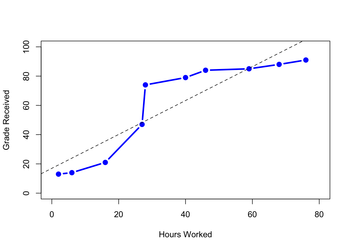
Figure 8.7: The relationship between hours worked and grade received, for a toy data set consisting of only 10 students (each circle corresponds to one student). The dashed line through the middle shows the linear relationship between the two variables. This produces a strong Pearson correlation of \(r = .91\). However, the interesting thing to note here is that there’s actually a perfect monotonic relationship between the two variables: in this toy example at least, increasing the hours worked always increases the grade received, as illustrated by the solid line. This is reflected in a Spearman correlation of \(rho = 1\). With such a small data set, however, it’s an open question as to which version better describes the actual relationship involved.
The Pearson correlation coefficient is useful for a lot of things, but it does have shortcomings. One issue in particular stands out: what it actually measures is the strength of the linear relationship between two variables. In other words, what it gives you is a measure of the extent to which the data all tend to fall on a single, perfectly straight line. Often, this is a pretty good approximation to what we mean when we say “relationship,” and so the Pearson correlation is a good thing to calculation. Sometimes, it isn’t.
One very common situation where the Pearson correlation isn’t quite the right thing to use arises when an increase in one variable \(X\) really is reflected in an increase in another variable \(Y\), but the nature of the relationship isn’t necessarily linear. An example of this might be the relationship between effort and reward when studying for an exam. If you put in zero effort (\(X\)) into learning a subject, then you should expect a grade of 0% (\(Y\)). However, a little bit of effort will cause a massive improvement: just turning up to lectures means that you learn a fair bit, and if you just turn up to classes, and scribble a few things down so your grade might rise to 35%, all without a lot of effort. However, you just don’t get the same effect at the other end of the scale. As everyone knows, it takes a lot more effort to get a grade of 90% than it takes to get a grade of 55%. What this means is that, if I’ve got data looking at study effort and grades, there’s a pretty good chance that Pearson correlations will be misleading.
To illustrate, consider the data plotted in Figure 8.7, showing the relationship between hours worked and grade received for 10 students taking some class. The curious thing about this – highly fictitious – data set is that increasing your effort always increases your grade. It might be by a lot or it might be by a little, but increasing effort will never decrease your grade. The data are stored in effort.Rdata:
> load( "effort.Rdata" )
> who(TRUE)
   -- Name --   -- Class --   -- Size --
   effort       data.frame    10 x 2
    $hours      numeric       10
    $grade      numeric       10
The raw data look like this:
> effort
   hours grade
1      2    13
2     76    91
3     40    79
4      6    14
5     16    21
6     28    74
7     27    47
8     59    85
9     46    84
10    68    88
If we run a standard Pearson correlation, it shows a strong relationship between hours worked and grade received,
> cor( effort$hours, effort$grade )
[1] 0.909402
but this doesn’t actually capture the observation that increasing hours worked always increases the grade. There’s a sense here in which we want to be able to say that the correlation is perfect but for a somewhat different notion of what a “relationship” is. What we’re looking for is something that captures the fact that there is a perfect ordinal relationship here. That is, if student 1 works more hours than student 2, then we can guarantee that student 1 will get the better grade. That’s not what a correlation of \(r = .91\) says at all.
How should we address this? Actually, it’s really easy: if we’re looking for ordinal relationships, all we have to do is treat the data as if it were ordinal scale! So, instead of measuring effort in terms of “hours worked,” lets rank all 10 of our students in order of hours worked. That is, student 1 did the least work out of anyone (2 hours) so they get the lowest rank (rank = 1). Student 4 was the next laziest, putting in only 6 hours of work in over the whole semester, so they get the next lowest rank (rank = 2). Notice that I’m using “rank =1” to mean “low rank.” Sometimes in everyday language we talk about “rank = 1” to mean “top rank” rather than “bottom rank.” So be careful: you can rank “from smallest value to largest value” (i.e., small equals rank 1) or you can rank “from largest value to smallest value” (i.e., large equals rank 1). In this case, I’m ranking from smallest to largest, because that’s the default way that R does it. But in real life, it’s really easy to forget which way you set things up, so you have to put a bit of effort into remembering!
Okay, so let’s have a look at our students when we rank them from worst to best in terms of effort and reward:
| rank (hours worked) | rank (grade received) | |
|---|---|---|
| student | 1 | 1 |
| student | 2 | 10 |
| student | 3 | 6 |
| student | 4 | 2 |
| student | 5 | 3 |
| student | 6 | 5 |
| student | 7 | 4 |
| student | 8 | 8 |
| student | 9 | 7 |
| student | 10 | 9 |
Hm. These are identical. The student who put in the most effort got the best grade, the student with the least effort got the worst grade, etc. We can get R to construct these rankings using the rank() function, like this:
> hours.rank <- rank( effort$hours )   # rank students by hours worked
> grade.rank <- rank( effort$grade )   # rank students by grade received
As the table above shows, these two rankings are identical, so if we now correlate them we get a perfect relationship:
> cor( hours.rank, grade.rank )
[1] 1
What we’ve just re-invented is Spearman’s rank order correlation, usually denoted \(\rho\) to distinguish it from the Pearson correlation \(r\). We can calculate Spearman’s \(\rho\) using R in two different ways. Firstly we could do it the way I just showed, using the rank() function to construct the rankings, and then calculate the Pearson correlation on these ranks. However, that’s way too much effort to do every time. It’s much easier to just specify the method argument of the cor() function.
> cor( effort$hours, effort$grade, method = "spearman")
[1] 1
The default value of the method argument is "pearson", which is why we didn’t have to specify it earlier on when we were doing Pearson correlations.
8.4.7 The correlate() function
As we’ve seen, the cor() function works pretty well, and handles many of the situations that you might be interested in. One thing that many beginners find frustrating, however, is the fact that it’s not built to handle non-numeric variables. From a statistical perspective, this is perfectly sensible: Pearson and Spearman correlations are only designed to work for numeric variables, so the cor() function spits out an error.
Here’s what I mean. Suppose you were keeping track of how many hours you worked in any given day, and counted how many tasks you completed. If you were doing the tasks for money, you might also want to keep track of how much pay you got for each job. It would also be sensible to keep track of the weekday on which you actually did the work: most of us don’t work as much on Saturdays or Sundays. If you did this for 7 weeks, you might end up with a data set that looks like this one:
> load("work.Rdata")

> who(TRUE)
   -- Name --   -- Class --   -- Size --
   work         data.frame    49 x 7
    $hours      numeric       49
    $tasks      numeric       49
    $pay        numeric       49
    $day        integer       49
    $weekday    factor        49
    $week       numeric       49
    $day.type   factor        49

> head(work)
  hours tasks pay day   weekday week day.type
1   7.2    14  41   1   Tuesday    1  weekday
2   7.4    11  39   2 Wednesday    1  weekday
3   6.6    14  13   3  Thursday    1  weekday
4   6.5    22  47   4    Friday    1  weekday
5   3.1     5   4   5  Saturday    1  weekend
6   3.0     7  12   6    Sunday    1  weekend
Obviously, I’d like to know something about how all these variables correlate with one another. I could correlate hours with pay quite using cor(), like so:
> cor(work$hours,work$pay)
[1] 0.7604283
But what if I wanted a quick and easy way to calculate all pairwise correlations between the numeric variables? I can’t just input the work data frame, because it contains two factor variables, weekday and day.type. If I try this, I get an error:
> cor(work)
Error in cor(work) : 'x' must be numeric
It order to get the correlations that I want using the cor() function, is create a new data frame that doesn’t contain the factor variables, and then feed that new data frame into the cor() function. It’s not actually very hard to do that, and I’ll talk about how to do it properly in Section ??. But it would be nice to have some function that is smart enough to just ignore the factor variables. That’s where the correlate() function in the lsr package can be handy. If you feed it a data frame that contains factors, it knows to ignore them, and returns the pairwise correlations only between the numeric variables:
> correlate(work)

CORRELATIONS
============
- correlation type:  pearson
- correlations shown only when both variables are numeric

          hours  tasks   pay    day weekday   week day.type
hours         .  0.800 0.760 -0.049       .  0.018        .
tasks     0.800      . 0.720 -0.072       . -0.013        .
pay       0.760  0.720     .  0.137       .  0.196        .
day      -0.049 -0.072 0.137      .       .  0.990        .
weekday       .      .     .      .       .      .        .
week      0.018 -0.013 0.196  0.990       .      .        .
day.type      .      .     .      .       .      .        .
The output here shows a . whenever one of the variables is non-numeric. It also shows a . whenever a variable is correlated with itself (it’s not a meaningful thing to do). The correlate() function can also do Spearman correlations, by specifying the corr.method to use:
> correlate( work, corr.method="spearman" )

CORRELATIONS
============
- correlation type:  spearman
- correlations shown only when both variables are numeric

          hours  tasks   pay    day weekday   week day.type
hours         .  0.805 0.745 -0.047       .  0.010        .
tasks     0.805      . 0.730 -0.068       . -0.008        .
pay       0.745  0.730     .  0.094       .  0.154        .
day      -0.047 -0.068 0.094      .       .  0.990        .
weekday       .      .     .      .       .      .        .
week      0.010 -0.008 0.154  0.990       .      .        .
day.type      .      .     .      .       .      .        .
Obviously, there’s no new functionality in the correlate() function, and any advanced R user would be perfectly capable of using the cor() function to get these numbers out. But if you’re not yet comfortable with extracting a subset of a data frame, the correlate() function is for you.
8.4.8 Missing values in pairwise calculations
I mentioned earlier that the cor() function is a special case. It doesn’t have an na.rm argument, because the story becomes a lot more complicated when more than one variable is involved. What it does have is an argument called use which does roughly the same thing, but you need to think little more carefully about what you want this time. To illustrate the issues, let’s open up a data set that has missing values, parenthood2.Rdata. This file contains the same data as the original parenthood data, but with some values deleted. It contains a single data frame, parenthood2:
> load( "parenthood2.Rdata" )
> print( parenthood2 )
  dan.sleep baby.sleep dan.grump day
1      7.59         NA        56   1
2      7.91      11.66        60   2
3      5.14       7.92        82   3
4      7.71       9.61        55   4
5      6.68       9.75        NA   5
6      5.99       5.04        72   6
BLAH BLAH BLAH
If I calculate my descriptive statistics using the describe() function
> describe( parenthood2 )
           var   n  mean    sd median trimmed   mad   min    max    BLAH
dan.sleep    1  91  6.98  1.02   7.03    7.02  1.13  4.84   9.00    BLAH
baby.sleep   2  89  8.11  2.05   8.20    8.13  2.28  3.25  12.07    BLAH
dan.grump    3  92 63.15  9.85  61.00   62.66 10.38 41.00  89.00    BLAH
day          4 100 50.50 29.01  50.50   50.50 37.06  1.00 100.00    BLAH
we can see from the n column that there are 9 missing values for dan.sleep, 11 missing values for baby.sleep and 8 missing values for dan.grump.116 Suppose what I would like is a correlation matrix. And let’s also suppose that I don’t bother to tell R how to handle those missing values. Here’s what happens:
> cor( parenthood2 )
           dan.sleep baby.sleep dan.grump day
dan.sleep          1         NA        NA  NA
baby.sleep        NA          1        NA  NA
dan.grump         NA         NA         1  NA
day               NA         NA        NA   1
Annoying, but it kind of makes sense. If I don’t know what some of the values of dan.sleep and baby.sleep actually are, then I can’t possibly know what the correlation between these two variables is either, since the formula for the correlation coefficient makes use of every single observation in the data set. Once again, it makes sense: it’s just not particularly helpful.
To make R behave more sensibly in this situation, you need to specify the use argument to the cor() function. There are several different values that you can specify for this, but the two that we care most about in practice tend to be "complete.obs" and "pairwise.complete.obs". If we specify use = "complete.obs", R will completely ignore all cases (i.e., all rows in our parenthood2 data frame) that have any missing values at all. So, for instance, if you look back at the extract earlier when I used the head() function, notice that observation 1 (i.e., day 1) of the parenthood2 data set is missing the value for baby.sleep, but is otherwise complete? Well, if you choose use = "complete.obs" R will ignore that row completely: that is, even when it’s trying to calculate the correlation between dan.sleep and dan.grump, observation 1 will be ignored, because the value of baby.sleep is missing for that observation. Here’s what we get:
> cor(parenthood2, use = "complete.obs")
             dan.sleep baby.sleep   dan.grump         day
dan.sleep   1.00000000  0.6394985 -0.89951468  0.06132891
baby.sleep  0.63949845  1.0000000 -0.58656066  0.14555814
dan.grump  -0.89951468 -0.5865607  1.00000000 -0.06816586
day         0.06132891  0.1455581 -0.06816586  1.00000000
The other possibility that we care about, and the one that tends to get used more often in practice, is to set use = "pairwise.complete.obs". When we do that, R only looks at the variables that it’s trying to correlate when determining what to drop. So, for instance, since the only missing value for observation 1 of parenthood2 is for baby.sleep R will only drop observation 1 when baby.sleep is one of the variables involved: and so R keeps observation 1 when trying to correlate dan.sleep and dan.grump. When we do it this way, here’s what we get:
> cor(parenthood2, use = "pairwise.complete.obs")
             dan.sleep  baby.sleep    dan.grump          day
dan.sleep   1.00000000  0.61472303 -0.903442442 -0.076796665
baby.sleep  0.61472303  1.00000000 -0.567802669  0.058309485
dan.grump  -0.90344244 -0.56780267  1.000000000  0.005833399
day        -0.07679667  0.05830949  0.005833399  1.000000000
Similar, but not quite the same. It’s also worth noting that the correlate() function (in the lsr package) automatically uses the “pairwise complete” method:
> correlate(parenthood2)

CORRELATIONS
============
- correlation type:  pearson
- correlations shown only when both variables are numeric

           dan.sleep baby.sleep dan.grump    day
dan.sleep          .      0.615    -0.903 -0.077
baby.sleep     0.615          .    -0.568  0.058
dan.grump     -0.903     -0.568         .  0.006
day           -0.077      0.058     0.006      .
The two approaches have different strengths and weaknesses. The “pairwise complete” approach has the advantage that it keeps more observations, so you’re making use of more of your data and (as we’ll discuss in tedious detail in Chapter 4.2 and it improves the reliability of your estimated correlation. On the other hand, it means that every correlation in your correlation matrix is being computed from a slightly different set of observations, which can be awkward when you want to compare the different correlations that you’ve got.
So which method should you use? It depends a lot on why you think your values are missing, and probably depends a little on how paranoid you are. For instance, if you think that the missing values were “chosen” completely randomly117 then you’ll probably want to use the pairwise method. If you think that missing data are a cue to thinking that the whole observation might be rubbish (e.g., someone just selecting arbitrary responses in your questionnaire), but that there’s no pattern to which observations are “rubbish” then it’s probably safer to keep only those observations that are complete. If you think there’s something systematic going on, in that some observations are more likely to be missing than others, then you have a much trickier problem to solve, and one that is beyond the scope of this book.
8.5 Linear regression
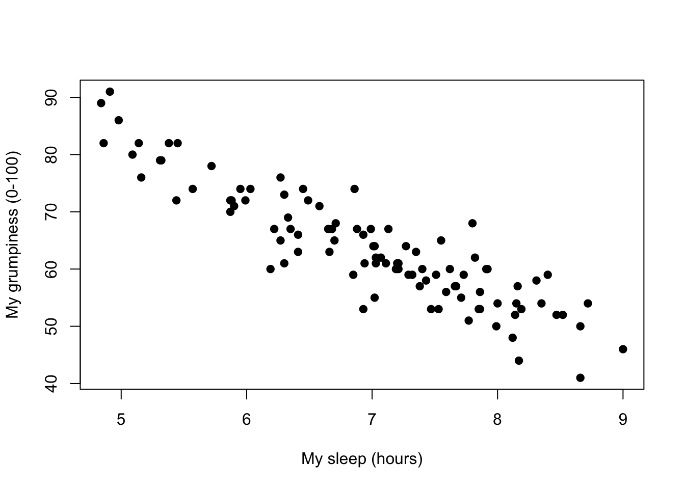
Figure 8.8: Scatterplot showing grumpiness as a function of hours slept.
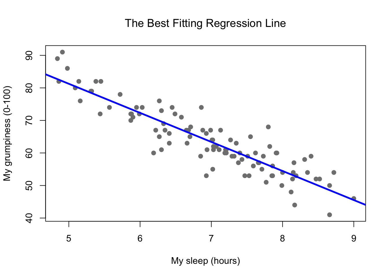
Figure 8.9: Panel a shows the sleep-grumpiness scatterplot from above with the best fitting regression line drawn over the top. Not surprisingly, the line goes through the middle of the data.
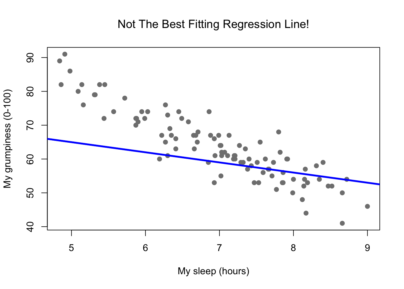
Figure 8.10: In contrast, this plot shows the same data, but with a very poor choice of regression line drawn over the top.
Since the basic ideas in regression are closely tied to correlation, we’ll return to the parenthood.Rdata file that we were using to illustrate how correlations work. Recall that, in this data set, we were trying to find out why Dan is so very grumpy all the time, and our working hypothesis was that I’m not getting enough sleep. We drew some scatterplots to help us examine the relationship between the amount of sleep I get, and my grumpiness the following day. The actual scatterplot that we draw is the one shown in Figure 8.8, and as we saw previously this corresponds to a correlation of \(r=-.90\), but what we find ourselves secretly imagining is something that looks closer to Figure 8.9. That is, we mentally draw a straight line through the middle of the data. In statistics, this line that we’re drawing is called a regression line. Notice that the regression line goes through the middle of the data. We don’t find ourselves imagining anything like the rather silly plot shown in Figure 8.10.
This is not highly surprising: the line that I’ve drawn in Figure 8.10 doesn’t “fit” the data very well, so it doesn’t make a lot of sense to propose it as a way of summarising the data, right? This is a very simple observation to make, but it turns out to be very powerful when we start trying to wrap just a little bit of maths around it. To do so, let’s start with a refresher of some high school maths. The formula for a straight line is usually written like this: \[ y = mx + c \] Or, at least, that’s what it was when I went to high school all those years ago. The two variables are \(x\) and \(y\), and we have two coefficients, \(m\) and \(c\). The coefficient \(m\) represents the slope of the line, and the coefficient \(c\) represents the \(y\)-intercept of the line. Digging further back into our decaying memories of high school (sorry, for some of us high school was a long time ago), we remember that the intercept is interpreted as “the value of \(y\) that you get when \(x=0\).” Similarly, a slope of \(m\) means that if you increase the \(x\)-value by 1 unit, then the \(y\)-value goes up by \(m\) units; a negative slope means that the \(y\)-value would go down rather than up. Ah yes, it’s all coming back to me now.
Now that we’ve remembered that, it should come as no surprise to discover that we use the exact same formula to describe a regression line. If \(Y\) is the outcome variable (the DV) and \(X\) is the predictor variable (the IV), then the formula that describes our regression is written like this: \[ \hat{Y_i} = b_1 X_i + b_0 \] Hm. Looks like the same formula, but there’s some extra frilly bits in this version. Let’s make sure we understand them. Firstly, notice that I’ve written \(X_i\) and \(Y_i\) rather than just plain old \(X\) and \(Y\). This is because we want to remember that we’re dealing with actual data. In this equation, \(X_i\) is the value of predictor variable for the \(i\)th observation (i.e., the number of hours of sleep that I got on day \(i\) of my little study), and \(Y_i\) is the corresponding value of the outcome variable (i.e., my grumpiness on that day). And although I haven’t said so explicitly in the equation, what we’re assuming is that this formula works for all observations in the data set (i.e., for all \(i\)). Secondly, notice that I wrote \(\hat{Y}_i\) and not \(Y_i\). This is because we want to make the distinction between the actual data \(Y_i\), and the estimate \(\hat{Y}_i\) (i.e., the prediction that our regression line is making). Thirdly, I changed the letters used to describe the coefficients from \(m\) and \(c\) to \(b_1\) and \(b_0\). That’s just the way that statisticians like to refer to the coefficients in a regression model. I’ve no idea why they chose \(b\), but that’s what they did. In any case \(b_0\) always refers to the intercept term, and \(b_1\) refers to the slope.
Excellent, excellent. Next, I can’t help but notice that – regardless of whether we’re talking about the good regression line or the bad one – the data don’t fall perfectly on the line. Or, to say it another way, the data \(Y_i\) are not identical to the predictions of the regression model \(\hat{Y_i}\). Since statisticians love to attach letters, names and numbers to everything, let’s refer to the difference between the model prediction and that actual data point as a residual, and we’ll refer to it as \(\epsilon_i\).118 Written using mathematics, the residuals are defined as: \[ \epsilon_i = Y_i - \hat{Y}_i \] which in turn means that we can write down the complete linear regression model as: \[ Y_i = b_1 X_i + b_0 + \epsilon_i \]
8.6 Estimating a linear regression model
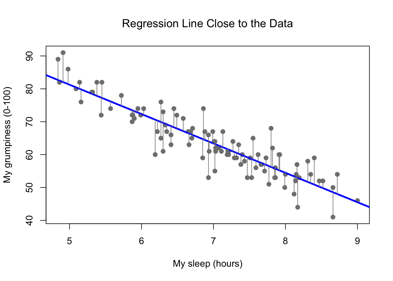
Figure 8.11: A depiction of the residuals associated with the best fitting regression line
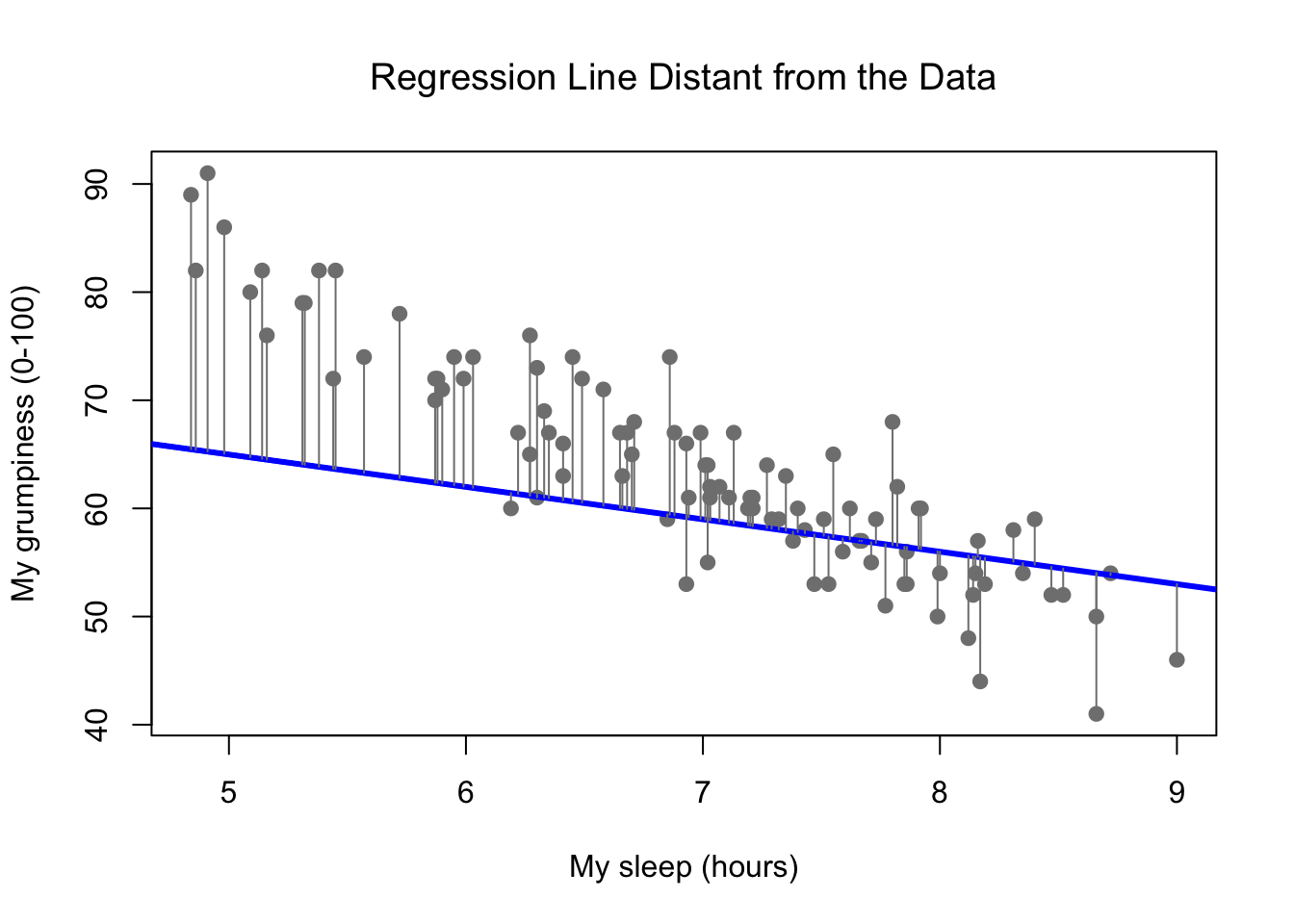
Figure 8.12: The residuals associated with a poor regression line
Okay, now let’s redraw our pictures, but this time I’ll add some lines to show the size of the residual for all observations. When the regression line is good, our residuals (the lengths of the solid black lines) all look pretty small, as shown in Figure 8.11, but when the regression line is a bad one, the residuals are a lot larger, as you can see from looking at Figure 8.12. Hm. Maybe what we “want” in a regression model is small residuals. Yes, that does seem to make sense. In fact, I think I’ll go so far as to say that the “best fitting” regression line is the one that has the smallest residuals. Or, better yet, since statisticians seem to like to take squares of everything why not say that …
The estimated regression coefficients, \(\hat{b}_0\) and \(\hat{b}_1\) are those that minimise the sum of the squared residuals, which we could either write as \(\sum_i (Y_i - \hat{Y}_i)^2\) or as \(\sum_i {\epsilon_i}^2\).
Yes, yes that sounds even better. And since I’ve indented it like that, it probably means that this is the right answer. And since this is the right answer, it’s probably worth making a note of the fact that our regression coefficients are estimates (we’re trying to guess the parameters that describe a population!), which is why I’ve added the little hats, so that we get \(\hat{b}_0\) and \(\hat{b}_1\) rather than \(b_0\) and \(b_1\). Finally, I should also note that – since there’s actually more than one way to estimate a regression model – the more technical name for this estimation process is ordinary least squares (OLS) regression.
At this point, we now have a concrete definition for what counts as our “best” choice of regression coefficients, \(\hat{b}_0\) and \(\hat{b}_1\). The natural question to ask next is, if our optimal regression coefficients are those that minimise the sum squared residuals, how do we find these wonderful numbers? The actual answer to this question is complicated, and it doesn’t help you understand the logic of regression.119 As a result, this time I’m going to let you off the hook. Instead of showing you how to do it the long and tedious way first, and then “revealing” the wonderful shortcut that R provides you with, let’s cut straight to the chase… and use the lm() function (short for “linear model”) to do all the heavy lifting.
8.6.1 Using the lm() function
The lm() function is a fairly complicated one: if you type ?lm, the help files will reveal that there are a lot of arguments that you can specify, and most of them won’t make a lot of sense to you. At this stage however, there’s really only two of them that you care about, and as it turns out you’ve seen them before:
formula. A formula that specifies the regression model. For the simple linear regression models that we’ve talked about so far, in which you have a single predictor variable as well as an intercept term, this formula is of the formoutcome ~ predictor. However, more complicated formulas are allowed, and we’ll discuss them later.data. The data frame containing the variables.
The output of the lm() function is a fairly complicated object, with quite a lot of technical information buried under the hood. Because this technical information is used by other functions, it’s generally a good idea to create a variable that stores the results of your regression. With this in mind, to run my linear regression, the command I want to use is this:
regression.1 <- lm( formula = dan.grump ~ dan.sleep,
                    data = parenthood )
Note that I used dan.grump ~ dan.sleep as the formula: in the model that I’m trying to estimate, dan.grump is the outcome variable, and dan.sleep is the predictor variable. It’s always a good idea to remember which one is which! Anyway, what this does is create an “lm object” (i.e., a variable whose class is "lm") called regression.1. Let’s have a look at what happens when we print() it out:
print( regression.1 )##
## Call:
## lm(formula = dan.grump ~ dan.sleep, data = parenthood)
##
## Coefficients:
## (Intercept) dan.sleep
## 125.956 -8.937This looks promising. There’s two separate pieces of information here. Firstly, R is politely reminding us what the command was that we used to specify the model in the first place, which can be helpful. More importantly from our perspective, however, is the second part, in which R gives us the intercept \(\hat{b}_0 = 125.96\) and the slope \(\hat{b}_1 = -8.94\). In other words, the best-fitting regression line that I plotted in Figure 8.9 has this formula: \[ \hat{Y}_i = -8.94 \ X_i + 125.96 \]
8.6.2 Interpreting the estimated model
The most important thing to be able to understand is how to interpret these coefficients. Let’s start with \(\hat{b}_1\), the slope. If we remember the definition of the slope, a regression coefficient of \(\hat{b}_1 = -8.94\) means that if I increase \(X_i\) by 1, then I’m decreasing \(Y_i\) by 8.94. That is, each additional hour of sleep that I gain will improve my mood, reducing my grumpiness by 8.94 grumpiness points. What about the intercept? Well, since \(\hat{b}_0\) corresponds to “the expected value of \(Y_i\) when \(X_i\) equals 0,” it’s pretty straightforward. It implies that if I get zero hours of sleep (\(X_i =0\)) then my grumpiness will go off the scale, to an insane value of (\(Y_i = 125.96\)). Best to be avoided, I think.
8.7 Multiple linear regression
The simple linear regression model that we’ve discussed up to this point assumes that there’s a single predictor variable that you’re interested in, in this case dan.sleep. In fact, up to this point, every statistical tool that we’ve talked about has assumed that your analysis uses one predictor variable and one outcome variable. However, in many (perhaps most) research projects you actually have multiple predictors that you want to examine. If so, it would be nice to be able to extend the linear regression framework to be able to include multiple predictors. Perhaps some kind of multiple regression model would be in order?
Multiple regression is conceptually very simple. All we do is add more terms to our regression equation. Let’s suppose that we’ve got two variables that we’re interested in; perhaps we want to use both dan.sleep and baby.sleep to predict the dan.grump variable. As before, we let \(Y_i\) refer to my grumpiness on the \(i\)-th day. But now we have two \(X\) variables: the first corresponding to the amount of sleep I got and the second corresponding to the amount of sleep my son got. So we’ll let \(X_{i1}\) refer to the hours I slept on the \(i\)-th day, and \(X_{i2}\) refers to the hours that the baby slept on that day. If so, then we can write our regression model like this:
\[
Y_i = b_2 X_{i2} + b_1 X_{i1} + b_0 + \epsilon_i
\]
As before, \(\epsilon_i\) is the residual associated with the \(i\)-th observation, \(\epsilon_i = {Y}_i - \hat{Y}_i\). In this model, we now have three coefficients that need to be estimated: \(b_0\) is the intercept, \(b_1\) is the coefficient associated with my sleep, and \(b_2\) is the coefficient associated with my son’s sleep. However, although the number of coefficients that need to be estimated has changed, the basic idea of how the estimation works is unchanged: our estimated coefficients \(\hat{b}_0\), \(\hat{b}_1\) and \(\hat{b}_2\) are those that minimise the sum squared residuals.
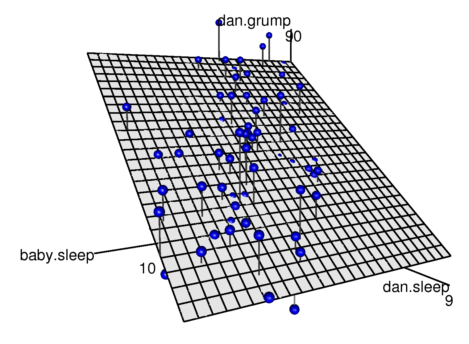
Figure 8.13: A 3D visualisation of a multiple regression model. There are two predictors in the model, dan.sleep and baby.sleep; the outcome variable is dan.grump. Together, these three variables form a 3D space: each observation (blue dots) is a point in this space. In much the same way that a simple linear regression model forms a line in 2D space, this multiple regression model forms a plane in 3D space. When we estimate the regression coefficients, what we’re trying to do is find a plane that is as close to all the blue dots as possible.
8.7.1 Doing it in R
Multiple regression in R is no different to simple regression: all we have to do is specify a more complicated formula when using the lm() function. For example, if we want to use both dan.sleep and baby.sleep as predictors in our attempt to explain why I’m so grumpy, then the formula we need is this:
dan.grump ~ dan.sleep + baby.sleepNotice that, just like last time, I haven’t explicitly included any reference to the intercept term in this formula; only the two predictor variables and the outcome. By default, the lm() function assumes that the model should include an intercept (though you can get rid of it if you want). In any case, I can create a new regression model – which I’ll call regression.2 – using the following command:
regression.2 <- lm( formula = dan.grump ~ dan.sleep + baby.sleep,
                     data = parenthood )
And just like last time, if we print() out this regression model we can see what the estimated regression coefficients are:
print( regression.2 )##
## Call:
## lm(formula = dan.grump ~ dan.sleep + baby.sleep, data = parenthood)
##
## Coefficients:
## (Intercept) dan.sleep baby.sleep
## 125.96557 -8.95025 0.01052The coefficient associated with dan.sleep is quite large, suggesting that every hour of sleep I lose makes me a lot grumpier. However, the coefficient for baby.sleep is very small, suggesting that it doesn’t really matter how much sleep my son gets; not really. What matters as far as my grumpiness goes is how much sleep I get. To get a sense of what this multiple regression model looks like, Figure 8.13 shows a 3D plot that plots all three variables, along with the regression model itself.
8.7.2 Formula for the general case
The equation that I gave above shows you what a multiple regression model looks like when you include two predictors. Not surprisingly, then, if you want more than two predictors all you have to do is add more \(X\) terms and more \(b\) coefficients. In other words, if you have \(K\) predictor variables in the model then the regression equation looks like this: \[ Y_i = \left( \sum_{k=1}^K b_{k} X_{ik} \right) + b_0 + \epsilon_i \]
8.8 Quantifying the fit of the regression model
So we now know how to estimate the coefficients of a linear regression model. The problem is, we don’t yet know if this regression model is any good. For example, the regression.1 model claims that every hour of sleep will improve my mood by quite a lot, but it might just be rubbish. Remember, the regression model only produces a prediction \(\hat{Y}_i\) about what my mood is like: my actual mood is \(Y_i\). If these two are very close, then the regression model has done a good job. If they are very different, then it has done a bad job.
8.8.1 The \(R^2\) value
Once again, let’s wrap a little bit of mathematics around this. Firstly, we’ve got the sum of the squared residuals:
\[
\mbox{SS}_{res} = \sum_i (Y_i - \hat{Y}_i)^2
\]
which we would hope to be pretty small. Specifically, what we’d like is for it to be very small in comparison to the total variability in the outcome variable,
\[
\mbox{SS}_{tot} = \sum_i (Y_i - \bar{Y})^2
\]
While we’re here, let’s calculate these values in R. Firstly, in order to make my R commands look a bit more similar to the mathematical equations, I’ll create variables X and Y:
X <- parenthood$dan.sleep  # the predictor
Y <- parenthood$dan.grump  # the outcome
Now that we’ve done this, let’s calculate the \(\hat{Y}\) values and store them in a variable called Y.pred. For the simple model that uses only a single predictor, regression.1, we would do the following:
Y.pred <- -8.94 * X + 125.97Okay, now that we’ve got a variable which stores the regression model predictions for how grumpy I will be on any given day, let’s calculate our sum of squared residuals. We would do that using the following command:
SS.resid <- sum( (Y - Y.pred)^2 )
print( SS.resid )
## [1] 1838.722Wonderful. A big number that doesn’t mean very much. Still, let’s forge boldly onwards anyway, and calculate the total sum of squares as well. That’s also pretty simple:
SS.tot <- sum( (Y - mean(Y))^2 )
print( SS.tot )
## [1] 9998.59Hm. Well, it’s a much bigger number than the last one, so this does suggest that our regression model was making good predictions. But it’s not very interpretable.
Perhaps we can fix this. What we’d like to do is to convert these two fairly meaningless numbers into one number. A nice, interpretable number, which for no particular reason we’ll call \(R^2\). What we would like is for the value of \(R^2\) to be equal to 1 if the regression model makes no errors in predicting the data. In other words, if it turns out that the residual errors are zero – that is, if \(\mbox{SS}_{res} = 0\) – then we expect \(R^2 = 1\). Similarly, if the model is completely useless, we would like \(R^2\) to be equal to 0. What do I mean by “useless?” Tempting as it is demand that the regression model move out of the house, cut its hair and get a real job, I’m probably going to have to pick a more practical definition: in this case, all I mean is that the residual sum of squares is no smaller than the total sum of squares, \(\mbox{SS}_{res} = \mbox{SS}_{tot}\). Wait, why don’t we do exactly that? The formula that provides us with out \(R^2\) value is pretty simple to write down, \[ R^2 = 1 - \frac{\mbox{SS}_{res}}{\mbox{SS}_{tot}} \] and equally simple to calculate in R:
R.squared <- 1 - (SS.resid / SS.tot)
print( R.squared )
## [1] 0.8161018The \(R^2\) value, sometimes called the coefficient of determination120 has a simple interpretation: it is the proportion of the variance in the outcome variable that can be accounted for by the predictor. So in this case, the fact that we have obtained \(R^2 = .816\) means that the predictor (my.sleep) explains 81.6% of the variance in the outcome (my.grump).
Naturally, you don’t actually need to type in all these commands yourself if you want to obtain the \(R^2\) value for your regression model. As we’ll see later on in Section 8.9.3, all you need to do is use the summary() function. However, let’s put that to one side for the moment. There’s another property of \(R^2\) that I want to point out.
8.8.2 The relationship between regression and correlation
At this point we can revisit my earlier claim that regression, in this very simple form that I’ve discussed so far, is basically the same thing as a correlation. Previously, we used the symbol \(r\) to denote a Pearson correlation. Might there be some relationship between the value of the correlation coefficient \(r\) and the \(R^2\) value from linear regression? Of course there is: the squared correlation \(r^2\) is identical to the \(R^2\) value for a linear regression with only a single predictor. To illustrate this, here’s the squared correlation:
r <- cor(X, Y)  # calculate the correlation
print( r^2 )    # print the squared correlation
## [1] 0.8161027Yep, same number. In other words, running a Pearson correlation is more or less equivalent to running a linear regression model that uses only one predictor variable.
8.8.3 The adjusted \(R^2\) value
One final thing to point out before moving on. It’s quite common for people to report a slightly different measure of model performance, known as “adjusted \(R^2\).” The motivation behind calculating the adjusted \(R^2\) value is the observation that adding more predictors into the model will always call the \(R^2\) value to increase (or at least not decrease). The adjusted \(R^2\) value introduces a slight change to the calculation, as follows. For a regression model with \(K\) predictors, fit to a data set containing \(N\) observations, the adjusted \(R^2\) is: \[ \mbox{adj. } R^2 = 1 - \left(\frac{\mbox{SS}_{res}}{\mbox{SS}_{tot}} \times \frac{N-1}{N-K-1} \right) \] This adjustment is an attempt to take the degrees of freedom into account. The big advantage of the adjusted \(R^2\) value is that when you add more predictors to the model, the adjusted \(R^2\) value will only increase if the new variables improve the model performance more than you’d expect by chance. The big disadvantage is that the adjusted \(R^2\) value can’t be interpreted in the elegant way that \(R^2\) can. \(R^2\) has a simple interpretation as the proportion of variance in the outcome variable that is explained by the regression model; to my knowledge, no equivalent interpretation exists for adjusted \(R^2\).
An obvious question then, is whether you should report \(R^2\) or adjusted \(R^2\). This is probably a matter of personal preference. If you care more about interpretability, then \(R^2\) is better. If you care more about correcting for bias, then adjusted \(R^2\) is probably better. Speaking just for myself, I prefer \(R^2\): my feeling is that it’s more important to be able to interpret your measure of model performance. Besides, as we’ll see in Section 8.9, if you’re worried that the improvement in \(R^2\) that you get by adding a predictor is just due to chance and not because it’s a better model, well, we’ve got hypothesis tests for that.
8.9 Hypothesis tests for regression models
So far we’ve talked about what a regression model is, how the coefficients of a regression model are estimated, and how we quantify the performance of the model (the last of these, incidentally, is basically our measure of effect size). The next thing we need to talk about is hypothesis tests. There are two different (but related) kinds of hypothesis tests that we need to talk about: those in which we test whether the regression model as a whole is performing significantly better than a null model; and those in which we test whether a particular regression coefficient is significantly different from zero.
At this point, you’re probably groaning internally, thinking that I’m going to introduce a whole new collection of tests…Me too. I’m so sick of hypothesis tests that I’m going to shamelessly reuse the \(F\)-test from ANOVA and the \(t\)-test. In fact, all I’m going to do in this section is show you how those tests are imported wholesale into the regression framework.
8.9.1 Testing the model as a whole: The omnibus test
Okay, suppose you’ve estimated your regression model. The first hypothesis test you might want to try is one in which the null hypothesis that there is no relationship between the predictors and the outcome, and the alternative hypothesis is that the data are distributed in exactly the way that the regression model predicts. Formally, our “null model” corresponds to the fairly trivial “regression” model in which we include 0 predictors, and only include the intercept term \(b_0\) \[ H_0: Y_i = b_0 + \epsilon_i \] If our regression model has \(K\) predictors, the “alternative model” is described using the usual formula for a multiple regression model: \[ H_1: Y_i = \left( \sum_{k=1}^K b_{k} X_{ik} \right) + b_0 + \epsilon_i \]
How can we test these two hypotheses against each other? The trick is to understand that just like we did with ANOVA, it’s possible to divide up the total variance \(\mbox{SS}_{tot}\) into the sum of the residual variance \(\mbox{SS}_{res}\) and the regression model variance \(\mbox{SS}_{mod}\). I’ll skip over the technicalities, since we will cover most of them in a future ANOVA chapter, and just note that the sum of squares for the model is equal to the total sum of squares minus sum of squares for the residual: \[ \mbox{SS}_{mod} = \mbox{SS}_{tot} - \mbox{SS}_{res} \] And, just like we will do with the ANOVA, we can convert the sums of squares in to mean squares by dividing by the degrees of freedom. \[ \begin{array}{rcl} \mbox{MS}_{mod} &=& \displaystyle\frac{\mbox{SS}_{mod} }{df_{mod}} \\ \\ \mbox{MS}_{res} &=& \displaystyle\frac{\mbox{SS}_{res} }{df_{res} } \end{array} \]
So, how many degrees of freedom do we have? As you might expect, the \(df\) associated with the model is closely tied to the number of predictors that we’ve included. In fact, it turns out that \(df_{mod} = K\). For the residuals, the total degrees of freedom is \(df_{res} = N -K - 1\).
Now that we’ve got our mean square values, you’re probably going to be entirely unsurprised to discover that we can calculate an \(F\)-statistic like this: \[ F = \frac{\mbox{MS}_{mod}}{\mbox{MS}_{res}} \] and the degrees of freedom associated with this are \(K\) and \(N-K-1\). This \(F\) statistic has exactly the same interpretation as for ANOVA. Large \(F\) values indicate that the null hypothesis is performing poorly in comparison to the alternative hypothesis. And since we already did some tedious “do it the long way” calculations back then, I won’t waste your time repeating them. In a moment I’ll show you how to do the test in R the easy way, but first, let’s have a look at the tests for the individual regression coefficients.
8.9.2 Tests for individual coefficients
The \(F\)-test that we’ve just introduced is useful for checking that the model as a whole is performing better than chance. This is important: if your regression model doesn’t produce a significant result for the \(F\)-test then you probably don’t have a very good regression model (or, quite possibly, you don’t have very good data). However, while failing this test is a pretty strong indicator that the model has problems, passing the test (i.e., rejecting the null) doesn’t imply that the model is good! Why is that, you might be wondering? The answer to that can be found by looking at the coefficients for the regression.2 model:
print( regression.2 ) ##
## Call:
## lm(formula = dan.grump ~ dan.sleep + baby.sleep, data = parenthood)
##
## Coefficients:
## (Intercept) dan.sleep baby.sleep
## 125.96557 -8.95025 0.01052I can’t help but notice that the estimated regression coefficient for the baby.sleep variable is tiny (0.01), relative to the value that we get for dan.sleep (-8.95). Given that these two variables are absolutely on the same scale (they’re both measured in “hours slept”), I find this suspicious. In fact, I’m beginning to suspect that it’s really only the amount of sleep that I get that matters in order to predict my grumpiness.
Once again, we can reuse a hypothesis test that we discussed earlier, this time the \(t\)-test. The test that we’re interested has a null hypothesis that the true regression coefficient is zero (\(b = 0\)), which is to be tested against the alternative hypothesis that it isn’t (\(b \neq 0\)). That is: \[ \begin{array}{rl} H_0: & b = 0 \\ H_1: & b \neq 0 \end{array} \] How can we test this? Well, if the central limit theorem is kind to us, we might be able to guess that the sampling distribution of \(\hat{b}\), the estimated regression coefficient, is a normal distribution with mean centred on \(b\). What that would mean is that if the null hypothesis were true, then the sampling distribution of \(\hat{b}\) has mean zero and unknown standard deviation. Assuming that we can come up with a good estimate for the standard error of the regression coefficient, \(\mbox{SE}({\hat{b}})\), then we’re in luck. That’s exactly the situation for which we introduced the one-sample \(t\) way back in Chapter 9. So let’s define a \(t\)-statistic like this, \[ t = \frac{\hat{b}}{\mbox{SE}({\hat{b})}} \] I’ll skip over the reasons why, but our degrees of freedom in this case are \(df = N- K- 1\). Irritatingly, the estimate of the standard error of the regression coefficient, \(\mbox{SE}({\hat{b}})\), is not as easy to calculate as the standard error of the mean that we used for the simpler \(t\)-tests and \(z\)-tests. In fact, the formula is somewhat ugly, and not terribly helpful to look at. For our purposes it’s sufficient to point out that the standard error of the estimated regression coefficient depends on both the predictor and outcome variables, and is somewhat sensitive to violations of the homogeneity of variance assumption (discussed shortly).
In any case, this \(t\)-statistic can be interpreted in the same way as any \(t\)-statistic. Assuming that you have a two-sided alternative (i.e., you don’t really care if \(b >0\) or \(b < 0\)), then it’s the extreme values of \(t\) (i.e., a lot less than zero or a lot greater than zero) that suggest that you should reject the null hypothesis.
8.9.3 Running the hypothesis tests in R
To compute all of the quantities that we have talked about so far, all you need to do is ask for a summary() of your regression model. Since I’ve been using regression.2 as my example, let’s do that:
summary( regression.2 )##
## Call:
## lm(formula = dan.grump ~ dan.sleep + baby.sleep, data = parenthood)
##
## Residuals:
## Min 1Q Median 3Q Max
## -11.0345 -2.2198 -0.4016 2.6775 11.7496
##
## Coefficients:
## Estimate Std. Error t value Pr(>|t|)
## (Intercept) 125.96557 3.04095 41.423 <2e-16 ***
## dan.sleep -8.95025 0.55346 -16.172 <2e-16 ***
## baby.sleep 0.01052 0.27106 0.039 0.969
## ---
## Signif. codes: 0 '***' 0.001 '**' 0.01 '*' 0.05 '.' 0.1 ' ' 1
##
## Residual standard error: 4.354 on 97 degrees of freedom
## Multiple R-squared: 0.8161, Adjusted R-squared: 0.8123
## F-statistic: 215.2 on 2 and 97 DF, p-value: < 2.2e-16The output that this command produces is pretty dense, but we’ve already discussed everything of interest in it, so what I’ll do is go through it line by line. The first line reminds us of what the actual regression model is:
Call:
lm(formula = dan.grump ~ dan.sleep + baby.sleep, data = parenthood)
You can see why this is handy, since it was a little while back when we actually created the regression.2 model, and so it’s nice to be reminded of what it was we were doing. The next part provides a quick summary of the residuals (i.e., the \(\epsilon_i\) values),
Residuals:
     Min       1Q   Median       3Q      Max
-11.0345  -2.2198  -0.4016   2.6775  11.7496
which can be convenient as a quick and dirty check that the model is okay. Remember, we did assume that these residuals were normally distributed, with mean 0. In particular it’s worth quickly checking to see if the median is close to zero, and to see if the first quartile is about the same size as the third quartile. If they look badly off, there’s a good chance that the assumptions of regression are violated. These ones look pretty nice to me, so let’s move on to the interesting stuff. The next part of the R output looks at the coefficients of the regression model:
Coefficients:
             Estimate Std. Error t value Pr(>|t|)
(Intercept) 125.96557    3.04095  41.423   <2e-16 ***
dan.sleep    -8.95025    0.55346 -16.172   <2e-16 ***
baby.sleep    0.01052    0.27106   0.039    0.969
---
Signif. codes:  0 ‘***’ 0.001 ‘**’ 0.01 ‘*’ 0.05 ‘.’ 0.1 ‘ ’ 1
Each row in this table refers to one of the coefficients in the regression model. The first row is the intercept term, and the later ones look at each of the predictors. The columns give you all of the relevant information. The first column is the actual estimate of \(b\) (e.g., 125.96 for the intercept, and -8.9 for the dan.sleep predictor). The second column is the standard error estimate \(\hat\sigma_b\). The third column gives you the \(t\)-statistic, and it’s worth noticing that in this table \(t= \hat{b}/\mbox{SE}({\hat{b}})\) every time. Finally, the fourth column gives you the actual \(p\) value for each of these tests.121 The only thing that the table itself doesn’t list is the degrees of freedom used in the \(t\)-test, which is always \(N-K-1\) and is listed immediately below, in this line:
Residual standard error: 4.354 on 97 degrees of freedomThe value of \(df = 97\) is equal to \(N-K-1\), so that’s what we use for our \(t\)-tests. In the final part of the output we have the \(F\)-test and the \(R^2\) values which assess the performance of the model as a whole
Residual standard error: 4.354 on 97 degrees of freedom
Multiple R-squared: 0.8161, Adjusted R-squared: 0.8123
F-statistic: 215.2 on 2 and 97 DF,  p-value: < 2.2e-16
So in this case, the model performs significantly better than you’d expect by chance (\(F(2,97) = 215.2\), \(p<.001\)), which isn’t all that surprising: the \(R^2 = .812\) value indicate that the regression model accounts for 81.2% of the variability in the outcome measure. However, when we look back up at the \(t\)-tests for each of the individual coefficients, we lack evidence that the baby.sleep variable has a significant effect; all the work could be done by the dan.sleep variable. Taken together, these results suggest that regression.2 is actually the wrong model for the data: you’d probably be better off dropping the baby.sleep predictor entirely. In other words, the regression.1 model that we started with is the better model.
8.10 Testing the significance of a correlation
8.10.1 Hypothesis tests for a single correlation
I don’t want to spend too much time on this, but it’s worth very briefly returning to the point I made earlier, that Pearson correlations are basically the same thing as linear regressions with only a single predictor added to the model. What this means is that the hypothesis tests that I just described in a regression context can also be applied to correlation coefficients. To see this, let’s take a summary() of the regression.1 model:
summary( regression.1 )##
## Call:
## lm(formula = dan.grump ~ dan.sleep, data = parenthood)
##
## Residuals:
## Min 1Q Median 3Q Max
## -11.025 -2.213 -0.399 2.681 11.750
##
## Coefficients:
## Estimate Std. Error t value Pr(>|t|)
## (Intercept) 125.9563 3.0161 41.76 <2e-16 ***
## dan.sleep -8.9368 0.4285 -20.85 <2e-16 ***
## ---
## Signif. codes: 0 '***' 0.001 '**' 0.01 '*' 0.05 '.' 0.1 ' ' 1
##
## Residual standard error: 4.332 on 98 degrees of freedom
## Multiple R-squared: 0.8161, Adjusted R-squared: 0.8142
## F-statistic: 434.9 on 1 and 98 DF, p-value: < 2.2e-16The important thing to note here is the \(t\) test associated with the predictor, in which we get a result of \(t(98) = -20.85\), \(p<.001\). Now let’s compare this to the output of a different function, which goes by the name of cor.test(). As you might expect, this function runs a hypothesis test to see if the observed correlation between two variables is significantly different from 0. Let’s have a look:
cor.test( x = parenthood$dan.sleep, y = parenthood$dan.grump )##
## Pearson's product-moment correlation
##
## data: parenthood$dan.sleep and parenthood$dan.grump
## t = -20.854, df = 98, p-value < 2.2e-16
## alternative hypothesis: true correlation is not equal to 0
## 95 percent confidence interval:
## -0.9340614 -0.8594714
## sample estimates:
## cor
## -0.903384Again, the key thing to note is the line that reports the hypothesis test itself, which seems to be saying that \(t(98) = -20.85\), \(p<.001\). Hm. Looks like it’s exactly the same test, doesn’t it? And that’s exactly what it is. The test for the significance of a correlation is identical to the \(t\) test that we run on a coefficient in a regression model.
8.10.2 Hypothesis tests for all pairwise correlations
Okay, one more digression before I return to regression properly. In the previous section I talked about the cor.test() function, which lets you run a hypothesis test on a single correlation. The cor.test() function is (obviously) an extension of the cor() function, which we talked about in Section 8.4. However, the cor() function isn’t restricted to computing a single correlation: you can use it to compute all pairwise correlations among the variables in your data set. This leads people to the natural question: can the cor.test() function do the same thing? Can we use cor.test() to run hypothesis tests for all possible parwise correlations among the variables in a data frame?
The answer is no, and there’s a very good reason for this. Testing a single correlation is fine: if you’ve got some reason to be asking “is A related to B?” then you should absolutely run a test to see if there’s a significant correlation. But if you’ve got variables A, B, C, D and E and you’re thinking about testing the correlations among all possible pairs of these, a statistician would want to ask: what’s your hypothesis? If you’re in the position of wanting to test all possible pairs of variables, then you’re pretty clearly on a fishing expedition, hunting around in search of significant effects when you don’t actually have a clear research hypothesis in mind. This is dangerous, and the authors of cor.test() obviously felt that they didn’t want to support that kind of behaviour.
On the other hand… a somewhat less hardline view might be to argue we encounter this situation when we talk about post hoc tests in ANOVA. When running post hoc tests, we didn’t have any specific comparisons in mind, so what we do is apply a correction (e.g., Bonferroni, Holm, etc) in order to avoid the possibility of an inflated Type I error rate. From this perspective, it’s okay to run hypothesis tests on all your pairwise correlations, but you must treat them as post hoc analyses, and if so you need to apply a correction for multiple comparisons. That’s what the correlate() function in the lsr package does. When we use the correlate() function in Section 8.4 all it did was print out the correlation matrix. But you can get it to output the results of all the pairwise tests as well by specifying test=TRUE. Here’s what happens with the parenthood data:
library(lsr)
correlate(parenthood, test=TRUE)
##
## CORRELATIONS
## ============
## - correlation type: pearson
## - correlations shown only when both variables are numeric
##
## dan.sleep baby.sleep dan.grump day
## dan.sleep . 0.628*** -0.903*** -0.098
## baby.sleep 0.628*** . -0.566*** -0.010
## dan.grump -0.903*** -0.566*** . 0.076
## day -0.098 -0.010 0.076 .
##
## ---
## Signif. codes: . = p < .1, * = p<.05, ** = p<.01, *** = p<.001
##
##
## p-VALUES
## ========
## - total number of tests run: 6
## - correction for multiple testing: holm
##
## dan.sleep baby.sleep dan.grump day
## dan.sleep . 0.000 0.000 0.990
## baby.sleep 0.000 . 0.000 0.990
## dan.grump 0.000 0.000 . 0.990
## day 0.990 0.990 0.990 .
##
##
## SAMPLE SIZES
## ============
##
## dan.sleep baby.sleep dan.grump day
## dan.sleep 100 100 100 100
## baby.sleep 100 100 100 100
## dan.grump 100 100 100 100
## day 100 100 100 100The output here contains three matrices. First it prints out the correlation matrix. Second it prints out a matrix of \(p\)-values, using the Holm method122 to correct for multiple comparisons. Finally, it prints out a matrix indicating the sample size (number of pairwise complete cases) that contributed to each correlation.
So there you have it. If you really desperately want to do pairwise hypothesis tests on your correlations, the correlate() function will let you do it. But please, please be careful. I can’t count the number of times I’ve had a student panicking in my office because they’ve run these pairwise correlation tests, and they get one or two significant results that don’t make any sense. For some reason, the moment people see those little significance stars appear, they feel compelled to throw away all common sense and assume that the results must correspond to something real that requires an explanation. In most such cases, my experience has been that the right answer is “it’s a Type I error.”
8.11 Regarding regression coefficients
Before moving on to discuss the assumptions underlying linear regression and what you can do to check if they’re being met, there’s two more topics I want to briefly discuss, both of which relate to the regression coefficients. The first thing to talk about is calculating confidence intervals for the coefficients; after that, I’ll discuss the somewhat murky question of how to determine which of predictor is most important.
8.11.1 Confidence intervals for the coefficients
Like any population parameter, the regression coefficients \(b\) cannot be estimated with complete precision from a sample of data; that’s part of why we need hypothesis tests. Given this, it’s quite useful to be able to report confidence intervals that capture our uncertainty about the true value of \(b\). This is especially useful when the research question focuses heavily on an attempt to find out how strongly variable \(X\) is related to variable \(Y\), since in those situations the interest is primarily in the regression weight \(b\). Fortunately, confidence intervals for the regression weights can be constructed in the usual fashion,
\[
\mbox{CI}(b) = \hat{b} \pm \left( t_{crit} \times \mbox{SE}({\hat{b})} \right)
\]
where \(\mbox{SE}({\hat{b}})\) is the standard error of the regression coefficient, and \(t_{crit}\) is the relevant critical value of the appropriate \(t\) distribution. For instance, if it’s a 95% confidence interval that we want, then the critical value is the 97.5th quantile of a \(t\) distribution with \(N-K-1\) degrees of freedom. In other words, this is basically the same approach to calculating confidence intervals that we’ve used throughout. To do this in R we can use the confint() function. There arguments to this function are
object. The regression model (lmobject) for which confidence intervals are required.parm. A vector indicating which coefficients we should calculate intervals for. This can be either a vector of numbers or (more usefully) a character vector containing variable names. By default, all coefficients are included, so usually you don’t bother specifying this argument.level. A number indicating the confidence level that should be used. As is usually the case, the default value is 0.95, so you wouldn’t usually need to specify this argument.
So, suppose I want 99% confidence intervals for the coefficients in the regression.2 model. I could do this using the following command:
confint( object = regression.2,
        level = .99)
## 0.5 % 99.5 %
## (Intercept) 117.9755724 133.9555593
## dan.sleep -10.4044419 -7.4960575
## baby.sleep -0.7016868 0.7227357Simple enough.
8.11.2 Calculating standardised regression coefficients
One more thing that you might want to do is to calculate “standardised” regression coefficients, often denoted \(\beta\). The rationale behind standardised coefficients goes like this. In a lot of situations, your variables are on fundamentally different scales. Suppose, for example, my regression model aims to predict people’s IQ scores, using their educational attainment (number of years of education) and their income as predictors. Obviously, educational attainment and income are not on the same scales: the number of years of schooling can only vary by 10s of years, whereas income would vary by 10,000s of dollars (or more). The units of measurement have a big influence on the regression coefficients: the \(b\) coefficients only make sense when interpreted in light of the units, both of the predictor variables and the outcome variable. This makes it very difficult to compare the coefficients of different predictors. Yet there are situations where you really do want to make comparisons between different coefficients. Specifically, you might want some kind of standard measure of which predictors have the strongest relationship to the outcome. This is what standardised coefficients aim to do.
The basic idea is quite simple: the standardised coefficients are the coefficients that you would have obtained if you’d converted all the variables to \(z\)-scores before running the regression.123 The idea here is that, by converting all the predictors to \(z\)-scores, they all go into the regression on the same scale, thereby removing the problem of having variables on different scales. Regardless of what the original variables were, a \(\beta\) value of 1 means that an increase in the predictor of 1 standard deviation will produce a corresponding 1 standard deviation increase in the outcome variable. Therefore, if variable A has a larger absolute value of \(\beta\) than variable B, it is deemed to have a stronger relationship with the outcome. Or at least that’s the idea: it’s worth being a little cautious here, since this does rely very heavily on the assumption that “a 1 standard deviation change” is fundamentally the same kind of thing for all variables. It’s not always obvious that this is true.
Leaving aside the interpretation issues, let’s look at how it’s calculated. What you could do is standardise all the variables yourself and then run a regression, but there’s a much simpler way to do it. As it turns out, the \(\beta\) coefficient for a predictor \(X\) and outcome \(Y\) has a very simple formula, namely
\[
\beta_X = b_X \times \frac{\sigma_X}{\sigma_Y}
\]
where \(\sigma_X\) is the standard deviation of the predictor, and \(\sigma_Y\) is the standard deviation of the outcome variable \(Y\). This makes matters a lot simpler. To make things even simpler, the lsr package includes a function standardCoefs() that computes the \(\beta\) coefficients.
standardCoefs( regression.2 )## b beta
## dan.sleep -8.95024973 -0.90474809
## baby.sleep 0.01052447 0.00217223This clearly shows that the dan.sleep variable has a much stronger effect than the baby.sleep variable. However, this is a perfect example of a situation where it would probably make sense to use the original coefficients \(b\) rather than the standardised coefficients \(\beta\). After all, my sleep and the baby’s sleep are already on the same scale: number of hours slept. Why complicate matters by converting these to \(z\)-scores?
8.12 Assumptions of regression
The linear regression model that I’ve been discussing relies on several assumptions. In Section 8.13 we’ll talk a lot more about how to check that these assumptions are being met, but first, let’s have a look at each of them.
- Normality. Like half the models in statistics, standard linear regression relies on an assumption of normality. Specifically, it assumes that the residuals are normally distributed. It’s actually okay if the predictors \(X\) and the outcome \(Y\) are non-normal, so long as the residuals \(\epsilon\) are normal. See Section 8.13.3.
- Linearity. A pretty fundamental assumption of the linear regression model is that relationship between \(X\) and \(Y\) actually be linear! Regardless of whether it’s a simple regression or a multiple regression, we assume that the relatiships involved are linear. See Section 8.13.4.
- Homogeneity of variance. Strictly speaking, the regression model assumes that each residual \(\epsilon_i\) is generated from a normal distribution with mean 0, and (more importantly for the current purposes) with a standard deviation \(\sigma\) that is the same for every single residual. In practice, it’s impossible to test the assumption that every residual is identically distributed. Instead, what we care about is that the standard deviation of the residual is the same for all values of \(\hat{Y}\), and (if we’re being especially paranoid) all values of every predictor \(X\) in the model. See Section 8.13.5.
- Uncorrelated predictors. The idea here is that, is a multiple regression model, you don’t want your predictors to be too strongly correlated with each other. This isn’t “technically” an assumption of the regression model, but in practice it’s required. Predictors that are too strongly correlated with each other (referred to as “collinearity”) can cause problems when evaluating the model. See Section 8.13.6
- Residuals are independent of each other. This is really just a “catch all” assumption, to the effect that “there’s nothing else funny going on in the residuals.” If there is something weird (e.g., the residuals all depend heavily on some other unmeasured variable) going on, it might screw things up.
- No “bad” outliers. Again, not actually a technical assumption of the model (or rather, it’s sort of implied by all the others), but there is an implicit assumption that your regression model isn’t being too strongly influenced by one or two anomalous data points; since this raises questions about the adequacy of the model, and the trustworthiness of the data in some cases. See Section 8.13.2.
8.13 Model checking
The main focus of this section is regression diagnostics, a term that refers to the art of checking that the assumptions of your regression model have been met, figuring out how to fix the model if the assumptions are violated, and generally to check that nothing “funny” is going on. I refer to this as the “art” of model checking with good reason: it’s not easy, and while there are a lot of fairly standardised tools that you can use to diagnose and maybe even cure the problems that ail your model (if there are any, that is!), you really do need to exercise a certain amount of judgment when doing this. It’s easy to get lost in all the details of checking this thing or that thing, and it’s quite exhausting to try to remember what all the different things are. This has the very nasty side effect that a lot of people get frustrated when trying to learn all the tools, so instead they decide not to do any model checking. This is a bit of a worry!
In this section, I describe several different things you can do to check that your regression model is doing what it’s supposed to. It doesn’t cover the full space of things you could do, but it’s still much more detailed than what I see a lot of people doing in practice; and I don’t usually cover all of this in my intro stats class myself. However, I do think it’s important that you get a sense of what tools are at your disposal, so I’ll try to introduce a bunch of them here. Finally, I should note that this section draws quite heavily from the Fox and Weisberg (2011) text, the book associated with the car package. The car package is notable for providing some excellent tools for regression diagnostics, and the book itself talks about them in an admirably clear fashion. I don’t want to sound too gushy about it, but I do think that Fox and Weisberg (2011) is well worth reading.
8.13.1 Three kinds of residuals
The majority of regression diagnostics revolve around looking at the residuals, and by now you’ve probably formed a sufficiently pessimistic theory of statistics to be able to guess that – precisely because of the fact that we care a lot about the residuals – there are several different kinds of residual that we might consider. In particular, the following three kinds of residual are referred to in this section: “ordinary residuals,” “standardised residuals,” and “Studentised residuals.” There is a fourth kind that you’ll see referred to in some of the Figures, and that’s the “Pearson residual”: however, for the models that we’re talking about in this chapter, the Pearson residual is identical to the ordinary residual.
The first and simplest kind of residuals that we care about are ordinary residuals. These are the actual, raw residuals that I’ve been talking about throughout this chapter. The ordinary residual is just the difference between the fitted value \(\hat{Y}_i\) and the observed value \(Y_i\). I’ve been using the notation \(\epsilon_i\) to refer to the \(i\)-th ordinary residual, and by gum I’m going to stick to it. With this in mind, we have the very simple equation \[ \epsilon_i = Y_i - \hat{Y}_i \] This is of course what we saw earlier, and unless I specifically refer to some other kind of residual, this is the one I’m talking about. So there’s nothing new here: I just wanted to repeat myself. In any case, you can get R to output a vector of ordinary residuals, you can use a command like this:
residuals( object = regression.2 )## 1 2 3 4 5 6
## -2.1403095 4.7081942 1.9553640 -2.0602806 0.7194888 -0.4066133
## 7 8 9 10 11 12
## 0.2269987 -1.7003077 0.2025039 3.8524589 3.9986291 -4.9120150
## 13 14 15 16 17 18
## 1.2060134 0.4946578 -2.6579276 -0.3966805 3.3538613 1.7261225
## 19 20 21 22 23 24
## -0.4922551 -5.6405941 -0.4660764 2.7238389 9.3653697 0.2841513
## 25 26 27 28 29 30
## -0.5037668 -1.4941146 8.1328623 1.9787316 -1.5126726 3.5171148
## 31 32 33 34 35 36
## -8.9256951 -2.8282946 6.1030349 -7.5460717 4.5572128 -10.6510836
## 37 38 39 40 41 42
## -5.6931846 6.3096506 -2.1082466 -0.5044253 0.1875576 4.8094841
## 43 44 45 46 47 48
## -5.4135163 -6.2292842 -4.5725232 -5.3354601 3.9950111 2.1718745
## 49 50 51 52 53 54
## -3.4766440 0.4834367 6.2839790 2.0109396 -1.5846631 -2.2166613
## 55 56 57 58 59 60
## 2.2033140 1.9328736 -1.8301204 -1.5401430 2.5298509 -3.3705782
## 61 62 63 64 65 66
## -2.9380806 0.6590736 -0.5917559 -8.6131971 5.9781035 5.9332979
## 67 68 69 70 71 72
## -1.2341956 3.0047669 -1.0802468 6.5174672 -3.0155469 2.1176720
## 73 74 75 76 77 78
## 0.6058757 -2.7237421 -2.2291472 -1.4053822 4.7461491 11.7495569
## 79 80 81 82 83 84
## 4.7634141 2.6620908 -11.0345292 -0.7588667 1.4558227 -0.4745727
## 85 86 87 88 89 90
## 8.9091201 -1.1409777 0.7555223 -0.4107130 0.8797237 -1.4095586
## 91 92 93 94 95 96
## 3.1571385 -3.4205757 -5.7228699 -2.2033958 -3.8647891 0.4982711
## 97 98 99 100
## -5.5249495 4.1134221 -8.2038533 5.6800859One drawback to using ordinary residuals is that they’re always on a different scale, depending on what the outcome variable is and how good the regression model is. That is, Unless you’ve decided to run a regression model without an intercept term, the ordinary residuals will have mean 0; but the variance is different for every regression. In a lot of contexts, especially where you’re only interested in the pattern of the residuals and not their actual values, it’s convenient to estimate the standardised residuals, which are normalised in such a way as to have standard deviation 1. The way we calculate these is to divide the ordinary residual by an estimate of the (population) standard deviation of these residuals. For technical reasons, mumble mumble, the formula for this is: \[ \epsilon_{i}^\prime = \frac{\epsilon_i}{\hat{\sigma} \sqrt{1-h_i}} \] where \(\hat\sigma\) in this context is the estimated population standard deviation of the ordinary residuals, and \(h_i\) is the “hat value” of the \(i\)th observation. I haven’t explained hat values to you yet (but have no fear,124 it’s coming shortly), so this won’t make a lot of sense. For now, it’s enough to interpret the standardised residuals as if we’d converted the ordinary residuals to \(z\)-scores. In fact, that is more or less the truth, it’s just that we’re being a bit fancier. To get the standardised residuals, the command you want is this:
rstandard( model = regression.2 )## 1 2 3 4 5 6
## -0.49675845 1.10430571 0.46361264 -0.47725357 0.16756281 -0.09488969
## 7 8 9 10 11 12
## 0.05286626 -0.39260381 0.04739691 0.89033990 0.95851248 -1.13898701
## 13 14 15 16 17 18
## 0.28047841 0.11519184 -0.61657092 -0.09191865 0.77692937 0.40403495
## 19 20 21 22 23 24
## -0.11552373 -1.31540412 -0.10819238 0.62951824 2.17129803 0.06586227
## 25 26 27 28 29 30
## -0.11980449 -0.34704024 1.91121833 0.45686516 -0.34986350 0.81233165
## 31 32 33 34 35 36
## -2.08659993 -0.66317843 1.42930082 -1.77763064 1.07452436 -2.47385780
## 37 38 39 40 41 42
## -1.32715114 1.49419658 -0.49115639 -0.11674947 0.04401233 1.11881912
## 43 44 45 46 47 48
## -1.27081641 -1.46422595 -1.06943700 -1.24659673 0.94152881 0.51069809
## 49 50 51 52 53 54
## -0.81373349 0.11412178 1.47938594 0.46437962 -0.37157009 -0.51609949
## 55 56 57 58 59 60
## 0.51800753 0.44813204 -0.42662358 -0.35575611 0.58403297 -0.78022677
## 61 62 63 64 65 66
## -0.67833325 0.15484699 -0.13760574 -2.05662232 1.40238029 1.37505125
## 67 68 69 70 71 72
## -0.28964989 0.69497632 -0.24945316 1.50709623 -0.69864682 0.49071427
## 73 74 75 76 77 78
## 0.14267297 -0.63246560 -0.51972828 -0.32509811 1.10842574 2.72171671
## 79 80 81 82 83 84
## 1.09975101 0.62057080 -2.55172097 -0.17584803 0.34340064 -0.11158952
## 85 86 87 88 89 90
## 2.10863391 -0.26386516 0.17624445 -0.09504416 0.20450884 -0.32730740
## 91 92 93 94 95 96
## 0.73475640 -0.79400855 -1.32768248 -0.51940736 -0.91512580 0.11661226
## 97 98 99 100
## -1.28069115 0.96332849 -1.90290258 1.31368144Note that this function uses a different name for the input argument, but it’s still just a linear regression object that the function wants to take as its input here.
The third kind of residuals are Studentised residuals (also called “jackknifed residuals”) and they’re even fancier than standardised residuals. Again, the idea is to take the ordinary residual and divide it by some quantity in order to estimate some standardised notion of the residual, but the formula for doing the calculations this time is subtly different: \[ \epsilon_{i}^* = \frac{\epsilon_i}{\hat{\sigma}_{(-i)} \sqrt{1-h_i}} \] Notice that our estimate of the standard deviation here is written \(\hat{\sigma}_{(-i)}\). What this corresponds to is the estimate of the residual standard deviation that you would have obtained, if you just deleted the \(i\)th observation from the data set. This sounds like the sort of thing that would be a nightmare to calculate, since it seems to be saying that you have to run \(N\) new regression models (even a modern computer might grumble a bit at that, especially if you’ve got a large data set). Fortunately, some terribly clever person has shown that this standard deviation estimate is actually given by the following equation: \[ \hat\sigma_{(-i)} = \hat{\sigma} \ \sqrt{\frac{N-K-1 - {\epsilon_{i}^\prime}^2}{N-K-2}} \] Isn’t that a pip? Anyway, the command that you would use if you wanted to pull out the Studentised residuals for our regression model is
rstudent( model = regression.2 )## 1 2 3 4 5 6
## -0.49482102 1.10557030 0.46172854 -0.47534555 0.16672097 -0.09440368
## 7 8 9 10 11 12
## 0.05259381 -0.39088553 0.04715251 0.88938019 0.95810710 -1.14075472
## 13 14 15 16 17 18
## 0.27914212 0.11460437 -0.61459001 -0.09144760 0.77533036 0.40228555
## 19 20 21 22 23 24
## -0.11493461 -1.32043609 -0.10763974 0.62754813 2.21456485 0.06552336
## 25 26 27 28 29 30
## -0.11919416 -0.34546127 1.93818473 0.45499388 -0.34827522 0.81089646
## 31 32 33 34 35 36
## -2.12403286 -0.66125192 1.43712830 -1.79797263 1.07539064 -2.54258876
## 37 38 39 40 41 42
## -1.33244515 1.50388257 -0.48922682 -0.11615428 0.04378531 1.12028904
## 43 44 45 46 47 48
## -1.27490649 -1.47302872 -1.07023828 -1.25020935 0.94097261 0.50874322
## 49 50 51 52 53 54
## -0.81230544 0.11353962 1.48863006 0.46249410 -0.36991317 -0.51413868
## 55 56 57 58 59 60
## 0.51604474 0.44627831 -0.42481754 -0.35414868 0.58203894 -0.77864171
## 61 62 63 64 65 66
## -0.67643392 0.15406579 -0.13690795 -2.09211556 1.40949469 1.38147541
## 67 68 69 70 71 72
## -0.28827768 0.69311245 -0.24824363 1.51717578 -0.69679156 0.48878534
## 73 74 75 76 77 78
## 0.14195054 -0.63049841 -0.51776374 -0.32359434 1.10974786 2.81736616
## 79 80 81 82 83 84
## 1.10095270 0.61859288 -2.62827967 -0.17496714 0.34183379 -0.11101996
## 85 86 87 88 89 90
## 2.14753375 -0.26259576 0.17536170 -0.09455738 0.20349582 -0.32579584
## 91 92 93 94 95 96
## 0.73300184 -0.79248469 -1.33298848 -0.51744314 -0.91435205 0.11601774
## 97 98 99 100
## -1.28498273 0.96296745 -1.92942389 1.31867548Before moving on, I should point out that you don’t often need to manually extract these residuals yourself, even though they are at the heart of almost all regression diagnostics. That is, the residuals(), rstandard() and rstudent() functions are all useful to know about, but most of the time the various functions that run the diagnostics will take care of these calculations for you. Even so, it’s always nice to know how to actually get hold of these things yourself in case you ever need to do something non-standard.
8.13.2 Three kinds of anomalous data
One danger that you can run into with linear regression models is that your analysis might be disproportionately sensitive to a smallish number of “unusual” or “anomalous” observations. I discussed this idea previously in Section 3.9.3.2 in the context of discussing the outliers that get automatically identified by the boxplot() function, but this time we need to be much more precise. In the context of linear regression, there are three conceptually distinct ways in which an observation might be called “anomalous.” All three are interesting, but they have rather different implications for your analysis.
Figure 8.14: An illustration of outliers. The dotted lines plot the regression line that would have been estimated without the anomalous observation included, and the corresponding residual (i.e., the Studentised residual). The solid line shows the regression line with the anomalous observation included. The outlier has an unusual value on the outcome (y axis location) but not the predictor (x axis location), and lies a long way from the regression line.
The second way in which an observation can be unusual is if it has high leverage: this happens when the observation is very different from all the other observations. This doesn’t necessarily have to correspond to a large residual: if the observation happens to be unusual on all variables in precisely the same way, it can actually lie very close to the regression line. An example of this is shown in Figure 8.15. The leverage of an observation is operationalised in terms of its hat value, usually written \(h_i\). The formula for the hat value is rather complicated125 but its interpretation is not: \(h_i\) is a measure of the extent to which the \(i\)-th observation is “in control” of where the regression line ends up going. You can extract the hat values using the following command:
hatvalues( model = regression.2 )## 1 2 3 4 5 6
## 0.02067452 0.04105320 0.06155445 0.01685226 0.02734865 0.03129943
## 7 8 9 10 11 12
## 0.02735579 0.01051224 0.03698976 0.01229155 0.08189763 0.01882551
## 13 14 15 16 17 18
## 0.02462902 0.02718388 0.01964210 0.01748592 0.01691392 0.03712530
## 19 20 21 22 23 24
## 0.04213891 0.02994643 0.02099435 0.01233280 0.01853370 0.01804801
## 25 26 27 28 29 30
## 0.06722392 0.02214927 0.04472007 0.01039447 0.01381812 0.01105817
## 31 32 33 34 35 36
## 0.03468260 0.04048248 0.03814670 0.04934440 0.05107803 0.02208177
## 37 38 39 40 41 42
## 0.02919013 0.05928178 0.02799695 0.01519967 0.04195751 0.02514137
## 43 44 45 46 47 48
## 0.04267879 0.04517340 0.03558080 0.03360160 0.05019778 0.04587468
## 49 50 51 52 53 54
## 0.03701290 0.05331282 0.04814477 0.01072699 0.04047386 0.02681315
## 55 56 57 58 59 60
## 0.04556787 0.01856997 0.02919045 0.01126069 0.01012683 0.01546412
## 61 62 63 64 65 66
## 0.01029534 0.04428870 0.02438944 0.07469673 0.04135090 0.01775697
## 67 68 69 70 71 72
## 0.04217616 0.01384321 0.01069005 0.01340216 0.01716361 0.01751844
## 73 74 75 76 77 78
## 0.04863314 0.02158623 0.02951418 0.01411915 0.03276064 0.01684599
## 79 80 81 82 83 84
## 0.01028001 0.02920514 0.01348051 0.01752758 0.05184527 0.04583604
## 85 86 87 88 89 90
## 0.05825858 0.01359644 0.03054414 0.01487724 0.02381348 0.02159418
## 91 92 93 94 95 96
## 0.02598661 0.02093288 0.01982480 0.05063492 0.05907629 0.03682026
## 97 98 99 100
## 0.01817919 0.03811718 0.01945603 0.01373394Figure 8.15: An illustration of high leverage points. The anomalous observation in this case is unusual both in terms of the predictor (x axis) and the outcome (y axis), but this unusualness is highly consistent with the pattern of correlations that exists among the other observations; as a consequence, the observation falls very close to the regression line and does not distort it.
In general, if an observation lies far away from the other ones in terms of the predictor variables, it will have a large hat value (as a rough guide, high leverage is when the hat value is more than 2-3 times the average; and note that the sum of the hat values is constrained to be equal to \(K+1\)). High leverage points are also worth looking at in more detail, but they’re much less likely to be a cause for concern unless they are also outliers. % guide from Venables and Ripley.
This brings us to our third measure of unusualness, the influence of an observation. A high influence observation is an outlier that has high leverage. That is, it is an observation that is very different to all the other ones in some respect, and also lies a long way from the regression line. This is illustrated in Figure 8.16. Notice the contrast to the previous two figures: outliers don’t move the regression line much, and neither do high leverage points. But something that is an outlier and has high leverage… that has a big effect on the regression line.
Figure 8.16: An illustration of high influence points. In this case, the anomalous observation is highly unusual on the predictor variable (x axis), and falls a long way from the regression line. As a consequence, the regression line is highly distorted, even though (in this case) the anomalous observation is entirely typical in terms of the outcome variable (y axis).
That’s why we call these points high influence; and it’s why they’re the biggest worry. We operationalise influence in terms of a measure known as Cook’s distance, \[ D_i = \frac{{\epsilon_i^*}^2 }{K+1} \times \frac{h_i}{1-h_i} \] Notice that this is a multiplication of something that measures the outlier-ness of the observation (the bit on the left), and something that measures the leverage of the observation (the bit on the right). In other words, in order to have a large Cook’s distance, an observation must be a fairly substantial outlier and have high leverage. In a stunning turn of events, you can obtain these values using the following command:
cooks.distance( model = regression.2 )## 1 2 3 4 5
## 1.736512e-03 1.740243e-02 4.699370e-03 1.301417e-03 2.631557e-04
## 6 7 8 9 10
## 9.697585e-05 2.620181e-05 5.458491e-04 2.876269e-05 3.288277e-03
## 11 12 13 14 15
## 2.731835e-02 8.296919e-03 6.621479e-04 1.235956e-04 2.538915e-03
## 16 17 18 19 20
## 5.012283e-05 3.461742e-03 2.098055e-03 1.957050e-04 1.780519e-02
## 21 22 23 24 25
## 8.367377e-05 1.649478e-03 2.967594e-02 2.657610e-05 3.448032e-04
## 26 27 28 29 30
## 9.093379e-04 5.699951e-02 7.307943e-04 5.716998e-04 2.459564e-03
## 31 32 33 34 35
## 5.214331e-02 6.185200e-03 2.700686e-02 5.467345e-02 2.071643e-02
## 36 37 38 39 40
## 4.606378e-02 1.765312e-02 4.689817e-02 2.316122e-03 7.012530e-05
## 41 42 43 44 45
## 2.827824e-05 1.076083e-02 2.399931e-02 3.381062e-02 1.406498e-02
## 46 47 48 49 50
## 1.801086e-02 1.561699e-02 4.179986e-03 8.483514e-03 2.444787e-04
## 51 52 53 54 55
## 3.689946e-02 7.794472e-04 1.941235e-03 2.446230e-03 4.270361e-03
## 56 57 58 59 60
## 1.266609e-03 1.824212e-03 4.804705e-04 1.163181e-03 3.187235e-03
## 61 62 63 64 65
## 1.595512e-03 3.703826e-04 1.577892e-04 1.138165e-01 2.827715e-02
## 66 67 68 69 70
## 1.139374e-02 1.231422e-03 2.260006e-03 2.241322e-04 1.028479e-02
## 71 72 73 74 75
## 2.841329e-03 1.431223e-03 3.468538e-04 2.941757e-03 2.738249e-03
## 76 77 78 79 80
## 5.045357e-04 1.387108e-02 4.230966e-02 4.187440e-03 3.861831e-03
## 81 82 83 84 85
## 2.965826e-02 1.838888e-04 2.149369e-03 1.993929e-04 9.168733e-02
## 86 87 88 89 90
## 3.198994e-04 3.262192e-04 4.547383e-05 3.400893e-04 7.881487e-04
## 91 92 93 94 95
## 4.801204e-03 4.493095e-03 1.188427e-02 4.796360e-03 1.752666e-02
## 96 97 98 99 100
## 1.732793e-04 1.012302e-02 1.225818e-02 2.394964e-02 8.010508e-03As a rough guide, Cook’s distance greater than 1 is often considered large (that’s what I typically use as a quick and dirty rule), though a quick scan of the internet and a few papers suggests that \(4/N\) has also been suggested as a possible rule of thumb.
As hinted above, you don’t usually need to make use of these functions, since you can have R automatically draw the critical plots.126 For the regression.2 model, these are the plots showing Cook’s distance (Figure 8.17) and the more detailed breakdown showing the scatter plot of the Studentised residual against leverage (Figure 8.18). To draw these, we can use the plot() function. When the main argument x to this function is a linear model object, it will draw one of six different plots, each of which is quite useful for doing regression diagnostics. You specify which one you want using the which argument (a number between 1 and 6). If you don’t do this then R will draw all six. The two plots of interest to us in this context are generated using the following commands:
plot(x = regression.2, which = 4)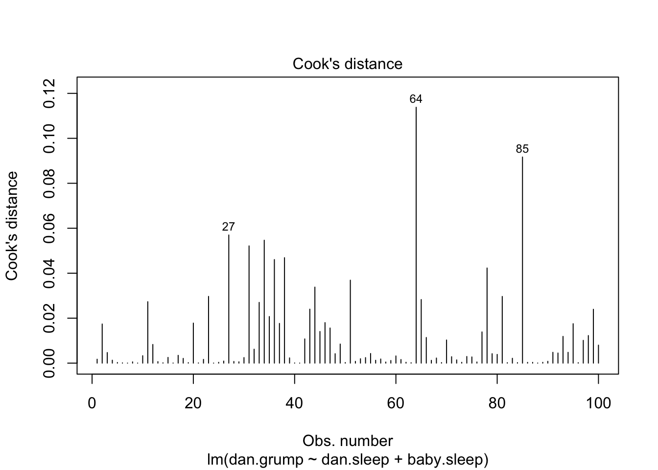
Figure 8.17: Cook’s distance for every observation. This is one of the standard regression plots produced by the plot() function when the input is a linear regression object. It is obtained by setting which=4
plot(x = regression.2, which = 5)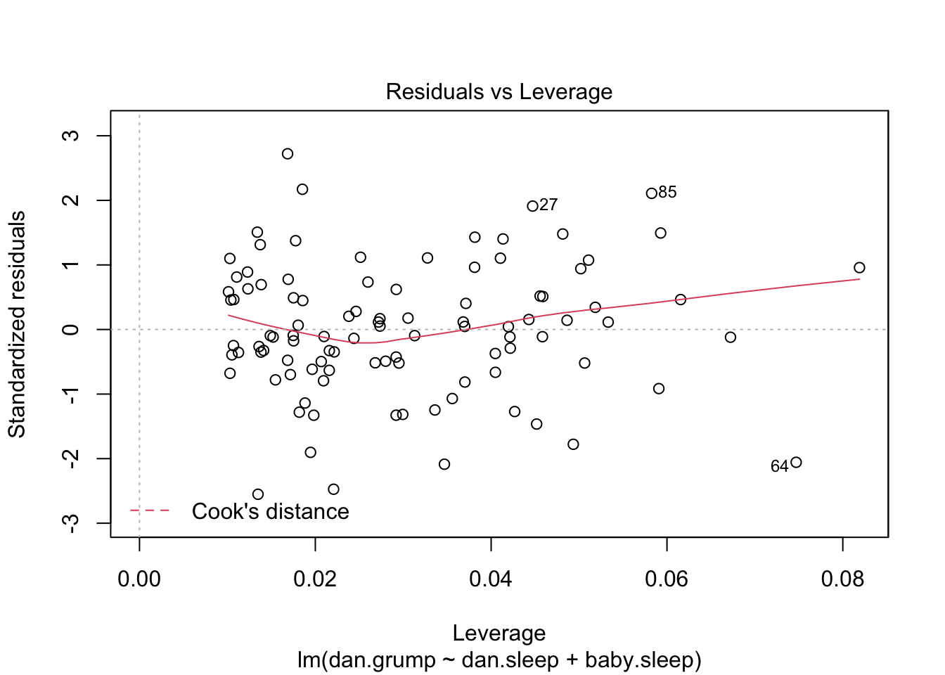
Figure 8.18: Residuals versus leverage. This is one of the standard regression plots produced by the plot() function when the input is a linear regression object. It is obtained by setting which=5.
An obvious question to ask next is, if you do have large values of Cook’s distance, what should you do? As always, there’s no hard and fast rules. Probably the first thing to do is to try running the regression with that point excluded and see what happens to the model performance and to the regression coefficients. If they really are substantially different, it’s time to start digging into your data set and your notes that you no doubt were scribbling as your ran your study; try to figure out why the point is so different. If you start to become convinced that this one data point is badly distorting your results, you might consider excluding it, but that’s less than ideal unless you have a solid explanation for why this particular case is qualitatively different from the others and therefore deserves to be handled separately.127 To give an example, let’s delete the observation from day 64, the observation with the largest Cook’s distance for the regression.2 model. We can do this using the subset argument:
lm( formula = dan.grump ~ dan.sleep + baby.sleep,  # same formula
     data = parenthood,       # same data frame...
     subset = -64             # ...but observation 64 is deleted
 )
##
## Call:
## lm(formula = dan.grump ~ dan.sleep + baby.sleep, data = parenthood,
## subset = -64)
##
## Coefficients:
## (Intercept) dan.sleep baby.sleep
## 126.3553 -8.8283 -0.1319As you can see, those regression coefficients have barely changed in comparison to the values we got earlier. In other words, we really don’t have any problem as far as anomalous data are concerned.
8.13.3 Checking the normality of the residuals
Like many of the statistical tools we’ve discussed in this book, regression models rely on a normality assumption. In this case, we assume that the residuals are normally distributed. Firstly, I firmly believe that it never hurts to draw an old fashioned histogram. The command I use might be something like this:
 hist( x = residuals( regression.2 ),   # data are the residuals
       xlab = "Value of residual",      # x-axis label
       main = "",                       # no title
       breaks = 20                      # lots of breaks
 )
The resulting plot is shown in Figure 8.19, and as you can see the plot looks pretty damn close to normal, almost unnaturally so.
Figure 8.19: A histogram of the (ordinary) residuals in the regression.2 model. These residuals look very close to being normally distributed, much moreso than is typically seen with real data. This shouldn’t surprise you… they aren’t real data, and they aren’t real residuals!
I could also run a Shapiro-Wilk test to check, using the shapiro.test() function; the \(W\) value of .99, at this sample size, is non-significant (\(p=.84\)), again suggesting that the normality assumption isn’t in any danger here. As a third measure, we might also want to draw a QQ-plot using the qqnorm() function. The QQ plot is an excellent one to draw, and so you might not be surprised to discover that it’s one of the regression plots that we can produce using the plot() function:
plot( x = regression.2, which = 2 ) # Figure @ref{fig:regressionplot2}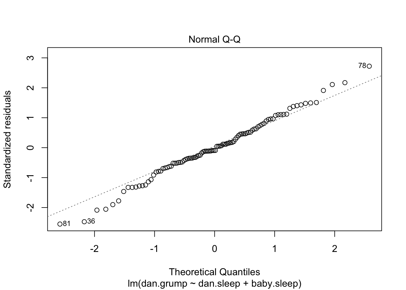
Figure 8.20: Plot of the theoretical quantiles according to the model, against the quantiles of the standardised residuals. This is one of the standard regression plots produced by the plot() function when the input is a linear regression object. It is obtained by setting which=2.
The output is shown in Figure 8.20, showing the standardised residuals plotted as a function of their theoretical quantiles according to the regression model. The fact that the output appends the model specification to the picture is nice.
8.13.4 Checking the linearity of the relationship
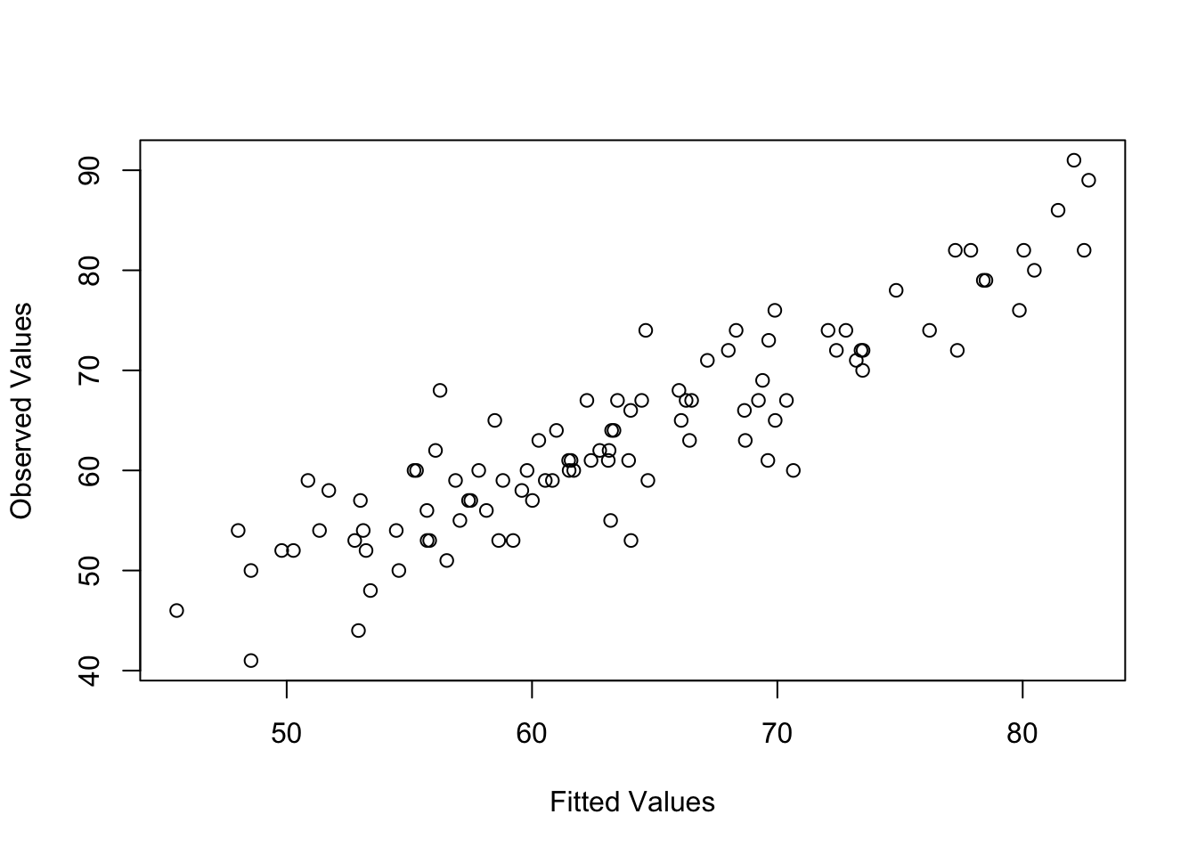
Figure 8.21: Plot of the fitted values against the observed values of the outcome variable. A straight line is what we’re hoping to see here. This looks pretty good, suggesting that there’s nothing grossly wrong, but there could be hidden subtle issues.
The third thing we might want to test is the linearity of the relationships between the predictors and the outcomes. There’s a few different things that you might want to do in order to check this. Firstly, it never hurts to just plot the relationship between the fitted values \(\hat{Y}_i\) and the observed values \(Y_i\) for the outcome variable, as illustrated in Figure 8.21. To draw this we could use the fitted.values() function to extract the \(\hat{Y_i}\) values in much the same way that we used the residuals() function to extract the \(\epsilon_i\) values. So the commands to draw this figure might look like this:
 yhat.2 <- fitted.values( object = regression.2 )
 plot( x = yhat.2,
       y = parenthood$dan.grump,
       xlab = "Fitted Values",
       ylab = "Observed Values"
 )
One of the reasons I like to draw these plots is that they give you a kind of “big picture view.” If this plot looks approximately linear, then we’re probably not doing too badly (though that’s not to say that there aren’t problems). However, if you can see big departures from linearity here, then it strongly suggests that you need to make some changes.
In any case, in order to get a more detailed picture it’s often more informative to look at the relationship between the fitted values and the residuals themselves. Again, we could draw this plot using low level commands, but there’s an easier way. Just plot() the regression model, and select which = 1:
plot(x = regression.2, which = 1)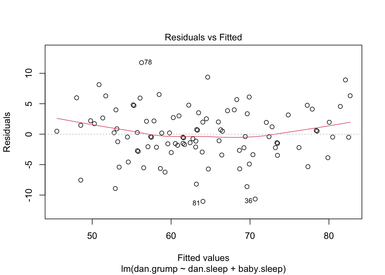
Figure 8.22: Plot of the fitted values against the residuals for regression.2, with a line showing the relationship between the two. If this is horizontal and straight, then we can feel reasonably confident that the “average residual” for all “fitted values” is more or less the same. This is one of the standard regression plots produced by the plot() function when the input is a linear regression object. It is obtained by setting which=1.
The output is shown in Figure 8.22. As you can see, not only does it draw the scatterplot showing the fitted value against the residuals, it also plots a line through the data that shows the relationship between the two. Ideally, this should be a straight, perfectly horizontal line. There’s some hint of curvature here, but it’s not clear whether or not we be concerned.
A somewhat more advanced version of the same plot is produced by the residualPlots() function in the car package. This function not only draws plots comparing the fitted values to the residuals, it does so for each individual predictor. The command is and the resulting plots are shown in Figure 8.23.
residualPlots( model = regression.2 ) 
Figure 8.23: Plot of the fitted values against the residuals for regression.2, along with similar plots for the two predictors individually. This plot is produced by the residualPlots() function in the car package. Note that it refers to the residuals as “Pearson residuals,” but in this context these are the same as ordinary residuals.
##            Test stat Pr(>|Test stat|)
## dan.sleep     2.1604          0.03323 *
## baby.sleep   -0.5445          0.58733
## Tukey test    2.1615          0.03066 *
## ---
## Signif. codes:  0 '***' 0.001 '**' 0.01 '*' 0.05 '.' 0.1 ' ' 1
Note that this function also reports the results of a bunch of curvature tests. For a predictor variable \(X\) in some regression model, this test is equivalent to adding a new predictor to the model corresponding to \(X^2\), and running the \(t\)-test on the \(b\) coefficient associated with this new predictor. If it comes up significant, it implies that there is some nonlinear relationship between the variable and the residuals.
The third line here is the Tukey test, which is basically the same test, except that instead of squaring one of the predictors and adding it to the model, you square the fitted-value. In any case, the fact that the curvature tests have come up significant is hinting that the curvature that we can see in Figures 8.22 and 8.23 is genuine;128 although it still bears remembering that the pattern in Figure 8.21 is pretty damn straight: in other words the deviations from linearity are pretty small, and probably not worth worrying about.
In a lot of cases, the solution to this problem (and many others) is to transform one or more of the variables.
Dave note: In my graduate training, I was taught to be conservative with variable transformations because they improve the statistical performance at the cost of interpretability. A significant relationship between a log-transformed Y and and X needs to be interpreted that way; you can no longer say you found a relationship between Y and X. For this reason, it may be preferable to suffer a decrease in statistical performance (possibly increasing the Type II error probability) rather than end up with a significant model that is challenging to interpret. In case you need it (and because Navarro (2018) said it was common), I will leave the following mention of the Box-Cox transform.
We discussed the basics of variable transformation in Sections ?? and (mathfunc), but I do want to make special note of one additional possibility that I didn’t mention earlier: the Box-Cox transform. The Box-Cox function is a fairly simple one, but it’s very widely used
\[
f(x,\lambda) = \frac{x^\lambda - 1}{\lambda}
\]
for all values of \(\lambda\) except \(\lambda = 0\). When \(\lambda = 0\) we just take the natural logarithm (i.e., \(\ln(x)\)). You can calculate it using the boxCox() function in the car package. Better yet, if what you’re trying to do is convert a data to normal, or as normal as possible, there’s the powerTransform() function in the car package that can estimate the best value of \(\lambda\). Variable transformation is another topic that deserves a fairly detailed treatment, but (again) due to deadline constraints, it will have to wait until a future version of this book.
8.13.5 Checking the homogeneity of variance
The regression models that we’ve talked about all make a homogeneity of variance assumption: the variance of the residuals is assumed to be constant. The “default” plot that R provides to help with doing this (which = 3 when using plot()) shows a plot of the square root of the size of the residual \(\sqrt{|\epsilon_i|}\), as a function of the fitted value \(\hat{Y}_i\). We can produce the plot using the following command,
plot(x = regression.2, which = 3)and the resulting plot is shown in Figure 8.24. Note that this plot actually uses the standardised residuals (i.e., converted to \(z\) scores) rather than the raw ones, but it’s immaterial from our point of view. What we’re looking to see here is a straight, horizontal line running through the middle of the plot.
Figure 8.24: Plot of the fitted values (model predictions) against the square root of the abs standardised residuals. This plot is used to diagnose violations of homogeneity of variance. If the variance is really constant, then the line through the middle should be horizontal and flat. This is one of the standard regression plots produced by the plot() function when the input is a linear regression object. It is obtained by setting which=3.
A slightly more formal approach is to run hypothesis tests. The car package provides a function called ncvTest() (non-constant variance test) that can be used for this purpose (R. D. Cook and Weisberg 1983). I won’t explain the details of how it works, other than to say that the idea is that what you do is run a regression to see if there is a relationship between the squared residuals \(\epsilon_i\) and the fitted values \(\hat{Y}_i\), or possibly to run a regression using all of the original predictors instead of just \(\hat{Y}_i\).129 Using the default settings, the ncvTest() looks for a relationship between \(\hat{Y}_i\) and the variance of the residuals, making it a straightforward analogue of Figure 8.24. So if we run it for our model,
ncvTest( regression.2 )## Non-constant Variance Score Test
## Variance formula: ~ fitted.values
## Chisquare = 0.09317511, Df = 1, p = 0.76018We see that our original impression was right: there’s no violations of homogeneity of variance in this data.
Dave note: According to B. H. Cohen (2013), ANOVA is robust to violations of homogeneity of variance so long as sample sizes are roughly equal. If your model is comparing groups, and those groups are unequal such that one group is 1.5x or more of another, then you may need to address your violation of homogeneity of variance. In a design with balanced groups, I would not go to the trouble of the correction described next. I leave it included here in case you ever need it.
It’s a bit beyond the scope of this chapter to talk too much about how to deal with violations of homogeneity of variance, but I’ll give you a quick sense of what you need to consider. The main thing to worry about, if homogeneity of variance is violated, is that the standard error estimates associated with the regression coefficients are no longer entirely reliable, and so your \(t\) tests for the coefficients aren’t quite right either. A simple fix to the problem is to make use of a “heteroscedasticity corrected covariance matrix” when estimating the standard errors. These are often called sandwich estimators, for reasons that only make sense if you understand the maths at a low level130 have implemented as the default in the hccm() function is a tweak on this, proposed by Long and Ervin (2000). This version uses \(\Sigma = \mbox{diag}(\epsilon_i^2/(1-h_i^2))\), where \(h_i\) is the \(i\)th hat value. Gosh, regression is fun, isn’t it?] You don’t need to understand what this means (not for an introductory class), but it might help to note that there’s a hccm() function in the car() package that does it. Better yet, you don’t even need to use it. You can use the coeftest() function in the lmtest package, but you need the car package loaded:
library(lmtest)
library(car)
coeftest( regression.2, vcov= hccm )
##
## t test of coefficients:
##
## Estimate Std. Error t value Pr(>|t|)
## (Intercept) 125.965566 3.247285 38.7910 <2e-16 ***
## dan.sleep -8.950250 0.615820 -14.5339 <2e-16 ***
## baby.sleep 0.010524 0.291565 0.0361 0.9713
## ---
## Signif. codes: 0 '***' 0.001 '**' 0.01 '*' 0.05 '.' 0.1 ' ' 1Not surprisingly, these \(t\) tests are pretty much identical to the ones that we saw when we used the summary(regression.2) command earlier; because the homogeneity of variance assumption wasn’t violated. But if it had been, we might have seen some more substantial differences.
8.13.6 Checking for collinearity
The last kind of regression diagnostic that I’m going to discuss in this chapter is the use of variance inflation factors (VIFs), which are useful for determining whether or not the predictors in your regression model are too highly correlated with each other. There is a variance inflation factor associated with each predictor \(X_k\) in the model, and the formula for the \(k\)-th VIF is:
\[
\mbox{VIF}_k = \frac{1}{1-{R^2_{(-k)}}}
\]
where \(R^2_{(-k)}\) refers to \(R\)-squared value you would get if you ran a regression using \(X_k\) as the outcome variable, and all the other \(X\) variables as the predictors. The idea here is that \(R^2_{(-k)}\) is a very good measure of the extent to which \(X_k\) is correlated with all the other variables in the model. Better yet, the square root of the VIF is pretty interpretable: it tells you how much wider the confidence interval for the corresponding coefficient \(b_k\) is, relative to what you would have expected if the predictors are all nice and uncorrelated with one another. If you’ve only got two predictors, the VIF values are always going to be the same, as we can see if we use the vif() function (car package)…
vif( mod = regression.2 )## dan.sleep baby.sleep
## 1.651038 1.651038And since the square root of 1.65 is 1.28, we see that the correlation between our two predictors isn’t causing much of a problem.
To give a sense of how we could end up with a model that has bigger collinearity problems, suppose I were to run a much less interesting regression model, in which I tried to predict the day on which the data were collected, as a function of all the other variables in the data set. To see why this would be a bit of a problem, let’s have a look at the correlation matrix for all four variables:
cor( parenthood )## dan.sleep baby.sleep dan.grump day
## dan.sleep 1.00000000 0.62794934 -0.90338404 -0.09840768
## baby.sleep 0.62794934 1.00000000 -0.56596373 -0.01043394
## dan.grump -0.90338404 -0.56596373 1.00000000 0.07647926
## day -0.09840768 -0.01043394 0.07647926 1.00000000We have some fairly large correlations between some of our predictor variables! When we run the regression model and look at the VIF values, we see that the collinearity is causing a lot of uncertainty about the coefficients. First, run the regression…
regression.3 <- lm( day ~ baby.sleep + dan.sleep + dan.grump, parenthood )and second, look at the VIFs…
vif( regression.3 )## baby.sleep dan.sleep dan.grump
## 1.651064 6.102337 5.437903Yep, that’s some mighty fine collinearity you’ve got there.
Dave note: A VIF cutoff of 4 is commonly used, where VIF <= 4 is not concerning, but VIF > 4 suggests redudnancy of variables in the model. The statistical solution would be to eliminate redundant variables from the model.
8.14 Model selection
One fairly major problem that remains is the problem of “model selection.” That is, if we have a data set that contains several variables, which ones should we include as predictors, and which ones should we not include? In other words, we have a problem of variable selection. In general, model selection is a complex business, but it’s made somewhat simpler if we restrict ourselves to the problem of choosing a subset of the variables that ought to be included in the model. Nevertheless, I’m not going to try covering even this reduced topic in a lot of detail. Instead, I’ll talk about two broad principles that you need to think about; and then discuss one concrete tool that R provides to help you select a subset of variables to include in your model. Firstly, the two principles:
- It’s nice to have an actual substantive basis for your choices. That is, in a lot of situations you the researcher have good reasons to pick out a smallish number of possible regression models that are of theoretical interest; these models will have a sensible interpretation in the context of your field. Never discount the importance of this. Statistics serves the scientific process, not the other way around.
- To the extent that your choices rely on statistical inference, there is a trade off between simplicity and goodness of fit. As you add more predictors to the model, you make it more complex; each predictor adds a new free parameter (i.e., a new regression coefficient), and each new parameter increases the model’s capacity to “absorb” random variations. So the goodness of fit (e.g., \(R^2\)) continues to rise as you add more predictors no matter what. If you want your model to be able to generalise well to new observations, you need to avoid throwing in too many variables.
This latter principle is often referred to as Ockham’s razor, and is often summarised in terms of the following pithy saying: do not multiply entities beyond necessity. We also calls this parsimony. In this context, it means: don’t chuck in a bunch of largely irrelevant predictors just to boost your \(R^2\). Hm. Yeah, the original was better.
In any case, what we need is an actual mathematical criterion that will implement the qualitative principle behind Ockham’s razor in the context of selecting a regression model. As it turns out there are several possibilities. The one that I’ll talk about is the Akaike information criterion [AIC; Akaike (1974)] simply because it’s the default one used in the R function step(). In the context of a linear regression model (and ignoring terms that don’t depend on the model in any way!), the AIC for a model that has \(K\) predictor variables plus an intercept is:131
\[
\mbox{AIC} = \displaystyle\frac{\mbox{SS}_{res}}{\hat{\sigma}}^2+ 2K
\]
The smaller the AIC value, the better the model performance is. If we ignore the low level details, it’s fairly obvious what the AIC does: on the left we have a term that increases as the model predictions get worse; on the right we have a term that increases as the model complexity increases. The best model is the one that fits the data well (low residuals; left hand side) using as few predictors as possible (low \(K\); right hand side). In short, this is a simple implementation of Ockham’s razor.
Dave note: Please consider the following sections to have a big “Warning!” sign next to them when used in confirmatory research. They are inherently exploratory techniques. One assumption common to all automated model selection strategies is that they assume that your sample data are perfect representations of their population distributions. The computer is effectively testing many possible models and picking the one that fits best. The resulting model is always exploratory, tentative, and highly dependent on the sample. It would need to be tested in a confirmatory study. It would be highly inappropriate and misleading to present a computer-generated model as if it was developed a priori or without explaining the process used to create the model.
8.14.1 Backward elimination
Okay, let’s have a look at the step() function at work. In this example I’ll keep it simple and use only the basic backward elimination approach. That is, start with the complete regression model, including all possible predictors. Then, at each “step” we try all possible ways of removing one of the variables, and whichever of these is best (in terms of lowest AIC value) is accepted. This becomes our new regression model; and we then try all possible deletions from the new model, again choosing the option with lowest AIC. This process continues until we end up with a model that has a lower AIC value than any of the other possible models that you could produce by deleting one of its predictors. Let’s see this in action. First, I need to define the model from which the process starts.
full.model <- lm( formula = dan.grump ~ dan.sleep + baby.sleep + day,
                   data = parenthood
 )
That’s nothing terribly new: yet another regression. Booooring. Still, we do need to do it: the object argument to the step() function will be this regression model. With this in mind, I would call the step() function using the following command:
 step( object = full.model,     # start at the full model
       direction = "backward"   # allow it remove predictors but not add them
 )
## Start: AIC=299.08
## dan.grump ~ dan.sleep + baby.sleep + day
##
## Df Sum of Sq RSS AIC
## - baby.sleep 1 0.1 1837.2 297.08
## - day 1 1.6 1838.7 297.16
## <none> 1837.1 299.08
## - dan.sleep 1 4909.0 6746.1 427.15
##
## Step: AIC=297.08
## dan.grump ~ dan.sleep + day
##
## Df Sum of Sq RSS AIC
## - day 1 1.6 1838.7 295.17
## <none> 1837.2 297.08
## - dan.sleep 1 8103.0 9940.1 463.92
##
## Step: AIC=295.17
## dan.grump ~ dan.sleep
##
## Df Sum of Sq RSS AIC
## <none> 1838.7 295.17
## - dan.sleep 1 8159.9 9998.6 462.50##
## Call:
## lm(formula = dan.grump ~ dan.sleep, data = parenthood)
##
## Coefficients:
## (Intercept) dan.sleep
## 125.956 -8.937although in practice I didn’t need to specify direction because "backward" is the default. The output is somewhat lengthy, so I’ll go through it slowly. Firstly, the output reports the AIC value for the current best model:
Start:  AIC=299.08
dan.grump ~ dan.sleep + baby.sleep + day
That’s our starting point. Since small AIC values are good, we want to see if we can get a value smaller than 299.08 by deleting one of those three predictors. So what R does is try all three possibilities, calculate the AIC values for each one, and then print out a short table with the results:
             Df Sum of Sq    RSS    AIC
- baby.sleep  1       0.1 1837.2 297.08
- day         1       1.6 1838.7 297.16
<none>                    1837.1 299.08
- dan.sleep   1    4909.0 6746.1 427.15
To read this table, it helps to note that the text in the left hand column is telling you what change R made to the regression model. So the line that reads <none> is the actual model we started with, and you can see on the right hand side that this still corresponds to an AIC value of 299.08 (obviously). The other three rows in the table correspond to the other three models that it looked at: it tried removing the baby.sleep variable, which is indicated by - baby.sleep, and this produced an AIC value of 297.08. That was the best of the three moves, so it’s at the top of the table. So, this move is accepted, and now we start again. There are two predictors left in the model, dan.sleep and day, so it tries deleting those:
Step:  AIC=297.08
dan.grump ~ dan.sleep + day

            Df Sum of Sq    RSS    AIC
- day        1       1.6 1838.7 295.17
<none>                   1837.2 297.08
- dan.sleep  1    8103.0 9940.1 463.92
Okay, so what we can see is that removing the day variable lowers the AIC value from 297.08 to 295.17. So R decides to keep that change too, and moves on:
Step:  AIC=295.17
dan.grump ~ dan.sleep

            Df Sum of Sq    RSS    AIC
<none>                   1838.7 295.17
- dan.sleep  1    8159.9 9998.6 462.50
This time around, there’s no further deletions that can actually improve the AIC value. So the step() function stops, and prints out the result of the best regression model it could find:
Call:
lm(formula = dan.grump ~ dan.sleep, data = parenthood)

Coefficients:
(Intercept)    dan.sleep
    125.956       -8.937
which is (perhaps not all that surprisingly) the regression.1 model that we started with at the beginning of the chapter.
8.14.2 Forward selection
As an alternative, you can also try forward selection. This time around we start with the smallest possible model as our start point, and only consider the possible additions to the model. However, there’s one complication: you also need to tell step() what the largest possible model you’re willing to entertain is, using the scope argument. The simplest usage is like this:
 null.model <- lm( dan.grump ~ 1, parenthood )   # intercept only.
 step( object = null.model,     # start with null.model
       direction = "forward",   # only consider "addition" moves
       scope =  dan.grump ~ dan.sleep + baby.sleep + day  # largest model allowed
 )
## Start: AIC=462.5
## dan.grump ~ 1
##
## Df Sum of Sq RSS AIC
## + dan.sleep 1 8159.9 1838.7 295.17
## + baby.sleep 1 3202.7 6795.9 425.89
## <none> 9998.6 462.50
## + day 1 58.5 9940.1 463.92
##
## Step: AIC=295.17
## dan.grump ~ dan.sleep
##
## Df Sum of Sq RSS AIC
## <none> 1838.7 295.17
## + day 1 1.55760 1837.2 297.08
## + baby.sleep 1 0.02858 1838.7 297.16##
## Call:
## lm(formula = dan.grump ~ dan.sleep, data = parenthood)
##
## Coefficients:
## (Intercept) dan.sleep
## 125.956 -8.937If I do this, the output takes on a similar form, but now it only considers addition (+) moves rather than deletion (-) moves:
Start:  AIC=462.5
dan.grump ~ 1

             Df Sum of Sq    RSS    AIC
+ dan.sleep   1    8159.9 1838.7 295.17
+ baby.sleep  1    3202.7 6795.9 425.89
<none>                    9998.6 462.50
+ day         1      58.5 9940.1 463.92

Step:  AIC=295.17
dan.grump ~ dan.sleep

             Df Sum of Sq    RSS    AIC
<none>                    1838.7 295.17
+ day         1   1.55760 1837.2 297.08
+ baby.sleep  1   0.02858 1838.7 297.16

Call:
lm(formula = dan.grump ~ dan.sleep, data = parenthood)

Coefficients:
(Intercept)    dan.sleep
    125.956       -8.937
As you can see, it’s found the same model. In general though, forward and backward selection don’t always have to end up in the same place.
8.14.3 A caveat
Automated variable selection methods are seductive things, especially when they’re bundled up in (fairly) simple functions like step(). They provide an element of objectivity to your model selection, and that’s kind of nice. Unfortunately, they’re sometimes used as an excuse for thoughtlessness. No longer do you have to think carefully about which predictors to add to the model and what the theoretical basis for their inclusion might be… everything is solved by the magic of AIC. And if we start throwing around phrases like Ockham’s razor, well, it sounds like everything is wrapped up in a nice neat little package that no-one can argue with.
Or, perhaps not. Firstly, there’s very little agreement on what counts as an appropriate model selection criterion. When I was taught backward elimination as an undergraduate, we used \(F\)-tests to do it, because that was the default method used by the software. The default in the step() function is AIC, and since this is an introductory text that’s the only method I’ve described, but the AIC is hardly the Word of the Gods of Statistics. It’s an approximation, derived under certain assumptions, and it’s guaranteed to work only for large samples when those assumptions are met. Alter those assumptions and you get a different criterion, like the BIC for instance. Take a different approach again and you get the NML criterion. Decide that you’re a Bayesian and you get model selection based on posterior odds ratios. Then there are a bunch of regression specific tools that I haven’t mentioned. And so on. All of these different methods have strengths and weaknesses, and some are easier to calculate than others (AIC is probably the easiest of the lot, which might account for its popularity). Almost all of them produce the same answers when the answer is “obvious” but there’s a fair amount of disagreement when the model selection problem becomes hard.
What does this mean in practice? Well, you could go and spend several years teaching yourself the theory of model selection, learning all the ins and outs of it; so that you could finally decide on what you personally think the right thing to do is. Speaking as someone who actually did that, I wouldn’t recommend it: you’ll probably come out the other side even more confused than when you started. A better strategy is to show a bit of common sense… if you’re staring at the results of a step() procedure, and the model that makes sense is close to having the smallest AIC, but is narrowly defeated by a model that doesn’t make any sense… trust your instincts. Statistical model selection is an inexact tool, and as I said at the beginning, interpretability matters.
8.14.4 Comparing two regression models
An alternative to using automated model selection procedures is for the researcher to explicitly select two or more regression models to compare to each other. You can do this in a few different ways, depending on what research question you’re trying to answer. Suppose we want to know whether or not the amount of sleep that my son got has any relationship to my grumpiness, over and above what we might expect from the amount of sleep that I got. We also want to make sure that the day on which we took the measurement has no influence on the relationship. That is, we’re interested in the relationship between baby.sleep and dan.grump, and from that perspective dan.sleep and day are nuisance variable or covariates that we want to control for. In this situation, what we would like to know is whether dan.grump ~ dan.sleep + day + baby.sleep (which I’ll call Model 1, or M1) is a better regression model for these data than dan.grump ~ dan.sleep + day (which I’ll call Model 0, or M0). There are two different ways we can compare these two models, one based on a model selection criterion like AIC, and the other based on an explicit hypothesis test. I’ll show you the AIC based approach first because it’s simpler, and follows naturally from the step() function that we saw in the last section. The first thing I need to do is actually run the regressions:
M0 <- lm( dan.grump ~ dan.sleep + day, parenthood )
M1 <- lm( dan.grump ~ dan.sleep + day + baby.sleep, parenthood )
Now that I have my regression models, I could use the summary() function to run various hypothesis tests and other useful statistics, just as we have discussed throughout this chapter. However, since the current focus on model comparison, I’ll skip this step and go straight to the AIC calculations. Conveniently, the AIC() function in R lets you input several regression models, and it will spit out the AIC values for each of them:132
AIC( M0, M1 )## df AIC
## M0 4 582.8681
## M1 5 584.8646Since Model 0 has the smaller AIC value, it is judged to be the better model for these data.
A somewhat different approach to the problem comes out of the hypothesis testing framework. Suppose you have two regression models, where one of them (Model 0) contains a subset of the predictors from the other one (Model 1). That is, Model 1 contains all of the predictors included in Model 0, plus one or more additional predictors. When this happens we say that Model 0 is nested within Model 1, or possibly that Model 0 is a submodel of Model 1. Regardless of the terminology what this means is that we can think of Model 0 as a null hypothesis and Model 1 as an alternative hypothesis. And in fact we can construct an \(F\) test for this in a fairly straightforward fashion. We can fit both models to the data and obtain a residual sum of squares for both models. I’ll denote these as SS\(_{res}^{(0)}\) and SS\(_{res}^{(1)}\) respectively. The superscripting here just indicates which model we’re talking about. Then our \(F\) statistic is \[ F = \frac{(\mbox{SS}_{res}^{(0)} - \mbox{SS}_{res}^{(1)})/k}{(\mbox{SS}_{res}^{(1)})/(N-p-1)} \] where \(N\) is the number of observations, \(p\) is the number of predictors in the full model (not including the intercept), and \(k\) is the difference in the number of parameters between the two models.133 The degrees of freedom here are \(k\) and \(N-p-1\). Note that it’s often more convenient to think about the difference between those two SS values as a sum of squares in its own right. That is: \[ \mbox{SS}_\Delta = \mbox{SS}_{res}^{(0)} - \mbox{SS}_{res}^{(1)} \] The reason why this his helpful is that we can express \(\mbox{SS}_\Delta\) a measure of the extent to which the two models make different predictions about the the outcome variable. Specifically: \[ \mbox{SS}_\Delta = \sum_{i} \left( \hat{y}_i^{(1)} - \hat{y}_i^{(0)} \right)^2 \] where \(\hat{y}_i^{(0)}\) is the fitted value for \(y_i\) according to model \(M_0\) and \(\hat{y}_i^{(1)}\) is the is the fitted value for \(y_i\) according to model \(M_1\).
Okay, so that’s the hypothesis test that we use to compare two regression models to one another. Now, how do we do it in R? The answer is to use the anova() function. All we have to do is input the two models that we want to compare (null model first):
anova( M0, M1 )## Analysis of Variance Table
##
## Model 1: dan.grump ~ dan.sleep + day
## Model 2: dan.grump ~ dan.sleep + day + baby.sleep
## Res.Df RSS Df Sum of Sq F Pr(>F)
## 1 97 1837.2
## 2 96 1837.1 1 0.063688 0.0033 0.9541Note that, just like we saw with the output from the step() function, R has used the acronym RSS to refer to the residual sum of squares from each model. That is, RSS in this output corresponds to SS\(_{res}\) in the formula above. Since we have \(p>.05\) we retain the null hypothesis (M0). This approach to regression, in which we add all of our covariates into a null model, and then add the variables of interest into an alternative model, and then compare the two models in hypothesis testing framework, is often referred to as hierarchical regression.
8.15 Practical Issues in Correlation and Regression
Text by David Schuster
8.15.1 Correlation is not causation
Remember that causality can be inferred when the cause comes before the effect, a relationship is shown between cause and effect, and we can find no other plausible explanations for the effect other than the cause. Our statistical analysis (regardless of which GLM analysis is used) can help with the middle criterion; we can use statistics to provide evidence of a relationship between two variables. However, no statistical analysis can, by itself, allow us to make causal inferences. Our best tool for making causal inferences is an experimental design. Designs that are quasi-experimental or non-experimental will not let us make inferences about causality.
In this statement, correlation refers to the evidence of a relationship between two variables. Therefore, it would be a bit clearer if it was, “quasi- and non-experimental research designs are not causation.” but I suppose the original version is catchier.
8.15.2 Interpreting NHST in Big Data
Sample size must be sufficiently large to detect a linear relationship. Larger samples increase power. Power is especially important when your measures are not reliable or when there is a weak linear relationship you are trying to find evidence for. You can also have too large of a sample. Extremely large samples with small effect sizes will be significant because it is assumed that your sample is an almost perfect representation of the population. Thus, even the tiniest effects will be significant. Take care to examine effect size and sample size when conducting NHST for correlations. Besides issues of power, a sufficiently large sample size is important to increase the stability of your estimates of the strength and direction of the correlation.
8.15.3 Outliers
If either of your variables includes an outlier, it will reduce the strength of your correlation. Because of this, you want to consider whether the extreme score belongs as part of your data set. The most common cause of an outlier in real world data is a mistake during data entry. As previously stated, being an outlier is not generally, itself, enough criteria for a researcher to exclude a case from a sample without concern that the sample will be biased.
8.15.4 Restriction of Range
When scores that are very high or very low on the IV, range restriction can occur. Range restriction lowers the strength of the correlation. Floor and ceiling effects can cause range restriction. Imagine a very easy math test as a measure of math skill. Students at the highest levels of math ability will score 100% on the test. Because the test does not measure past 100%, some information is lost about individuals who could have scored higher than 100% if it were possible. This is an example of a ceiling effect. Similarly, a very challenging test can result in 0% scores with the test similarly lacking diagnosticity between low-scorers at the bottom of the distribution.
This can be illustrated easily by drawing scatterplots. First, we start with two variables with a high correlation:
# Two variables with a known correlation of r = .9.
x <- c(-0.169062295,0.053822267,0.527217327,0.07727407,0.722027061,-0.28132826,-0.893490299,0.79516792,0.175189753,-0.733235739)
y <- c(0.648162835, 0.964985264,1.160828115,1.403311403,1.692166183,0.26407813,-0.393116812,2.110632623,1.684217475,0.464734783)

cor(x, y) # r =.9
## [1] 0.9plot(x,y,xlab="x",ylab="y") # generate a scatterplot and label the axes
abline(reg = lm(y ~ x)) # draw the line of best fit for the regression equation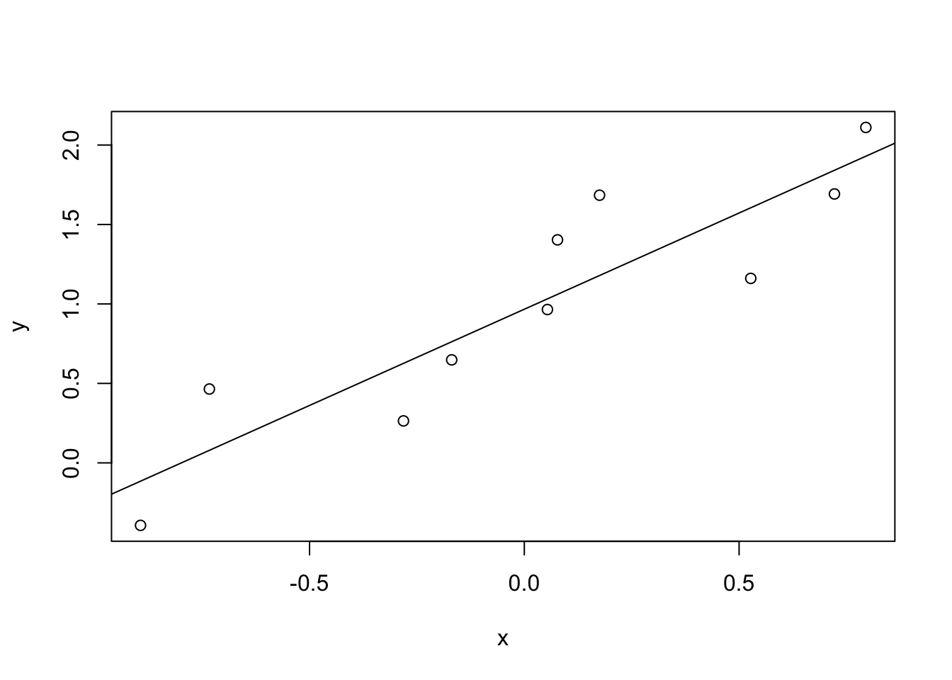 We will create a floor effect by saying that 0 is now the lowest possible score on this measure. Any negative values become zero in our new variable,
 x_floor. Notice the change in the line, fit, and \(r\).
# Two variables with a known correlation of r = .9, changing all scores where x < 0 to 0.

x_floor <- c(0,0.053822267,0.527217327,0.07727407,0.722027061,0,0,0.79516792,0.175189753,0)
y <- c(0.648162835, 0.964985264,1.160828115,1.403311403,1.692166183,0.26407813,-0.393116812,2.110632623,1.684217475,0.464734783)

cor(x_floor, y) # Correlation r = .74
## [1] 0.7353465plot(x_floor,y,xlab="x",ylab="y") # generate a scatterplot and label the axes
abline(reg = lm(y ~ x)) # draw the line of best fit for the regression equation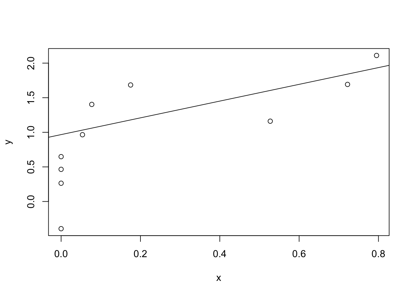 A floor/ceiling effect can cause this problem but is not the only cause. Simply excluding low scores can have this effect. Next, we will eliminate any case with a negative value of x instead of removing it. Notice that although no scores are changed, the correlation is weaker. Whenever we start with a linear relationship and “zoom in” to a portion of it, the subset of the data will be a weaker correlation than the overall relationship. Therefore, restriction of range can result in a weaker correlation.
# Two variables with a known correlation of r = .9, excluding all scores where x < 0.
x <- c(0.053822267,0.527217327,0.07727407,0.722027061,0.79516792,0.175189753)
y <- c(0.964985264,1.160828115,1.403311403,1.692166183,2.110632623,1.684217475)

cor(x, y) # r =.9
## [1] 0.6347461plot(x,y,xlab="x",ylab="y") # generate a scatterplot and label the axes
abline(reg = lm(y ~ x)) # draw the line of best fit for the regression equation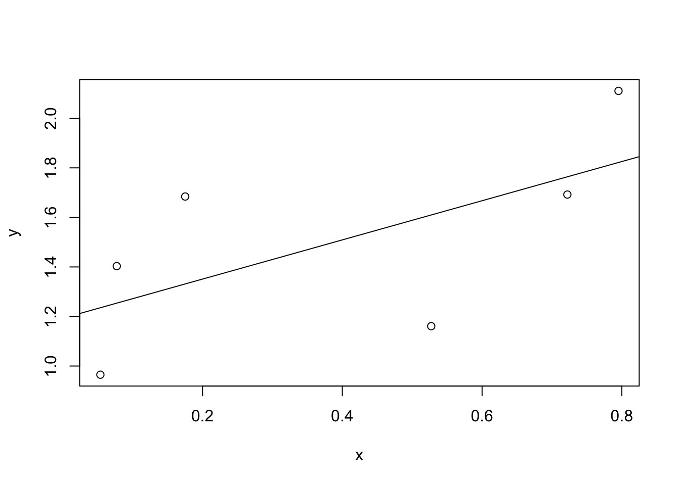
8.15.5 Regression Toward the Mean
Galton (1886) came up with the concept of regression toward mediocrity which he applied to heredity. This phrase is designed to be pejorative (suggesting that inheritance is losing something of value) and Galton’s explanation for why it mattered was eugenics (see also the Video: Eugenics and Francis Galton - 13 min on this topic). We now understand that it has nothing to do with heredity and more to do with the properties of the mean. In present use, regression toward the mean refers to mistaking an extreme score as evidence of an effect. Imagine you are playing a challenging level of a video game. After a lot of practice, your score tends to hover around 10,000 points. Sometimes you score a bit more, sometimes a bit less, but if you were to have all the data available, you would find a mean of 10,000 points. Regression toward the mean would occur if you played this level one day and scored 20,000 points, then concluded that you were a video game superstar, left school, and went to be a pro gamer. Playing the level again, you are dismayed that your score has fallen back to around 10,000 points. What happened? How could you gain and lose such an ability? What is happening is that your performance has variability, and it is unlikely but possible to observe an extreme score. Researchers need to be mindful that extreme events will tend to be less extreme with repeated sampling.
8.15.6 Report Effect Size
Interpretation of the correlation coefficient \(r\) (or \(R^2\)). The statistic \(r\) measures both strength (i.e., it is the measure of effect size) and direction of a correlation. A strong correlation means that the data points of the scatterplot lie close to the line. When you report a correlation, give the proper interpretation of its effect size. Also note that, depending on the research question, small effect sizes can be important and meaningful.
How do you interpret the direction of an effect in multiple regression? \(R^2\) will always be positive. The answer is to look at the direction of the coefficients. If they are positive, it suggests a positive relationship with the DV. If negative, it suggests a negative relationship with the DV.
8.15.6.1 Interpretation of \(\eta^2\) and \(r^2\) (Cohen, 1988)
These are reference points, not firm cutoffs. For example, .056 is a medium effect size.
| Effect Size | Interpretation |
|---|---|
| \(\eta^2 = r^2 = .01\) | Small effect |
| \(\eta^2 = r^2 = .06\) | Medium effect |
| \(\eta^2 = r^2 = .14\) | Large effect |
8.15.6.2 Interpretation of \(r\) (Cohen, 1988; Note: This is not \(r^2\))
These are reference points, not firm cutoffs. For example, .056 is a medium effect size.
| Effect Size | Interpretation |
|---|---|
| \(r\pm.10\) Small effe | ct |
| \(r\pm.30\) Medium e | ffect |
| \(r\pm.50\) Large effe | ct |
8.15.7 What are Degrees of Freedom, again?
This is more of a footnote. The calculation of variance is a fraction. The numerator of the fraction is a sum of squared deviations. The denominator of the fraction is degrees of freedom. I find it helpful to think about degrees of freedom in any of three ways (pick which makes the most sense to you):
Degrees of freedom (df), are the number of values free to vary given some constraint. The calculation of a mean has \(N - 1\) degrees of freedom because if the mean is known and \(N - 1\) of the values are known, then the last value is defined. Thus, only \(N - 1\) values are free to vary. This is my least favorite explanation.
Degrees of freedom (df) are the number of values that provide information about variability. If you know only your score on the last exam, you could use that as an estimate of the class mean, but you would have no way of estimating variability of test scores in class (df = 0). If you know your score and another classmate’s, you can now estimate variability, albeit crudely (df = 1). With your score and seven others, you can make a better estimate of the variability in the class (df = 7). This is my favorite definition and it comes from B. H. Cohen (2013).
Because degrees of freedom (df) are directly related to sample size, think of degrees of freedom as sample size. I think of the sum of squared deviations as adding up all of the variation that has been observed, and degrees of freedom as being the sample size. Therefore, I think of variance as being roughly the variation per unit, or the average variation. This is the least precise.
8.16 Summary
- Basic ideas in linear regression and how regression models are estimated (Sections 8.5 and 8.6).
- Multiple linear regression (Section 8.7).
- Measuring the overall performance of a regression model using \(R^2\) (Section 8.8)
- Hypothesis tests for regression models (Section 8.9)
- Calculating confidence intervals for regression coefficients, and standardised coefficients (Section 8.11)
- The assumptions of regression (Section 8.12) and how to check them (Section 8.13)
- Selecting a regression model (Section 8.14)
References
Actually, even that table is more than I’d bother with. In practice most people pick one measure of central tendency, and one measure of variability only.↩︎
Just like we saw with the variance and the standard deviation, in practice we divide by \(N-1\) rather than \(N\).↩︎
This is an oversimplification, but it’ll do for our purposes.↩︎
If you are reading this after having already completed Chapter 5 you might be wondering about hypothesis tests for correlations. R has a function called
cor.test()that runs a hypothesis test for a single correlation, and thepsychpackage contains a version calledcorr.test()that can run tests for every correlation in a correlation matrix; hypothesis tests for correlations are discussed in more detail in Section 8.10.↩︎An alternative usage of
cor()is to correlate one set of variables with another subset of variables. IfXandYare both data frames with the same number of rows, thencor(x = X, y = Y)will produce a correlation matrix that correlates all variables inXwith all variables inY.↩︎It’s worth noting that, even though we have missing data for each of these variables, the output doesn’t contain any
NAvalues. This is because, whiledescribe()also has anna.rmargument, the default value for this function isna.rm = TRUE.↩︎The technical term here is “missing completely at random” (often written MCAR for short). Makes sense, I suppose, but it does sound ungrammatical to me.↩︎
The \(\epsilon\) symbol is the Greek letter epsilon. It’s traditional to use \(\epsilon_i\) or \(e_i\) to denote a residual.↩︎
Or at least, I’m assuming that it doesn’t help most people. But on the off chance that someone reading this is a proper kung fu master of linear algebra (and to be fair, I always have a few of these people in my intro stats class), it will help you to know that the solution to the estimation problem turns out to be \(\hat{b} = (X^TX)^{-1} X^T y\), where \(\hat{b}\) is a vector containing the estimated regression coefficients, \(X\) is the “design matrix” that contains the predictor variables (plus an additional column containing all ones; strictly \(X\) is a matrix of the regressors, but I haven’t discussed the distinction yet), and \(y\) is a vector containing the outcome variable. For everyone else, this isn’t exactly helpful, and can be downright scary. However, since quite a few things in linear regression can be written in linear algebra terms, you’ll see a bunch of footnotes like this one in this chapter. If you can follow the maths in them, great. If not, ignore it.↩︎
And by “sometimes” I mean “almost never.” In practice everyone just calls it “\(R\)-squared.”↩︎
Note that, although R has done multiple tests here, it hasn’t done a Bonferroni correction or anything. These are standard one-sample \(t\)-tests with a two-sided alternative. If you want to make corrections for multiple tests, you need to do that yourself.↩︎
You can change the kind of correction it applies by specifying the
p.adjust.methodargument.↩︎Strictly, you standardise all the regressors: that is, every “thing” that has a regression coefficient associated with it in the model. For the regression models that I’ve talked about so far, each predictor variable maps onto exactly one regressor, and vice versa. However, that’s not actually true in general: we’ll see some examples of this in Chapter ??. But for now, we don’t need to care too much about this distinction.↩︎
Or have no hope, as the case may be.↩︎
Again, for the linear algebra fanatics: the “hat matrix” is defined to be that matrix \(H\) that converts the vector of observed values \(y\) into a vector of fitted values \(\hat{y}\), such that \(\hat{y} = H y\). The name comes from the fact that this is the matrix that “puts a hat on \(y\).” The hat value of the \(i\)-th observation is the \(i\)-th diagonal element of this matrix (so technically I should be writing it as \(h_{ii}\) rather than \(h_{i}\)). Oh, and in case you care, here’s how it’s calculated: \(H = X(X^TX)^{-1} X^T\). Pretty, isn’t it?↩︎
Though special mention should be made of the
influenceIndexPlot()andinfluencePlot()functions in thecarpackage. These produce somewhat more detailed pictures than the default plots that I’ve shown here. There’s also anoutlierTest()function that tests to see if any of the Studentised residuals are significantly larger than would be expected by chance.↩︎An alternative is to run a “robust regression”; I’ll discuss robust regression in a later version of this book.↩︎
And, if you take the time to check the
residualPlots()forregression.1, it’s pretty clear that this isn’t some wacky distortion being caused by the fact thatbaby.sleepis a useless predictor variable. It’s an actual nonlinearity in the relationship betweendan.sleepanddan.grump.↩︎Note that the underlying mechanics of the test aren’t the same as the ones I’ve described for regressions; the goodness of fit is assessed using what’s known as a score-test not an \(F\)-test, and the test statistic is (approximately) \(\chi^2\) distributed if there’s no relationship↩︎
Again, a footnote that should be read only by the two readers of this book that love linear algebra (mmmm… I love the smell of matrix computations in the morning; smells like… nerd). In these estimators, the covariance matrix for \(b\) is given by \((X^T X)^{-1}\ X^T \Sigma X \ (X^T X)^{-1}\). See, it’s a “sandwich?” Assuming you think that \((X^T X)^{-1} = \mbox{"bread"}\) and \(X^T \Sigma X = \mbox{"filling"}\), that is. Which of course everyone does, right? In any case, the usual estimator is what you get when you set \(\Sigma = \hat\sigma^2 I\). The corrected version that I learned originally uses \(\Sigma = \mbox{diag}(\epsilon_i^2)\) (White 1980). However, the version that Fox and Weisberg (2011)↩︎
Note, however, that the
step()function computes the full version of AIC, including the irrelevant constants that I’ve dropped here. As a consequence this equation won’t correctly describe the AIC values that you see in the outputs here. However, if you calculate the AIC values using my formula for two different regression models and take the difference between them, this will be the same as the differences between AIC values thatstep()reports. In practice, this is all you care about: the actual value of an AIC statistic isn’t very informative, but the differences between two AIC values are useful, since these provide a measure of the extent to which one model outperforms another.↩︎While I’m on this topic I should point out that there is also a function called
BIC()which computes the Bayesian information criterion (BIC) for the models. So you could typeBIC(M0,M1)and get a very similar output. In fact, while I’m not particularly impressed with either AIC or BIC as model selection methods, if you do find yourself using one of these two, the empirical evidence suggests that BIC is the better criterion of the two. In most simulation studies that I’ve seen, BIC does a much better job of selecting the correct model.↩︎It’s worth noting in passing that this same \(F\) statistic can be used to test a much broader range of hypotheses than those that I’m mentioning here. Very briefly: notice that the nested model M0 corresponds to the full model M1 when we constrain some of the regression coefficients to zero. It is sometimes useful to construct submodels by placing other kinds of constraints on the regression coefficients. For instance, maybe two different coefficients might have to sum to zero, or something like that. You can construct hypothesis tests for those kind of constraints too, but it is somewhat more complicated and the sampling distribution for \(F\) can end up being something known as the non-central \(F\) distribution, which is waaaaay beyond the scope of this book! All I want to do is alert you to this possibility.↩︎